Before you start
Constructo is a classic WordPress theme for construction, building and trade sites. It ships with fourteen complete demo sites, two page builders to choose between, and a setup wizard that installs the whole thing in order.
Read this chapter before you upload anything. It covers what is in your download, what your server has to be able to do, and the one decision that is awkward to reverse later: which page builder you edit your pages with.
What you downloaded
Your purchase is a single file, constructo_main.zip. Unzip it on your
computer. Inside:
| File or folder | What it is |
|---|---|
constructo.zip |
The theme. This is the file you upload in Appearance → Themes |
plugins/anps_theme_plugin.zip |
The Anps Theme Plugin. Required — the demos, post types and shortcodes live in it |
plugins/revslider.zip |
Slider Revolution, bundled with the theme's licence |
plugins/js_composer.zip |
WPBakery Page Builder, bundled with the theme's licence |
constructo-child.zip |
The optional child theme |
licensing/ |
GPL.txt and README_License.txt — the licence terms |
| The documentation folder | This manual, which works with no connection |
| The PSD folder | Layered design files for the demo layouts |
Do not upload
constructo_main.zipto WordPress. It is the wrapper around the whole download, not the theme. WordPress answers The package could not be installed if you hand it that file. Unzip it first and uploadconstructo.zip.
The two builder plugins and Slider Revolution are commercial plugins included with your theme purchase. You do not buy a separate licence for them, and you do not register them anywhere — see Licence and updates.
What your site needs
Constructo runs on ordinary shared hosting. The numbers below matter most during a demo import, which creates a few hundred posts and copies every demo image into your media library in one request.
These are the exact thresholds the theme measures, from
anps-framework/classes/Requirements.php. A fail breaks a feature
outright; the recommended column is what the theme was built against and
the number to quote to your host.
| Check | Fails below | Recommended | What a low value costs you |
|---|---|---|---|
| PHP version | 7.4 | 8.0 | Older PHP crashes on syntax the theme and its plugins use |
| WordPress version | 5.6 | 6.0 | The theme is built and tested against 6.0 and newer |
| Memory limit | 128 MB | 256 MB | The import dies part-way; image resizing is the high-water mark |
| Max execution time | 60s | 600s | The import stops half way through and leaves the site in a mixed state |
| Upload max filesize | 8 MB | 32 MB | Larger plugin zips and images are rejected at upload |
| Max post size | 8 MB | 32 MB | Uploads fail with no message at all; keep it at least as large as the upload limit |
| Max input vars | 1000 | 3000 | A long builder page saves with part of its content silently dropped |
| ZipArchive | missing | available | No demo import and no custom font upload — neither can unpack |
| Image library | missing | GD or Imagick | WordPress cannot crop or resize anything you upload |
| MySQLi | missing | available | WordPress cannot talk to the database at all |
| cURL | missing | available | Plugin installs, demo downloads and updates become unreliable |
| Uploads folder | not writable | writable | No media and no demo images can be saved |
| HTTPS | not enabled | enabled | Browsers label the site as not secure |
cURL and HTTPS are marked recommended: missing them is a warning, not a
failure. Everything else is required. A limit your host reports as unlimited
— a negative memory_limit, a max_execution_time of 0 — passes, because
there is no ceiling to hit.
max_input_varsis the one that fails invisibly. PHP drops everything past that number when a form is posted. A long WPBakery or Elementor page saves without an error and comes back missing rows, and nothing anywhere says why. If your host reports fewer than 3000, ask for 3000 before you build long pages.
Without ZipArchive there is no demo import. The PHP zip extension is how the importer unpacks slider exports and how the custom font upload unpacks a font archive. If the check says missing, ask your host to enable the zip extension; nothing else on this list will help.
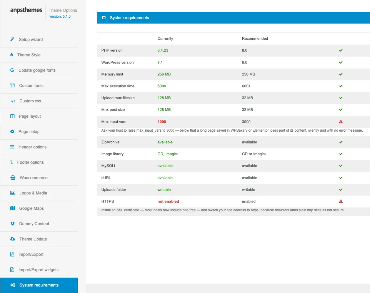
You do not have to measure any of this by hand. Once the theme is active, Appearance → Theme Options → System requirements prints your server's real values against these thresholds, and the setup wizard shows you the same table on its Server step. Both read the same code, so they can never tell you two different stories.
WordPress and PHP versions
The theme declares Requires PHP: 5.6 in its header for backwards
compatibility with old installs, but the requirements check fails PHP below
7.4 and warns below 8.0. Treat PHP 8.0 or newer as the real answer. Version
5.1.0 is tested up to WordPress 6.8.3.
If your host still runs PHP 7.x, most hosting control panels have a one-click PHP version switcher. Do it before importing a demo, not after.
Which page builder
Constructo supports two page builders, and you use one of them:
- Elementor. Free, actively developed, and every one of the fourteen demos has an Elementor version. This is the choice for a new site. See Building pages with Elementor.
- WPBakery Page Builder. Bundled with the theme, licence included. Choose it if you already know it, or if you are moving an existing Constructo site onto this version. Demos 12, 13 and 14 have no WPBakery version. See Building pages with WPBakery.
Install one, not both. With both active the theme has to pick, and it picks WPBakery; you also get two sets of widgets in two editors and a slower admin.
The choice is not permanent in the sense that nothing locks — you can install the other builder tomorrow. What does not transfer is your page content. A page built in WPBakery is stored as WPBakery shortcodes and a page built in Elementor is stored as Elementor data; switching builders means rebuilding those pages. So decide now, while the site is empty.
What to back up
On a brand-new, empty WordPress install there is nothing to lose, and you can skip this section.
On a site that already has content, back up before you import a demo. A demo import writes over your theme options, replaces your widget layout, sets your front page and posts page, and changes your permalink structure. It adds its own pages rather than deleting yours, but the settings it overwrites are gone.
Back up both halves:
- The database — all your posts, pages, settings and widget layout. Your host's control panel almost certainly has a one-click database backup, or use a backup plugin.
wp-content/uploads— your media library. The import adds files here; it does not remove yours, but a backup costs nothing.
Keep the backup until you are happy with the imported site.
What happens next
You do not have to assemble the site by hand. Right after you activate the theme it sends you once to its own setup wizard at Appearance → Constructo Setup, which walks through the whole installation in order: server check, builder choice, plugins, demo import, updates.
Read Installing for the two uploads that come first, then The setup wizard for the wizard itself. If you would rather pick your demo first, The fourteen demos lists all of them with live previews.
Installing
Two uploads, in this order: the theme, then the plugin. On a normal host it takes ten minutes and nothing here is irreversible — the irreversible step is the demo import, and that comes later.
Install the theme
- In WordPress, go to Appearance → Themes.
- Click Add New, then Upload Theme at the top of the screen.
- Choose
constructo.zipfrom your unzipped download. - Click Install Now, then Activate.
Upload
constructo.zip, notconstructo_main.zip. The_mainfile is the wrapper around the whole download — it contains the theme zip, the plugin zips, the child theme, the licensing folder and this manual. WordPress cannot read it as a theme and answers The package could not be installed. Unzip it on your computer and upload the innerconstructo.zip.
The theme zip is the large one. All fourteen demo packs live inside it — about 28 MB of demo content before anything else — so this is the upload that hits a host's file size limit, not the plugin.
If the upload is refused on size. A host still capped at the old 2 MB or 8 MB default answers The uploaded file exceeds the upload_max_filesize directive. That is a limit on the upload, not a problem with the file. Three ways past it, in the order worth trying:
- Raise the limit. Set
upload_max_filesizeandpost_max_sizeto 32M. Many hosts expose both in their control panel; otherwise ask support. You want this anyway — see Before you start.- Upload by FTP or your host's file manager. Unzip
constructo.zipon your computer and upload the resultingconstructofolder intowp-content/themes/, so you end up withwp-content/themes/constructo/style.css. Then activate it under Appearance → Themes. No size limit applies to FTP.- Use WP-CLI, if your host offers shell access:
wp theme install /path/to/constructo.zip --activate.
On activation the theme sends you once to Appearance → Constructo Setup. That is the setup wizard, and it can drive the rest of this chapter for you — see The setup wizard. You can close it and come back.
Install the Anps Theme Plugin
The theme cannot work alone. The plugin travels as its own zip beside it because a WordPress theme may not carry plugin files inside itself; it is not something that went missing from the theme zip.
- Go to Plugins → Add New Plugin, then Upload Plugin.
- Choose
plugins/anps_theme_plugin.zipfrom your unzipped download. - Click Install Now, then Activate.
In the plugins list the entry is called Anps Theme plugin. There is no separate "Constructo" plugin to look for.
Everything in the table below comes from that plugin, not from the theme:
| Missing without the plugin | What that means |
|---|---|
| The shortcodes | Every demo page is built from them; without the plugin the pages print raw [shortcode] text |
| The Elementor widgets | No Anps Constructo category in the Elementor panel, and no theme widgets to drag in |
| The WPBakery elements | The theme's elements disappear from the WPBakery element list |
| Portfolio | No Portfolio post type and no Portfolio categories |
| Team | No Team post type and no Team categories |
| Apartments | No Apartments post type, and the Residences demo has nothing to show |
| The theme's widgets | The ten AnpsThemes – widgets (Download, Images, Opening time, Recent Projects, Social icons, Text and icon, CTA, Recent Posts, Categories List, Tags) vanish from Appearance → Widgets |
| The page and post meta boxes | Header options, sidebar generator, featured video, gallery images and heading settings |
Install the plugin before importing a demo. The demos are built from the plugin's post types and shortcodes. The wizard's Demo step refuses to continue without it and says so.
The plugins the theme asks for
Beyond its own plugin, the theme asks for a handful of third-party plugins. The list lives in one place in the code, and both the wizard's Plugins step and Appearance → Install Plugins render it:
| Plugin | Needed | Source |
|---|---|---|
| Anps Theme plugin | Required | Comes with the theme |
| Slider Revolution | Optional | Comes with the theme |
| Contact form 7 | Optional | wordpress.org |
| WPBakery Page Builder | Required | Comes with the theme |
| Elementor | Required | wordpress.org |
| Newsletter | Optional | wordpress.org |
| WooCommerce | Optional | wordpress.org |
| Envato Market | Optional | Comes with the theme |
| MCP Adapter | Optional | wordpress.org |
Comes with the theme in that table means the theme supplies the download location, so WordPress fetches the plugin without you uploading anything. wordpress.org means it is an ordinary free plugin from the WordPress plugin directory.
What each one is for, and whether you pay for it:
- Anps Theme plugin — required, always. Portfolio, team, apartments, shortcodes and widgets. Covered above.
- WPBakery Page Builder — one of the two page builders. Commercial, bundled with your theme licence: you do not buy it separately and you do not enter a purchase code. Required if it is the builder you use.
- Elementor — the other page builder, free from wordpress.org. Required if it is the builder you use. The two builders show as required because whichever one you chose is required; the registry hides the one you did not choose.
- Slider Revolution — optional. Commercial, bundled with your theme licence. Most demo home pages open with a Revolution Slider, and without the plugin that slider is skipped during import. Install it before the import if you want the demo's home page to look like the preview.
- Contact form 7 — optional, free. The contact and estimate forms in the demos are Contact Form 7 forms. See Forms and maps.
- Newsletter — optional, free. Powers the newsletter signup in the footer of several demos.
- WooCommerce — optional, free. Only if you sell products. The shop demos need it; see WooCommerce shop.
- Envato Market — optional, free from Envato. Theme updates for ThemeForest purchases. If you bought through the ANPS Club you use the club licence screen instead — see Licence and updates.
Install them from the wizard's Plugins step, which does them one at a time and reports each result, or from Appearance → Install Plugins.
The child theme
constructo-child.zip is optional and most sites never need it. Install it
only if you intend to edit theme files — a template, or PHP in
functions.php. Colours, fonts, menus, Custom CSS and everything on the Theme
Options screen live in the database, survive an update on their own, and are
not a reason to use a child theme.
If you do want it:
- Install
constructo-child.zipthe same way as the theme, through Appearance → Themes → Add New → Upload Theme. - Activate Constructo Child Theme — instead of Constructo, not as well as. Only one theme is ever active.
- Leave Constructo itself installed. The child theme is only the files you changed; everything else still comes from the parent, and deleting the parent breaks the site.
Switching to the child theme keeps your settings and content. See Child theme and customisation.
Check it worked
Four checks, all in the admin:
- Appearance → Themes shows Constructo (or Constructo Child Theme) as active.
- Plugins shows Anps Theme plugin as active.
- Appearance → Theme Options opens, with the version number under the heading in the left rail.
- Appearance → Theme Options → System requirements shows your server's values with nothing flagged as a failure.
Fix anything flagged before you import a demo. A half-finished import is much more work than a raised memory limit.
Next
Go to The setup wizard. It checks the server, installs your builder and the remaining plugins, and imports a demo, in that order.
The setup wizard
The wizard is seven screens that take a fresh install from "theme activated" to "finished site": welcome, server check, builder choice, plugins, demo import, updates, done. It is not a separate installer — it drives the same plugin registry and the same demo importer you would use by hand, in the right order.
Opening it, leaving it, coming back
The theme sends you to the wizard once, automatically, straight after you activate it. Once only: it never reappears on later admin pages, and it does not come back on a site where the wizard has already been finished or closed.
After that, three ways in:
- Appearance → Constructo Setup.
- The Setup wizard link at the top of the left rail in Appearance → Theme Options.
- The link in the notice you get if you close the wizard, which says Setup closed. You can run it again from Appearance → Constructo Setup.
Nothing in the wizard is blocking. Every step has a way past it — Continue, Skip, Decide later — and Exit setup in the top right leaves for good and drops you on Appearance → Theme Options. The wizard remembers the furthest step you reached, so closing the tab and coming back resumes there. Going back to re-read an earlier screen does not rewind your progress.
While you are on the wizard screen, other plugins' admin banners are suppressed. On a fresh install there can be four of them stacked above the step, and the screen reads as broken. They come back everywhere else.
You need the manage_options capability — in practice, an administrator.
Step 1: Welcome
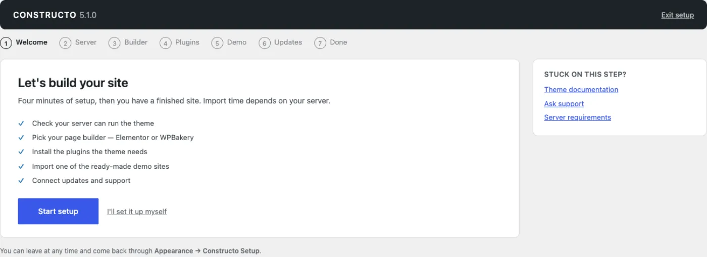
A list of what the wizard is about to do and two buttons: Start setup, and I'll set it up myself, which closes the wizard for good. Nothing is saved by this screen except the fact that you started.
Step 2: Server
The server check. It measures your server here and now — PHP version,
WordPress version, memory limit, execution time, upload and post size,
max_input_vars, ZipArchive, image library, MySQLi, cURL, the uploads folder
and HTTPS — and prints each one as Currently against Recommended. The
thresholds and what each one costs you are in Before you
start. Nothing is fetched, reported or transmitted
anywhere.
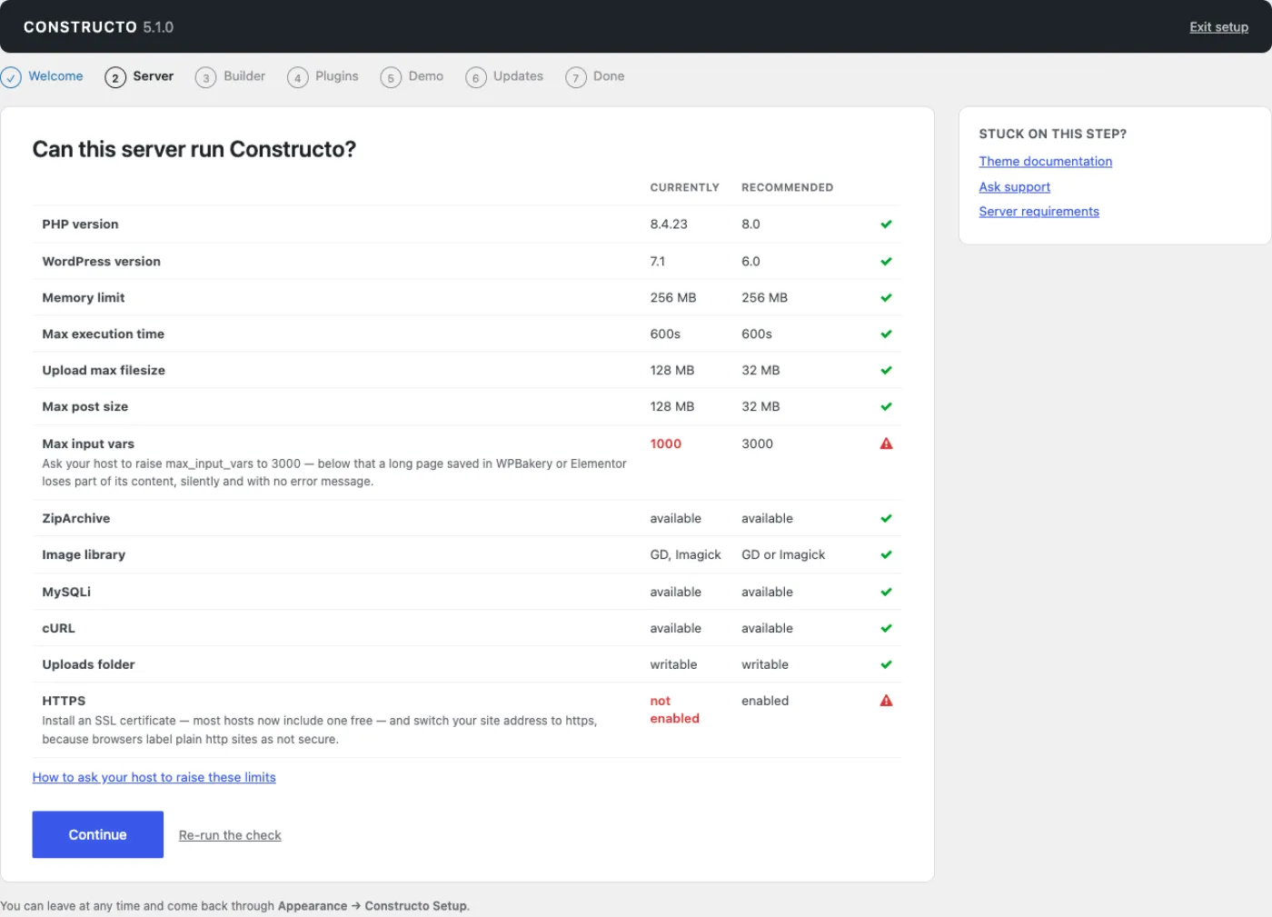
The banner at the top is the verdict:
- Green — Your server is ready, followed by your own numbers.
- Yellow — Some values are below what the theme needs. Setup works, but demo imports and builder saves may be slow or unreliable.
- Red — This server cannot run parts of the theme. The import will most likely fail, and builder saves can silently lose content.
Every row that is not passing prints the fix underneath its own label, written as a sentence you can forward: which directive, which value, and why. That text is what to send your host. The button becomes Continue anyway on a red verdict; the wizard will not stop you, but a failed import costs more time than an email to support does.
Re-run the check reloads the screen and measures again, which is how you confirm your host actually applied the change.
Fix a red server before the demo step, not after. A demo import that dies half way leaves pages imported, widgets not, and settings in between. Raising
memory_limitandmax_execution_timefirst is minutes; untangling a broken import is an afternoon.
The same table is always available outside the wizard at Appearance → Theme Options → System requirements.
Step 3: Builder
Two cards, Elementor and WPBakery Page Builder, with a note on each. Pick one and press Continue: the wizard installs and activates that builder for you there and then, which is why it does not appear again on the next screen. An overlay says Installing your page builder… while it runs.
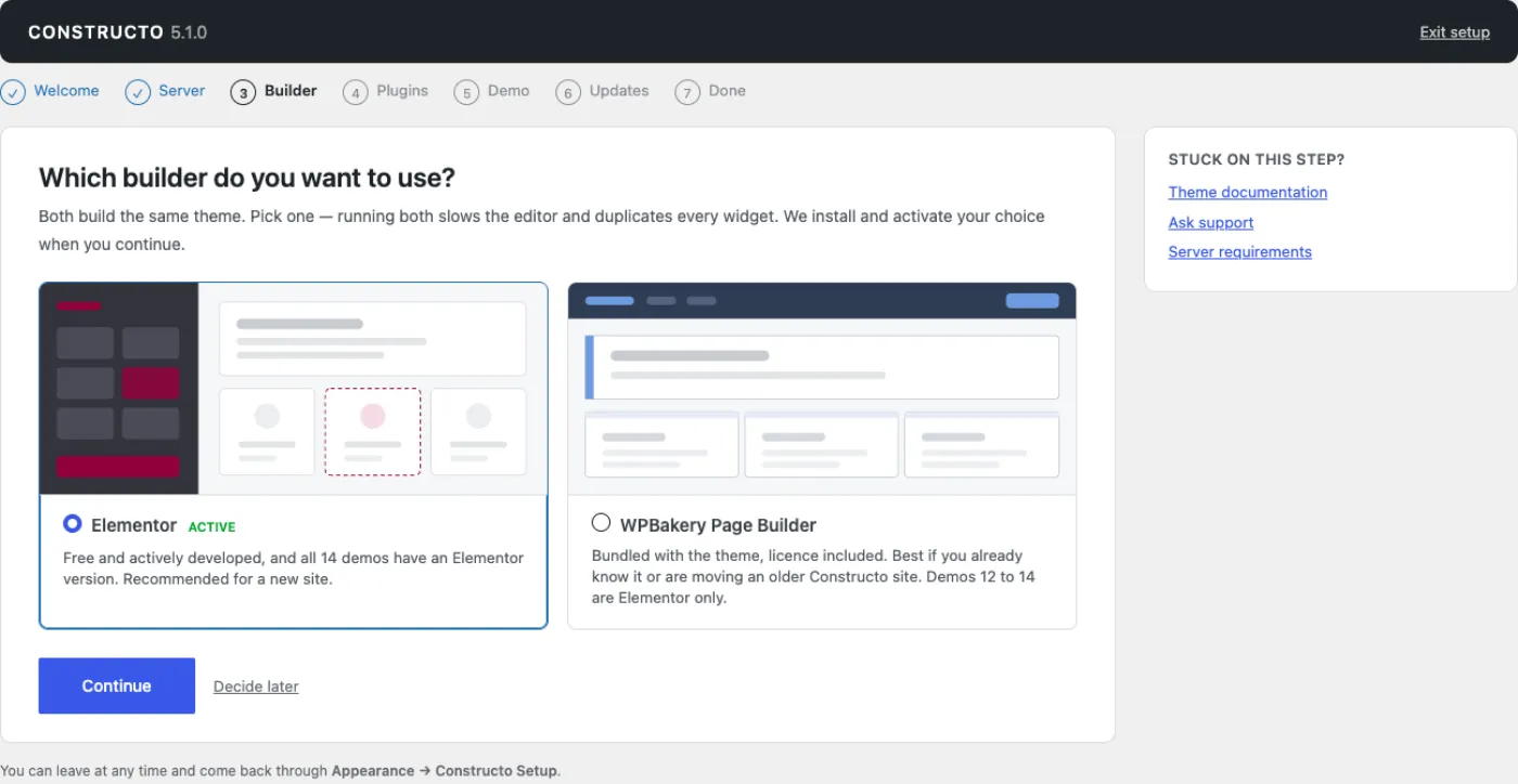
If a builder is already active, its card is labelled active. If both are active, a warning tells you to keep one and deactivate the other when setup is done.
Decide later moves on without installing anything.
If the install fails, you land on the Plugins step with a red notice — Your page builder could not be installed — followed by the actual error and an invitation to try again from the list below. That is the same install, run from the plugin list instead.
Step 4: Plugins
One row per plugin the theme asks for, each with a line saying why the theme wants it. The list comes from the theme's plugin registry, so it cannot drift out of sync with what the theme actually requires. The builder you did not choose is left out.
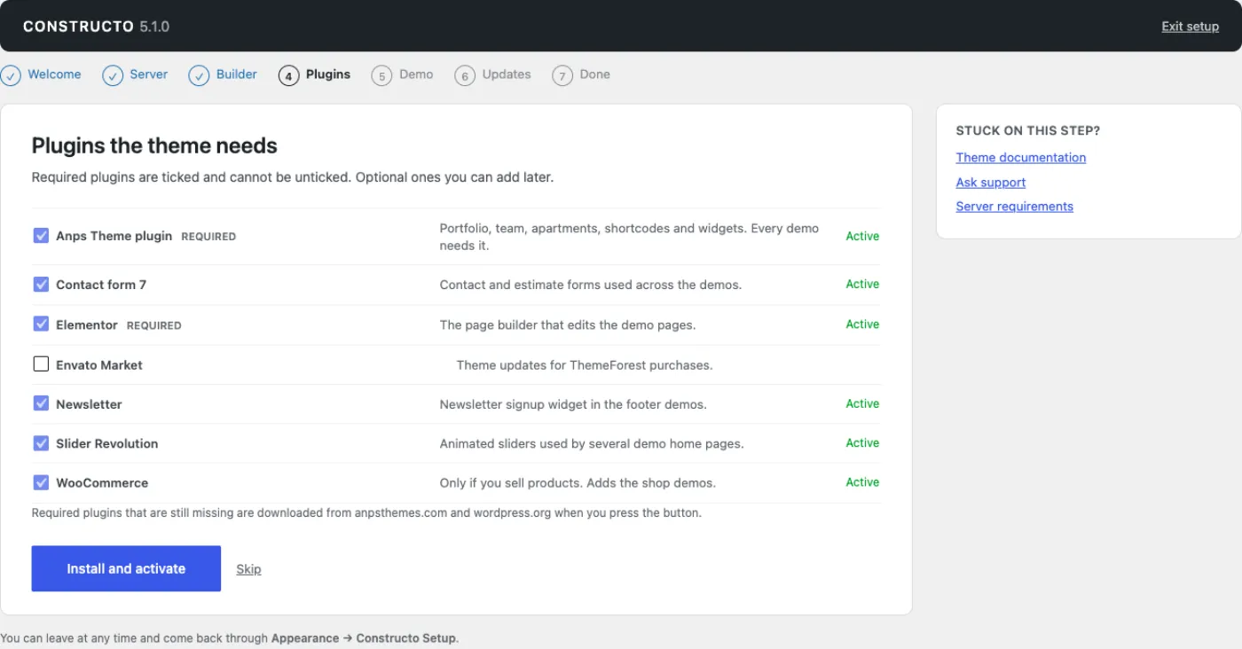
Required rows are ticked and locked — you cannot untick them. Rows for plugins that are already active are ticked and locked too, and marked Active. Optional rows you can tick or leave; you can always add them later.
Press Install and activate. The installs run one at a time, not all at once: a slow host firing eight concurrent downloads hits its own process limit. Each row shows Installing… and then Active or a failure message. When the queue is done the button reads All set and the link beside it becomes Continue.
A failure message is the reason the install or activation actually gave — a download that did not arrive, a permissions problem, a fatal in the plugin's own activation code. One message is worth recognising:
"The server ended the request without answering — usually a memory limit." The request died before it could reply, which on shared hosting almost always means PHP ran out of memory while activating the plugin. Go back to the Server step, get
memory_limitraised, and try that row again. The wizard re-checks the site before reporting this, so a plugin that activated anyway is still shown as Active.
Step 5: Demo
The demo cards, each with a preview link and an Import this demo button. The list is filtered by your builder choice: the Elementor-only demos are hidden when Elementor is not active, and hidden when you chose WPBakery. See The fourteen demos.
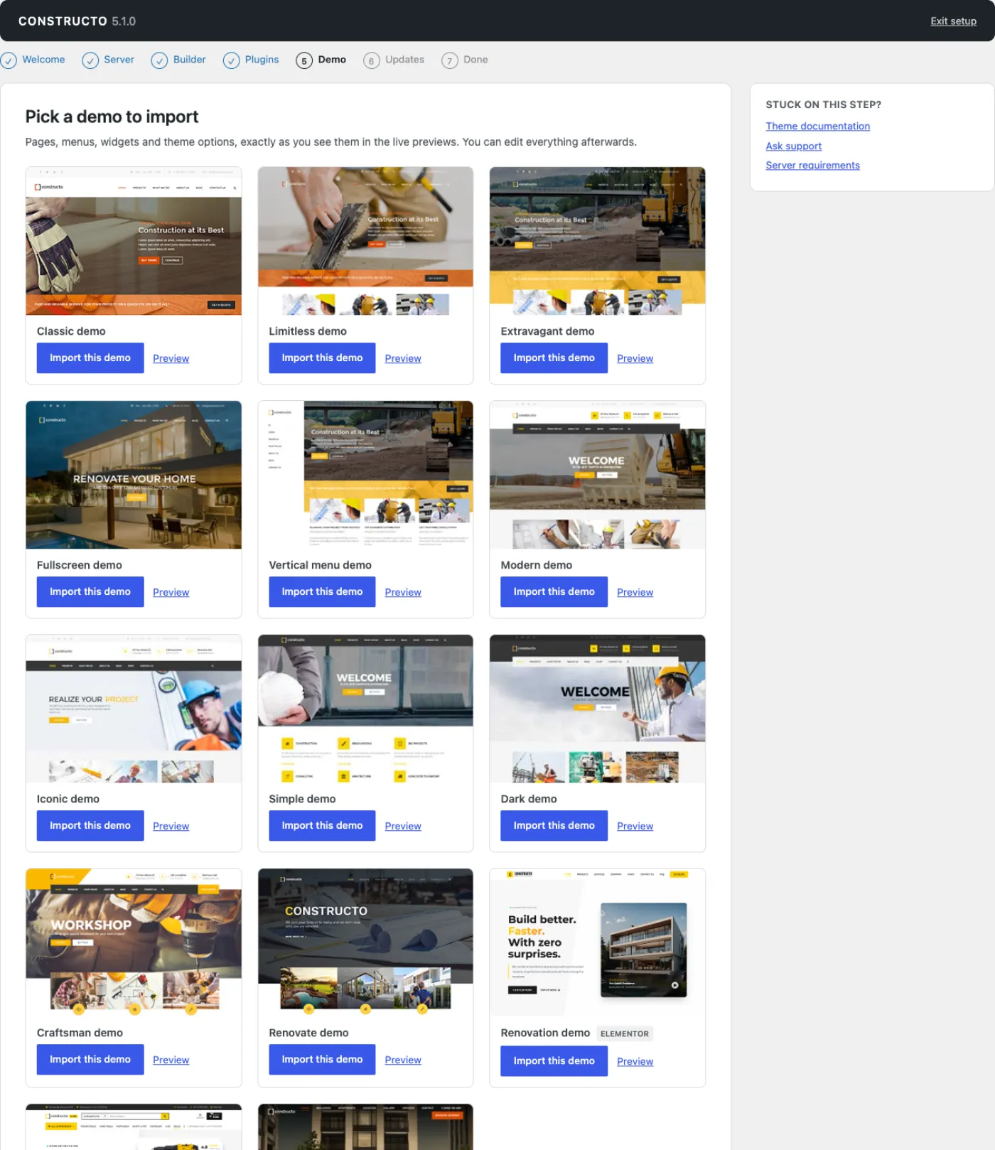
If the Anps Theme Plugin is not active, the step says so and refuses to go further — the demos are built from its post types and shortcodes.
Pressing a demo's button starts the import immediately. A full-screen overlay appears — Importing the demo — this can take a few minutes — with an elapsed-time counter.
Do not close or reload the tab while the overlay is up. The import runs in that one request. Closing the tab does not roll it back; it leaves the site with part of a demo in it. Minutes, not seconds, is normal.
Two notices can appear above the cards:
- A demo has already been imported on this site. Importing another one adds a second set of pages rather than replacing the first. You also get a confirmation dialog before the import starts.
- The last import did not finish. The theme records the moment an import starts and clears the record when it completes, so a record left behind means the previous run died mid-way — almost always the execution time or memory limit. The notice links back to the Server step. Fix the limit, then try again, or try a smaller demo.
When the import finishes the wizard jumps straight to the Done step. Full detail on what an import writes is in Importing a demo.
Step 6: Updates
The licence step. It explains what a licence buys and hands over to the real licence screen; it does not duplicate the form.
The theme is fully functional without a licence — nothing is locked. A club licence adds one-click updates and direct support. Enter a licence key opens Appearance → ANPS Club Licence. If a key is already connected, the step says so instead. See Licence and updates.
If you get stuck at any point, the help desk is at club.anpsthemes.com/help — it is also linked from the Stuck on this step? box beside every screen.
Step 7: Done
A summary of what actually happened: the demo that was imported, the builder you are editing with, and how many plugins are active. Three buttons: View your site, Colours & fonts (which opens Theme Options) and Read the docs. Reaching this screen marks the wizard complete.
The hosting recommendations
The column beside each wizard step carries one recommendation card per partner we work with — the hosts we point people at when a site needs more than a basic shared plan. They are shown to administrators only, never outside the wizard, and every card names the affiliate relationship on it.
Two ways to get rid of them. Hide this removes that one card for your user account permanently. Never show recommendations, under the cards, switches the whole mechanism off for the site; afterwards Appearance → Theme Options → System requirements carries one muted line saying recommendations are off, with the way to switch them back on.
The fourteen demos
A demo is a complete site somebody built and exported: pages, posts, portfolio, team, menus, widgets, sliders and a full set of theme options. You import one, then replace its words and pictures with yours. Every demo uses the same theme — the differences are layout, colour, header style and the kind of content each one carries.
| # | Demo | Builders | Live preview |
|---|---|---|---|
| 1 | Classic demo | Elementor or WPBakery | Preview |
| 2 | Limitless demo | Elementor or WPBakery | Preview |
| 3 | Extravagant demo | Elementor or WPBakery | Preview |
| 4 | Fullscreen demo | Elementor or WPBakery | Preview |
| 5 | Vertical menu demo | Elementor or WPBakery | Preview |
| 6 | Modern demo | Elementor or WPBakery | Preview |
| 7 | Iconic demo | Elementor or WPBakery | Preview |
| 8 | Simple demo | Elementor or WPBakery | Preview |
| 9 | Dark demo | Elementor or WPBakery | Preview |
| 10 | Craftsman demo | Elementor or WPBakery | Preview |
| 11 | Renovate demo | Elementor or WPBakery | Preview |
| 12 | Renovation demo | Elementor only | Preview |
| 13 | Constructo Shop demo | Elementor only | Preview |
| 14 | Constructo Residences demo | Elementor only | Preview |
Open a few previews before you choose. All fourteen are on the live preview site, and the link in the table goes straight to each one.
What each demo is for
Each demo sets its own header type — the row of header thumbnails in Appearance → Theme Options → Header options — and its own colours and fonts. Where a description below is short, the demo differs from its neighbours mainly in styling, and ten seconds on the preview will tell you more than a paragraph can.
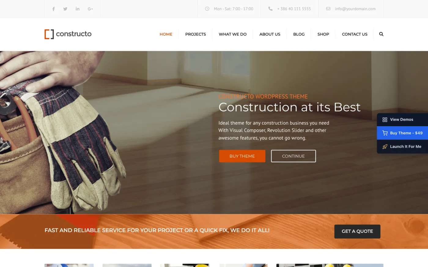
1 · Classic demo. The original Constructo layout and the safest starting point: a Revolution Slider home page, eight portfolio projects, a four-person team and a small blog, under a solid top menu. It is the only one of the first five demos that sets up WooCommerce shop pages, and it imports twenty products.
2 · Limitless demo. The same content set as Classic — eight projects, four team members, a Revolution Slider home page — under a transparent top menu that sits over the slider. No shop.
3 · Extravagant demo. Same content again, same transparent top menu, its own colour and layout treatment. No shop.
4 · Fullscreen demo. The smallest pack of the classic set: twenty-two pages, eight projects, four team members, transparent top menu, no shop.
5 · Vertical menu demo. The one demo that turns the vertical menu on — the navigation sits down the side of the page instead of across the top. Worth importing if that is the layout you want, because building it by hand means turning the option on and then rebuilding every page around the narrower content column. Largest page count of the classic set, no shop.
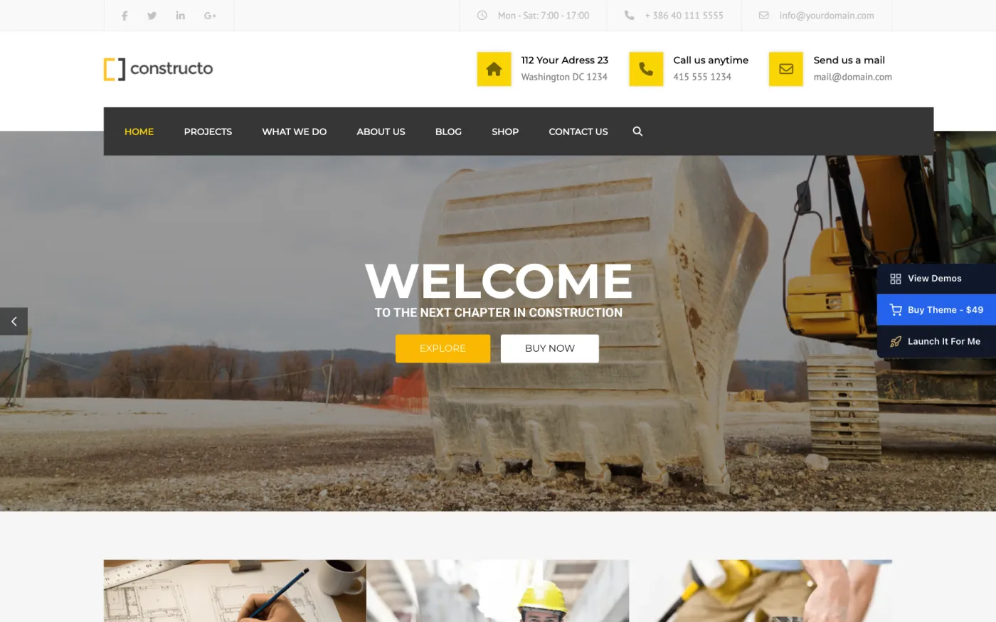
6 · Modern demo. The same construction-company structure on the boxed header type, with nine portfolio projects. Shop pages and twenty products.
7 · Iconic demo. Nine projects and four team members under the full-length header type, where the navigation bar spans the full width of the window. Shop pages and twenty products.
8 · Simple demo. The plainest of the set: nine projects, four team members, a solid top menu and little decoration. Shop pages and twenty products.
9 · Dark demo. Dark top bar and dark footer over a light content area, on the boxed header type. Shop pages and twenty products.
10 · Craftsman demo. For trades and workshops: service pages for furniture, restoration and architecture, and a portfolio organised by room — kitchen, living room, dining room. The only demo that imports two Revolution Sliders, one for the home page and one used inside the content. Boxed header. Shop pages and twenty products.
11 · Renovate demo. The same interiors and renovation content as Craftsman, on a different design: a transparent top menu, its own slider export, and its own typography — the import switches all three font slots to Work Sans from Google Fonts. Shop pages and twenty products.
12 · Renovation demo. Elementor only. A more recent design with ten portfolio projects, a FAQ page and a newsletter page, and no team section. It uses no Revolution Slider at all — the home page is built entirely in Elementor. The import sets Montserrat for headings and navigation and Manrope for body text.
13 · Constructo Shop demo. Elementor only, and the shop-first demo: a builders' merchant with twenty-four products, the shop header type, and the retail pages that go with it — Track my order, Delivery & returns, Trade accounts, Finance options, Help centre. The import sets the WooCommerce currency to GBP with the symbol on the left and switches WooCommerce's "coming soon" mode off, which otherwise blanks the store pages on a new WooCommerce install. Install WooCommerce before importing this one. See WooCommerce shop.
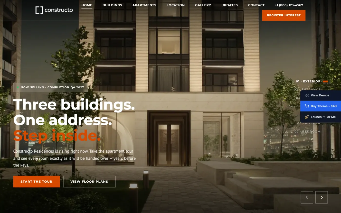
14 · Constructo Residences demo. Elementor only, and the only demo built on the Apartments post type: eighteen apartments across three building pages (Arc, Beam and Cast), plus a gallery, a location page, a news section and a small team. Start from this one for a residential development with a unit list and a building tour. See Apartments and the building tour.
Which demo works with which builder
Demos 1 to 11 exist twice, once for each builder. Demos 12, 13 and 14 exist only in an Elementor version — there is no WPBakery pack for them.
What that means in practice:
- Elementor active. You get all fourteen. Picking any of demos 1 to 11 imports its Elementor pack automatically; you do not choose the pack, and there is no separate "Elementor" button to press.
- WPBakery active. You get demos 1 to 11. The Elementor-only demos are hidden on the wizard's Demo step.
- Neither builder active. The Elementor-only demos are hidden. You can still import demos 1 to 11, but the pages import as WPBakery content and nothing will render them until a builder is installed.
- Both builders active. WPBakery wins. The theme treats WPBakery as the active builder, so demos 1 to 11 import their WPBakery pack even though Elementor is installed. Deactivate one before importing — the theme shows a red admin notice while both are on.
Choosing a "WPBakery demo" is not a thing. You pick a demo by name, and the importer picks the pack: if an Elementor version of that demo exists and Elementor is your active builder, it uses that one. So with Elementor active you always get Elementor pages, whichever of the fourteen you press.
Importing demo 12, 13 or 14 without Elementor. Those three always import their Elementor pack because no other pack exists. Without Elementor active, the pages arrive but nothing can render their layout, and you get a blank or broken home page. Install and activate Elementor first.
What an import does to your site
Importing a demo is not additive styling — it rewrites settings.
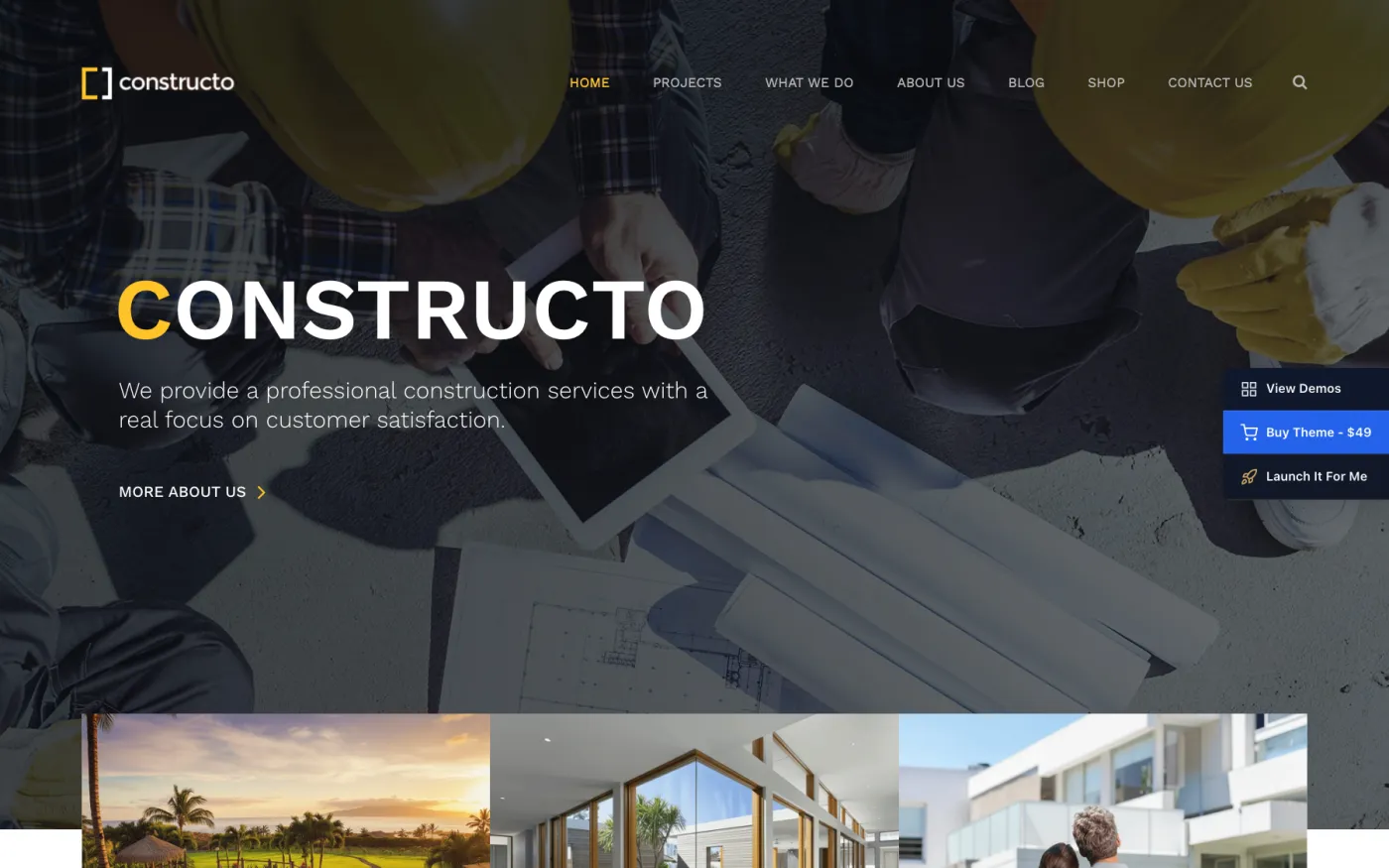
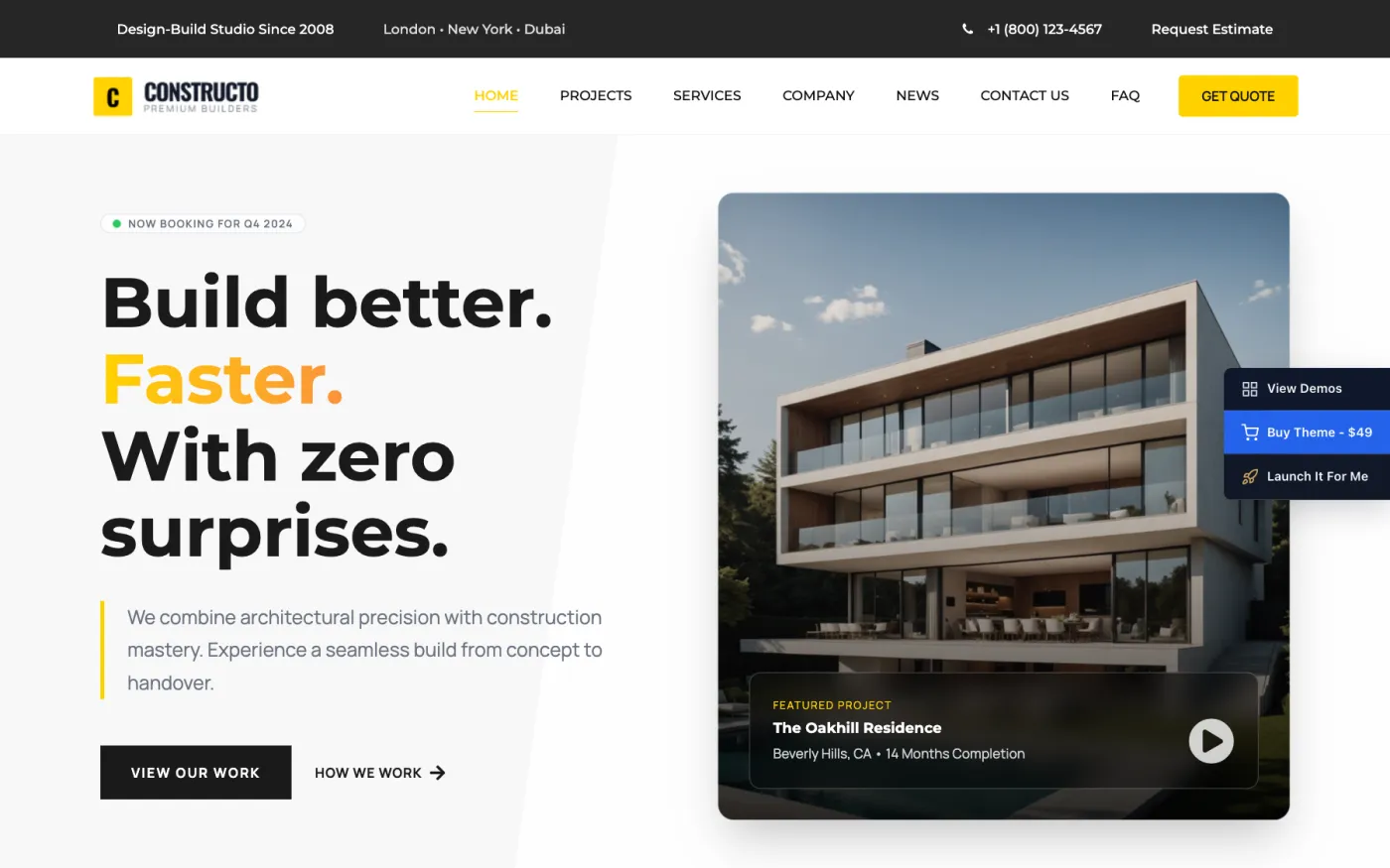
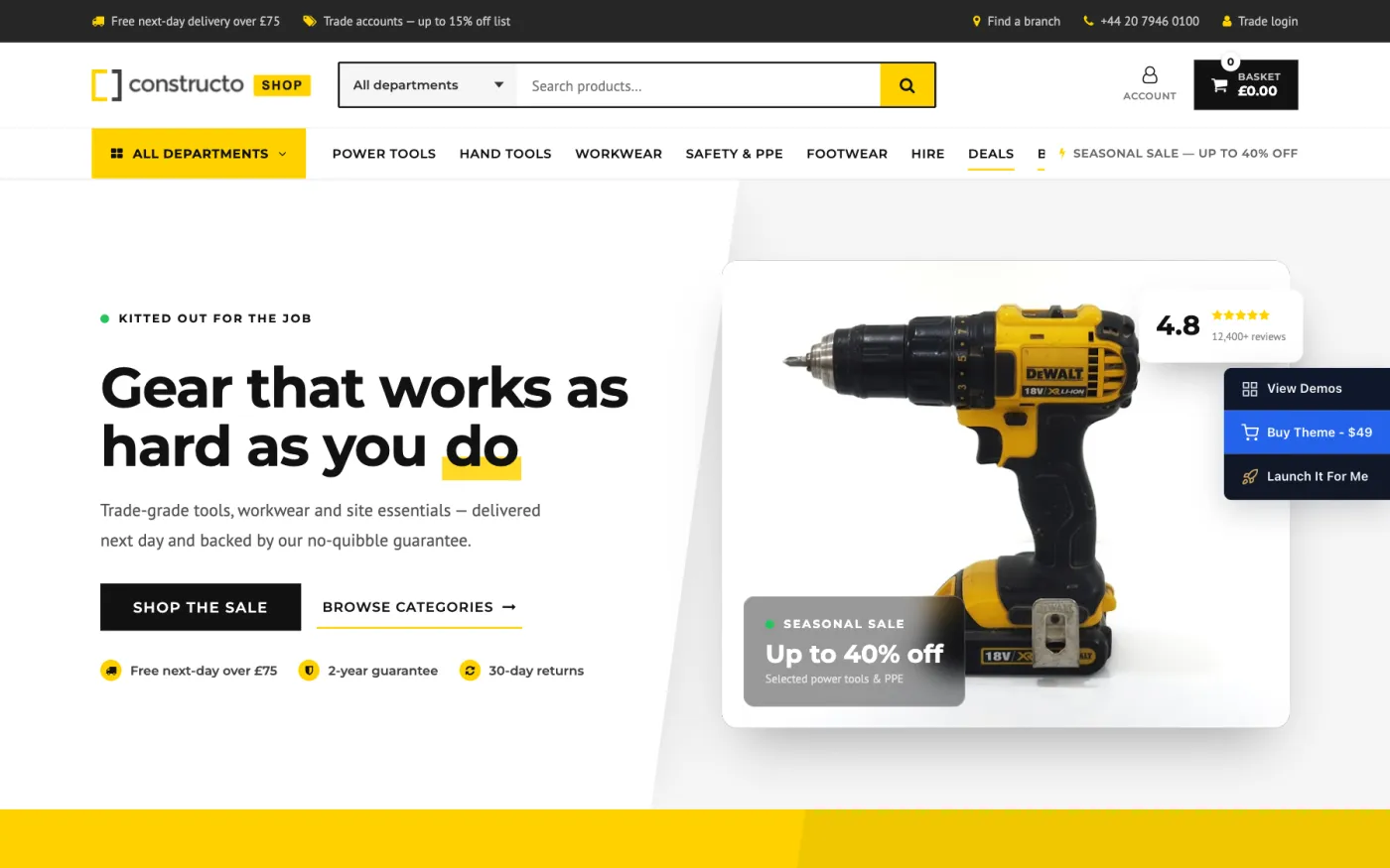
An import replaces your theme options wholesale with the demo's own set:
colours, fonts, header type, footer layout, logos, page setup. It replaces
your widget layout with the demo's. It sets your front page and posts page, it
sets the permalink structure to /%postname%/, and it assigns the demo's menu
as the primary menu. Some demos also overwrite font settings and, for the shop
demo, WooCommerce currency settings.
It adds pages, posts, portfolio items, team members, apartments and media rather than deleting your own. Which is also why importing a second demo onto a site that already has one gives you two sets of pages, not a replacement.
Before you import anything onto a site with content on it, read Before you start on backups. Then go to Importing a demo for the import itself — where the button is, how long it takes, what to do when it stops half way, and what to clean up afterwards.
Importing a demo
An import builds the demo site you picked: its pages, posts, portfolio and team entries, images, menus, widgets, theme options and — where the demo has them — its sliders and Elementor settings. It is one long request, and it is the single most demanding thing your server will do with this theme.
This chapter covers the import itself. The demos are listed in The fourteen demos.
Before you import
- Activate the Anps Theme Plugin. Without it the screen replaces the demo list with Please enable the Anps Theme Plugin to be able to import dummy content. The demos are built from its post types and shortcodes.
- Install and activate the builder you want. The importer looks at which builder is active and imports that demo's version. With Elementor active you get the Elementor pages; with WPBakery active you get the WPBakery ones. With both active WPBakery wins, which is rarely what you meant.
- Activate Slider Revolution if you want the demo's sliders. Demos 1 to 11 ship slider exports; demos 12, 13 and 14 do not use them.
- Activate WooCommerce if you want the demo's shop. Demos 1 and 6 to 14 import shop pages and set them up; demos 2 to 5 have no shop content.
- Check your server. Open Appearance → Theme Options → System requirements. Memory, execution time and ZipArchive are the three that decide whether an import finishes. See Before you start.
- Back up if the site already has content.
Where an import starts
Two screens start the same import, and nothing about it differs but where you end up afterwards:
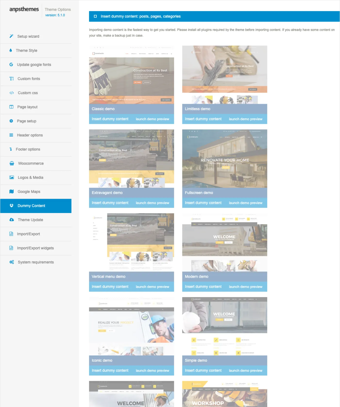
- Appearance → Constructo Setup → Demo, the wizard's fifth step. Press Import this demo. When it finishes you land on the wizard's Done step. This is the path described in The setup wizard.
- Appearance → Theme Options → Dummy Content. Press Insert dummy content under the demo you want. When it finishes the screen returns with Demo content imported.
Both screens put a link to the live preview next to each demo's button, so you can check the site before committing to it.
What an import does, in order
- Deletes the existing WooCommerce shop, cart, checkout, my-account and terms pages, for the demos that bring their own.
- Marks the site as imported, so the screens know a demo has already run.
- Imports the demo's theme options, overwriting every theme option you have set.
- Forces the demo's fonts where the demo needs them. Demo 13 additionally sets the WooCommerce currency to GBP and switches WooCommerce's "coming soon" mode off, which otherwise blanks the store pages.
- Imports the demo's XML: pages, posts, portfolio and team entries, categories, tags, menus and media. Every image is downloaded from the demo server and added to your media library, which is the slowest part by far.
- Sets the page titled Home as your front page and the page titled News, or Blog, as your posts page.
- Sets your permalink structure to
/%postname%/and flushes the rewrite rules. - Deletes the duplicate WooCommerce pages the import created and points WooCommerce at the demo's Shop, Cart, Checkout and My account pages.
- Assigns the demo's menu to the Primary Navigation location and, for shop demos, appends the Shop page to it.
- Empties your widget areas and installs the demo's widgets in their place.
- Imports the demo's Revolution Slider exports and repairs the image paths in them, since the demos are exported from a multisite install.
- Imports the demo's Elementor templates and site settings kit and clears the Elementor cache — Elementor demos only, and only when Elementor is the active builder.
- Clears the theme's cached CSS so the demo's colours and fonts render.
What it overwrites, and what it leaves alone
Overwritten without asking: every theme option, your widget areas, your front page and posts page, your permalink structure, the Primary Navigation menu assignment and, on shop demos, your WooCommerce page settings. None of that is recoverable except from a backup.
Left alone: your existing posts and pages, your media library, your users and your plugins. The demo's content is added alongside yours, not in place of it.
The settings are the part you lose. Content is only ever added, so people reasonably assume an import is additive. It is not additive for options and widgets: those are replaced wholesale. If you have spent an afternoon in Theme Options, export it first from Appearance → Theme Options → Import/Export.
While it runs
An import takes minutes, not seconds. The screen covers itself with Import might take some time, please be patient, an elapsed-time counter, and Do not close or reload this tab. Take that literally: closing the tab or hitting reload does not cancel the import, but it does leave you with no idea how far it got.
The import runs before the admin page is drawn, so your browser keeps showing the previous screen with the overlay on it for the whole run rather than a half-rendered blank one. A page that looks frozen is normal.
The theme records the attempt when it starts and clears the record when it finishes. An attempt that is still on record means the import died part-way, and the wizard's Demo step says so: The last import did not finish.
Importing a second demo
A second import adds a second set of pages; it does not replace the first. Both screens warn you. On the Dummy Content screen the demos dim and clicking one asks you to confirm: WARNING: You have already insert dummy content and by inserting it again, you will have duplicate content. The wizard says the same thing in a notice.
Import a second demo only if you have deleted the first demo's content, or if the first import failed and you are retrying. Theme options and widgets are replaced by the second demo, so the site will at least look like one demo, but you will be left with two sets of pages to clear up by hand.
Page settings survive the import
While an import is running, the theme's meta boxes — header options, page heading, sidebars, portfolio and team fields, the apartment fields — skip their own save routines. That is deliberate: without it, WordPress's save hooks would fire during the import and blank the per-page settings the demo had written a moment earlier. It is why demo pages come in with their headers, headings and sidebars already configured.
When an import goes wrong
It stops part-way. Some pages arrive, the rest do not, and the wizard later reports that the last import did not finish. Almost always the server's execution time or memory limit. Open Appearance → Theme Options → System requirements, or the wizard's Server step, and ask your host for the values it lists — 600 seconds of execution time and 256 MB of memory are what the theme was built against. Thresholds are in Before you start. Then delete the partial content and import again.
Images are missing. Pages and text are there; pictures are not. The images
are downloaded from the demo server during the import, so this is a network or
a filesystem problem, not a content one. Three causes, in order of likelihood:
your server cannot make outbound HTTP requests, so nothing downloads; the
wp-content/uploads folder is not writable, so nothing can be saved; or the
memory limit runs out while resizing the largest images, which is why some
images are there and some are not. The System requirements tab reports the last
two directly.
An Elementor demo with Elementor inactive. Demos 12, 13 and 14 exist only in an Elementor version, and demos 1 to 11 fall back to their WPBakery version unless Elementor is the active builder. Import one of those three without Elementor running and the pages come in as empty shells; the screen tells you Elementor is not active. Demo data for Elementor can't be inserted. Activate Elementor, deactivate WPBakery, delete the imported pages and import again.
No sliders. The demo's home page has a gap where its slider should be, and
the screen reported Revolution slider is not active. Demo data for revolution
slider can't be inserted. The slider export can only be imported by Slider
Revolution itself. Activate the plugin — it is in your download as
plugins/revslider.zip — and import the demo again, or import the demo's slider
export by hand. See Sliders and media.
Slider images are missing although the slider is there. The demos are
exported from a multisite install, where upload paths contain a /sites/N/
segment that means nothing on your site. The importer rewrites those paths to
your own uploads folder and clears the slider caches. If images are still
missing, the underlying files did not download — treat it as the missing-images
case above.
After the import
- Check the front page. Visit the site. If it shows your posts rather than the demo's home page, the demo's page was not titled Home; set it yourself under Settings → Reading.
- Check the menu. Appearance → Menus — confirm a menu is assigned to Primary Navigation. The import assigns one, but a site that already had menus can end up with the wrong one selected.
- Save your permalinks. Settings → Permalinks → Save Changes. The import flushes the rewrite rules, but saving once removes any doubt about portfolio and team single pages returning 404.
- Read through Theme Options. Everything there is now the demo's. Your logo, your social links and your Google Maps key are the first three things to change. See Theme Options.
- Delete what you do not want. Demo pages, demo posts, demo portfolio items and demo products are ordinary content; delete them as you would any other. Leave the front page and posts page in place until you have replacements.
If something is still wrong, Troubleshooting lists the common import failures with their fixes.
Theme Options
Almost everything the theme lets you change outside the page builder lives on one screen: Appearance → Theme Options. The version you are running is printed under the title in the left rail. The screen is registered for administrators only, so if the menu entry is missing you are signed in as an editor or a shop manager.
Every tab is its own form with its own Save all changes button. Changes on one tab are lost if you click through to another tab before saving.
The tabs
The left rail lists the tabs in this order. The first entry is a shortcut out to the wizard described in The setup wizard.
| Tab | What it holds |
|---|---|
| Theme Style | Font families, font sizes, every colour, button colours |
| Update google fonts | Refreshes the list of Google font families |
| Custom fonts | Uploads your own font files as a ZIP |
| Custom css | A CSS box added to every page |
| Page layout | Boxed or full width, container width, global sidebars, page heading, vertical menu |
| Page setup | Coming soon and 404 pages, portfolio settings, WPBakery legacy mode, post meta |
| Header options | Front page header type, top bar, menu behaviour |
| Footer options | Prefooter, footer columns and style, copyright footer |
| Woocommerce | Shop skin, cart icon, product grid |
| Logos & Media | Logo, sticky logo, mobile logo, favicon, heading backgrounds, text logo |
| Google Maps | Your Google Maps API key |
| AI visibility | Structured data about your company, and the /llms.txt index for AI tools |
| Agent access | Whether AI assistants may read this site, change it, or publish to it |
| Dummy Content | The 14 demo packs |
| Theme Update | How to update the theme |
| Import/Export | Moves theme options between sites |
| Import/Export widgets | Moves widgets between sites |
| System requirements | What this server provides against what the theme needs |
Theme Style
The biggest tab, and the one you will use most. It has four blocks.
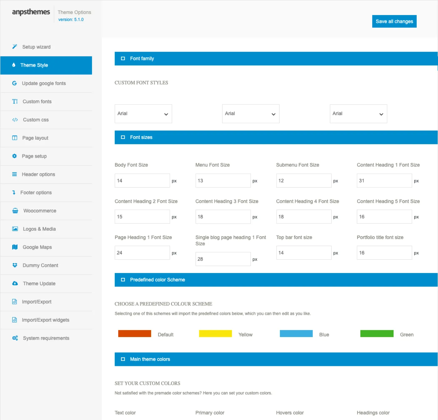
Font family holds the three font slots — Font type 1, Font type 2 and Navigation font type — each a single list of system, custom and Google families. See Fonts and typography.
Font sizes is twelve pixel fields, from Body Font Size (14) to Portfolio title font size (16). They are listed with their defaults in Fonts and typography.
Predefined color Scheme offers Default (#d54900), Yellow (#f9e60d),
Blue (#3aaedf) and Green (#43b425). Clicking one fills every colour field
below so you can then edit individual values.
A scheme is not saved until you save. Clicking a palette only fills the fields in your browser. Press Save all changes or the old colours stay.
Main theme colors, Header colors, Footer colors and Button styles follow: Colours and the Customizer.
Update google fonts, Custom fonts, Custom css
Update google fonts has one button. It downloads the current Google font list and stores it, then prints how many families are available; nothing refreshes it automatically. Custom fonts takes a ZIP of font files and installs them into the theme. Both are explained in Fonts and typography.
Custom css is a code editor whose contents are appended to the theme's generated stylesheet on every page. Use it for small overrides and a child theme for anything larger: Child theme and customisation.
Page layout
| Setting | What it does | Default |
|---|---|---|
| Boxed | Centres the site in a fixed-width box on a background | off |
| Pattern | One of ten background patterns, shown when Boxed is on | — |
| Custom background type | stretched, tilled or custom color, with an image or colour field for the choice |
— |
| Desktop Container Width | Width of the content container, in pixels | 1170 |
| Page Sidebars, Post Sidebars | Default left and right sidebars for pages and for posts | None |
| Page title and breadcrumbs style | Style 1 or Style 2 | Style 1 |
| Disable page title, breadcrumbs and background | Removes the whole page heading block | off |
| Disable breadcrumbs | Keeps the heading, drops the breadcrumb trail | off |
| Enable Vertical menu | Switches to the vertical side menu, with its own background image field | off |
| Disable page comments | Hides comments on pages | off |
| Mobile layout | Footer and prefooter widget columns on phones: 1 column or 2 columns | 2 columns |
The vertical menu overrides the header type set on Header options. The two sidebar pairs are the fallback described in Sidebars.
Page setup
| Setting | What it does | Default |
|---|---|---|
| Coming soon page | Shows this page to everyone except super admins | none |
| 404 error page | Page used for the not-found screen | none |
| Portfolio slug | URL segment for portfolio items | empty |
| Portfolio single style | Style 1, Style 2 or Style 3 | Style 1 |
| Portfolio single footer | Editor content appended to every portfolio item | empty |
| Legacy mode | WPBakery backwards compatibility, for old sites only | off |
| Disable Post meta elements | Four checkboxes: Comments, Categories, Author, Date | all shown |
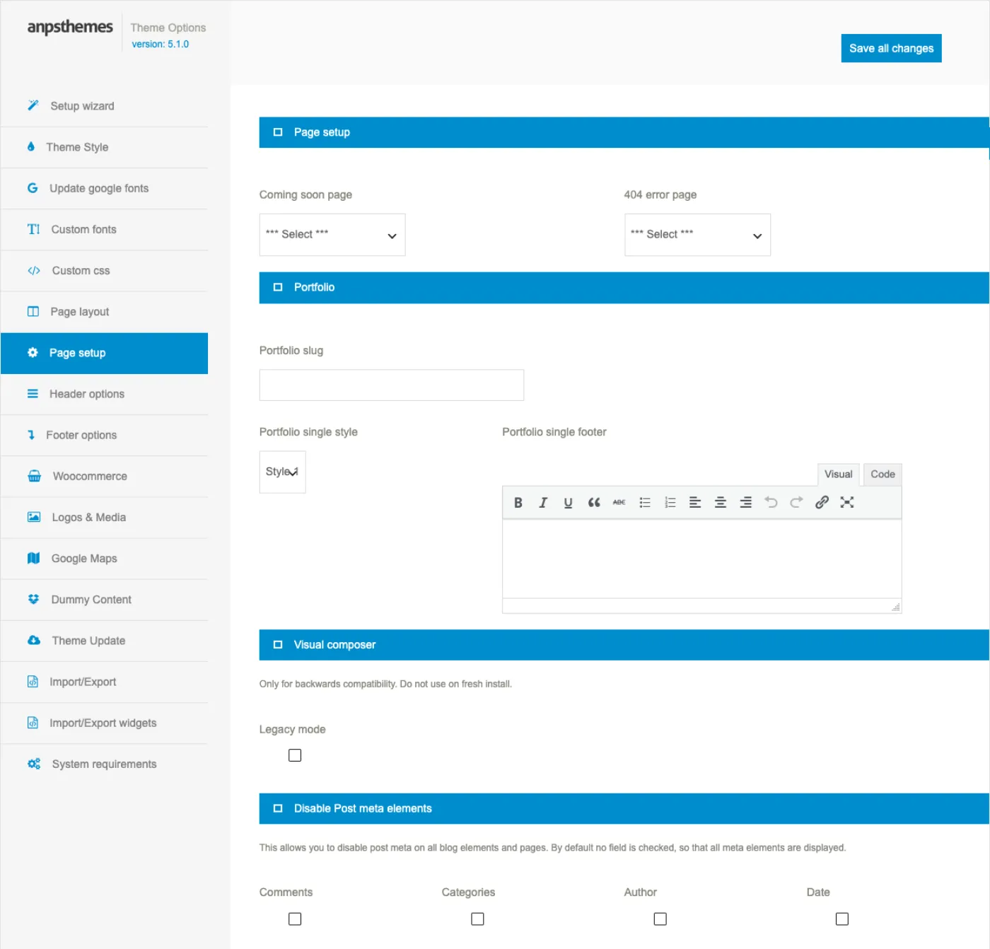
Coming soon hides your whole site. Once a page is chosen here, every visitor who is not a super admin sees that page instead of the site. Set it back to
*** Select ***to go live.
Legacy mode is described under Building pages with WPBakery. Do not switch it on for a new site.
Header options, Footer options and Woocommerce
Header options sets the front page header type and its transparent-header colours, the shop header texts, the menu and CTA buttons, the top bar, the search style, sticky behaviour and the mega menu walker: Header and navigation.
Footer options covers the prefooter, footer columns and style, the copyright footer and the parallax footer. Those choices decide how many widget areas exist, so read Footer and widgets before placing widgets.
Woocommerce holds Shop style, the header cart icon, How many products in row?, Products per page (default 12), image zoom and lightbox, and the modern shop's assurance strip: WooCommerce shop.
Logos & Media
Heading background takes Page heading background and Search page heading background, shown behind the page title.
Favicon and logo holds Logo, Sticky logo, Mobile logo and Favicon. Each logo has width and height fields defaulting to 158 × 33 pixels; Auto adjust logo size? is on by default and ignores them.
Text based logo replaces the image with editor text plus a Logo font picker.
Google Maps
One field: Google Maps API key. Every map in the theme needs it, because Google refuses unauthenticated map requests. See Forms and maps.
AI visibility
Structured data describing your company and every page, and the /llms.txt
index for AI tools. Both are on by default and both stay on your own site:
AI visibility.
Agent access
Whether an AI assistant connected to this site may read it, change it or publish to it. Reading is on, writing is off until you allow it, and every call is recorded: Agent access.
Dummy Content and Theme Update
Dummy Content lists the demo packs and runs the importer: Importing a demo.
Theme Update describes the two update routes, the Envato Market plugin or a manual upload. Licence and updates has the detail.
Import/Export
This tab moves your settings to another site. The top box holds a JSON object
of every option whose name starts with anps_, minus the two font caches.
- On the source site, press Export to download
anps-theme-options.json, or Copy to clipboard to take the JSON. - On the target site's same tab, paste the JSON into the lower box or choose the file, then press Import.
Every key in the file is written as an option. anps_custom_css is also
copied into WordPress's own Additional CSS so the Customizer shows it.
Import writes, it never merges. Any option in the file replaces the value on the target site. Options that are not in the file are left alone, so an import cannot reset a site to defaults — export the target site first if you want a way back.
Attachment IDs and page IDs differ between sites, so logo URLs, the coming soon page and the 404 page usually need fixing by hand after an import.
Import/Export widgets
The same idea for widgets. Export downloads anps-widgets.txt, a
serialised map of every widget area to the widgets inside it; custom menu
widgets store the menu slug rather than its ID so they survive the move.
Import reads that file back into the matching areas, skipping areas the
target site does not have.
Importing widgets adds, it does not replace. Each import appends its widgets to the areas that already exist. Run it twice and every widget appears twice — empty the areas first in Appearance → Widgets.
System requirements
A table of what your server provides against what the theme needs, with a verdict on each row and a hint on any row that is not a pass. Red means demo import will fail, amber means it will be slow. The thresholds are listed in Before you start.
Why a saved change appears at once
The theme does not write a stylesheet file. It builds the CSS from your
options and caches it in four transients: anps_theme_options_styles,
anps_theme_options_styles_css, anps_theme_options_buttons and
anps_theme_options_buttons_css. Saving any tab here clears all four, so the
next page load rebuilds the CSS and your change is live. A demo import clears
them too.
Colours and the Customizer
Constructo registers a Customizer panel called Theme options at Appearance → Customize. It edits the same settings as Appearance → Theme Options, but with a live preview of the page you are looking at.
Use whichever you prefer. The Customizer is better for colour work because you see the result; the Theme Options screen is better for everything else, because it shows every field at once and it is the only place some settings exist.
The nine sections
The panel adds its sections in this order.
| Section | Holds |
|---|---|
| Main theme colors | 26 colour pickers for text, menu, footer and cart |
| Button colors | Seven button styles |
| Typography | Ten font sizes |
| Page layout | Global sidebars, page title and breadcrumbs |
| Page setup | Coming soon page, 404 page, portfolio style, post meta |
| Header options | Top bar, menu position, sticky menu, search, shop header texts |
| Footer options | Prefooter, footer columns and style, copyright footer |
| Woocommerce | Shop skin, cart icon, product grid, zoom and lightbox |
| Logos | Heading backgrounds, logo, sticky logo, favicon |
Four colours are not in the Customizer and can only be set on
Appearance → Theme Options → Theme Style: Main divider color
(#d54900), Submenu divider color (#ececec), Page heading background
color and Page heading text color.
Main theme colors
Twenty-six pickers, grouped here by what they paint. The defaults are the values the theme falls back to when you have never saved a colour.
| Group | Settings | Defaults |
|---|---|---|
| Body | Text color, Primary color, Headings color | #727272, #292929, #000 |
| Accent | Hovers color — links, hovers, active states, dividers and most accents | #d54900 |
| Top bar | Top bar color, Top bar background color | #c1c1c1, #f9f9f9 |
| Header | Page header background color, Menu text color, Selected main menu color, Logo background color, Above menu background color | #fff, #000, #d54900, empty, empty |
| Dropdowns | Submenu background color, Submenu text color | #fff, #000 |
| Vertical menu | Side submenu background color, Side submenu text color, Side submenu text hover color | all empty |
| Footer | Footer background color, Footer text color, Footer heading text color, Footer selected color, Footer hover color, Footer divider color | #242424, #d9d9d9, #fff, empty, empty, #fff |
| Copyright bar | Copyright footer text color, Copyright footer background color | #c4c4c4, #0f0f0f |
| Shop | Shopping cart item number background color, Shoping cart item number text color | primary colour, #fff |
An empty picker means the theme writes no rule for it and the stylesheet's own value stands. That is why leaving Footer hover color blank is a valid choice, not an unfinished one.
Hovers color is the one to change first. It is the theme's accent: link hovers, the current menu item, heading dividers, icon backgrounds, carousel dots and the default button hover all use it.
Some Customizer swatches start on a different colour. On a site where a colour has never been saved, a few Customizer pickers open on a value that is not what the site is rendering. The Theme Style tab always shows the colour actually in use. Saving from either screen makes the two agree.
Button colors
Seven groups, each introduced by its own label in the section. All of them write plain CSS rules against a class, so what matters is which class your buttons carry.
| Group | Paints | Colours |
|---|---|---|
| Normal button | Every button with no style class: contact form submits, Add to cart, WooCommerce buttons, checkout Place order | background, colour, hover background, hover colour |
| Button style 1 | .btn.style-1 |
background, colour, hover background, hover colour |
| Button style 2 | .btn.style-2 |
background, colour, hover background, hover colour |
| Button style 3 | .btn.style-3, an outlined button |
colour, hover background, hover colour, border colour |
| Button style 4 | .btn.style-4, a link-style button |
colour, hover colour |
| Button slider | .btn.slider, used by slider captions |
background, colour, hover background, hover colour |
| Button style 5 | .btn.style-5 |
background, colour, hover background, hover colour |
Both page builders offer styles 1 to 4 on their button element: the Style dropdown in the WPBakery button and in the Elementor Button widget writes the same class. Styles 5 and slider come from demo markup and from sliders.
Button style 5 does not follow the panel. In 5.1.0 the four Button style 5 fields are saved under a different option name from the one the generated CSS reads, so changing them has no visible effect. Those buttons keep grey
#c3c3c3on white with a#737373hover. Restyle them with a rule on.btn.style-5in Custom css.
Typography
Ten pixel sizes: Body font size (14), Menu font size (14), Content heading 1 to 5 (31, 24, 21, 18, 16), Page heading 1 font size (24), Single blog page heading 1 font size (28) and Top bar font size font size (14). Two more — Submenu font size and Portfolio title font size — exist only on the Theme Style tab.
Sizes and font families are independent: the size applies whichever family the slot is set to. See Fonts and typography.
The other six sections
These duplicate the matching Theme Options tabs and are documented with them.
- Page layout — the four global sidebar pickers, Sidebars, and the page heading switches.
- Page setup — coming soon page, 404 page, portfolio single style and the four post meta checkboxes.
- Header options — Header and navigation.
- Footer options — Footer and widgets.
- Woocommerce — WooCommerce shop.
- Logos — page and search heading backgrounds, logo, sticky logo, favicon.
Enable Bredcrumbs does the opposite. The checkbox in the Customizer's Page layout section is the same setting as Disable breadcrumbs on the Theme Options tab. Ticking it removes the breadcrumb trail.
Which setting wins
Three places can change how a page looks. In order of strength:
- Per-page meta boxes, in the sidebar of a page or post: sidebars, top bar and above-menu visibility, header and footer margins, and the page heading box with its own colours. These beat everything else, for that one page.
- Theme Options and the Customizer. These are not two layers — they read and write the same options. Whichever you saved last is the value.
- The stylesheet defaults, used wherever you have left a field empty.
Custom CSS is separate: it is appended after the generated CSS, so it overrides all three whenever the selectors are equally specific.
Where the CSS comes from
The theme does not ship a stylesheet with your colours in it. On each request it reads your options, builds a block of CSS and caches it in four transients:
anps_theme_options_styles— the option valuesanps_theme_options_styles_css— the compiled colour and font CSSanps_theme_options_buttons— the button option valuesanps_theme_options_buttons_css— the compiled button CSS
Saving any tab of Appearance → Theme Options clears all four. Importing a
demo clears them too. Saving the Custom css tab clears
anps_theme_options_styles_css.
The Customizer does not clear that cache. It writes the options, and the preview inside the Customizer is correct, but the front end can keep serving the previously compiled CSS. If a Customizer colour change is not showing, open Appearance → Theme Options → Theme Style and press Save all changes once. That rebuilds the CSS from the options the Customizer wrote.
Custom CSS or a child theme
Appearance → Theme Options → Custom css is a code editor whose contents are appended to the generated CSS on every page. It is stored as an option, so it survives theme updates, and the import file carries it to another site.
Use Custom CSS for a handful of rules: a colour the panel does not expose, a margin on one section, hiding an element on mobile.
Use a child theme when you need more than CSS — a changed template, a new function, a modified header. A child theme also keeps large stylesheets in a file you can version-control instead of a database field. See Child theme and customisation.
Whichever you choose, do not edit the theme's own CSS files. They are compiled from SCSS and the next update overwrites them.
Fonts and typography
Constructo sets type in three slots. Each slot picks one family from one of
three sources, and the theme writes the font-family rules for you. Sizes are
separate numbers, so changing a family never changes a size.
The three slots
You set them at Appearance → Theme Options → Theme Style, under Font family.
| Slot | Field | Paints |
|---|---|---|
font_type_1 |
Font type 1 | Headings h1–h6, buttons, the page heading, prices, pagination, table headers, alerts, pricing tables, product meta and the header search field |
font_type_2 |
Font type 2 | Body text, post headers, heading subtitles and the language switcher |
font_type_navigation |
Navigation font type | The main navigation, tab titles, the menu button and the above-menu bar |
A fourth, smaller slot lives on another tab: Appearance → Theme Options → Logos & Media → Logo font styles the text-based logo. It defaults to Arial from the system list.
On a fresh install all three slots are Google fonts: Montserrat for
Font type 1 and the navigation, PT Sans for the body. When a slot is set
to Montserrat the theme also writes font-weight: 500 for it, which is what
gives the demos their semi-bold headings.
The three sources
The picker groups every family under the source it came from.
System fonts are thirteen families already on the visitor's device: Arial, Arial black, Comic Sans MS, Courier New, Georgia, Impact, Lucida Console, Lucida Sans Unicode, Palatino Linotype, Tahoma, Trebuchet MS, Times New Roman and Verdana. Nothing is downloaded, so they are the fastest choice.
Google fonts are fetched from Google's servers when the page loads.
Custom fonts are files you upload into the theme and the theme serves.
The choice you make writes two options: the family, and the source it came
from. That is how the theme knows whether to add a Google stylesheet link, an
@font-face rule, or nothing at all.
Refreshing the Google font list
The list of Google families is stored in your database, not fetched on every page load, so new families do not appear on their own.
- Open Appearance → Theme Options → Update google fonts.
- Press Update Google Fonts.
- The page reloads and prints Number of available Google fonts.
Run it once after installing the theme and again whenever a family you expect is missing from the picker. It needs outbound HTTP from your server; on a host that blocks that, the count stays at zero and the Google group in the picker stays empty.
Uploading a custom font
The Custom fonts tab takes one ZIP archive and unpacks it into the theme's
fonts directory.
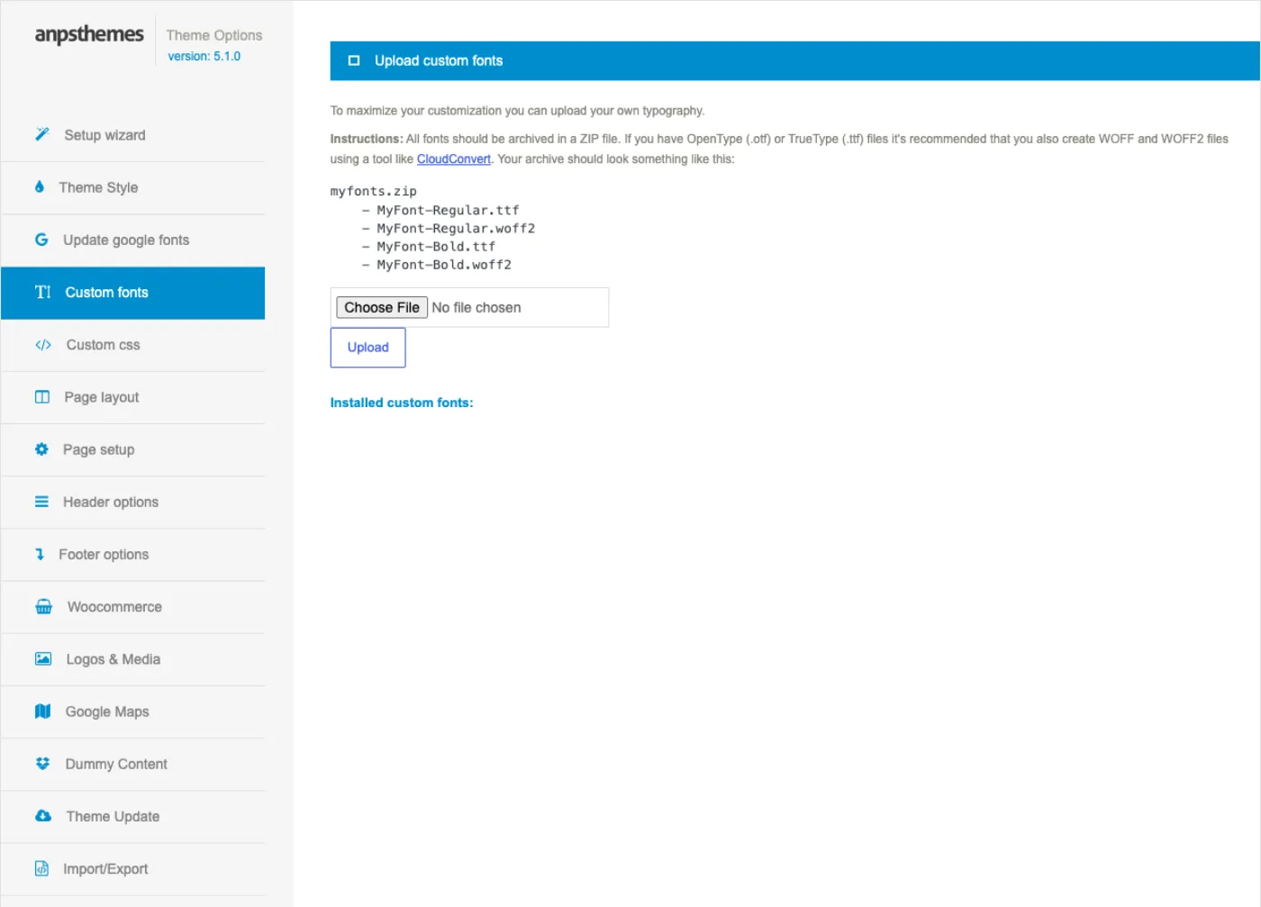
- Convert your font to WOFF2 and WOFF. The tab links to CloudConvert for
this. Keep the
.ttfor.otfas a fallback if you like. - Put the files in the root of a ZIP — no folder inside the archive.
- Open Appearance → Theme Options → Custom fonts, choose the ZIP and press Upload.
- The installed families are listed at the bottom of the tab, and they appear in every font picker under Custom fonts.
A valid archive looks like this:
myfonts.zip
    - MyFont-Regular.ttf
    - MyFont-Regular.woff2
    - MyFont-Bold.ttf
    - MyFont-Bold.woff2
The theme groups files by their name before the extension, so the archive
above installs two families, MyFont-Regular and MyFont-Bold, each with a
@font-face rule listing every format it found. Recognised extensions are
woff2, woff, ttf and otf; anything else in the ZIP is ignored.
Weights are separate families here. There is no bold or italic pairing. If you want bold headings, choose the bold file as the family for that slot; the browser will not synthesise weights from a single face beyond faux bold.
Three things the upload refuses: a file that is not a .zip, a file whose
name matches one already in the fonts directory, and any upload at all if
that directory is not writable. Each returns a red message at the top of the
tab.
A theme update replaces the fonts directory. Uploaded fonts live inside the theme folder, not in your uploads. Keep the ZIP, and re-upload it after a manual theme update. See Licence and updates.
Sizes
Sizes are pixel numbers on the same Theme Style tab, under Font sizes. Ten of the twelve are also in the Customizer's Typography section.
| Field | Default | Applies to |
|---|---|---|
| Body Font Size | 14 | Body copy |
| Menu Font Size | 14 | Top-level menu items |
| Submenu Font Size | 12 | Dropdown items |
| Content Heading 1–5 Font Size | 31, 24, 21, 18, 16 | h1–h5 inside content |
| Page Heading 1 Font Size | 24 | The title in the page heading block |
| Single blog page heading 1 Font Size | 28 | The title on a single post |
| Top bar font size | 14 | The bar above the header |
| Portfolio title font size | 16 | Titles in portfolio grids and sliders |
Leave a field empty and the theme writes no rule for it, so the stylesheet's
own size stands. Sizes and slots are independent: Content Heading 2 Font
Size sets the size of h2, whichever family Font type 1 is using.
Google fonts, performance and privacy
When a slot uses a Google family, the theme adds one stylesheet request to
fonts.googleapis.com in the page head, asking for weights 300 to 700 plus a
400 italic, with display=swap.
That request is made by the visitor's browser, which means their IP address reaches Google's servers. Courts in the EU have treated that as a transfer of personal data, so if you serve visitors in the EU and you have not covered it in your privacy policy, this is worth attending to before launch. A system font makes no request at all; a custom font is served from your own domain.
One Google request stays even with no Google slots. The theme always requests Playfair Display, which the style-3 blockquote uses. Switching all three slots to system or custom fonts reduces the request to that one family; removing it entirely means dequeuing the
google_fontsstylesheet handle from a child theme. See Child theme and customisation.
Fewer families is faster in any case. Each family is a separate download before text renders in its final form, so a site using Montserrat and PT Sans in three slots is one request; a site with three different Google families is still one request but three downloads. Weigh that against everything else in Performance and launch.
When a font change does not show
Font families and sizes are compiled into the theme's cached CSS along with the colours. Saving the Theme Style tab clears that cache, which is why the change is live on the next page load.
If you changed a size in the Customizer instead and nothing moved, open Appearance → Theme Options → Theme Style and press Save all changes once — the Customizer writes the option but does not clear the compiled CSS. The same applies after a demo import that you then edited by hand.
If a custom family is selected but the site still renders a fallback, check
the Custom fonts tab: the family must be listed there. A file removed from
the fonts directory leaves the option pointing at a family that no longer
has an @font-face rule.
Header and navigation
The header is assembled from four strips, and each one can be switched off: the top bar, the above-navigation bar, the logo-and-menu row, and the page heading below it. Which strips appear, and in what arrangement, is decided in Appearance → Theme Options → Header options, with a few per-page overrides in the page editor.
Choose a header type
Appearance → Theme Options → Header options → Front page Top Menu shows
eight thumbnails. Click one and save. The option is stored as
anps_menu_type; the default is 2.
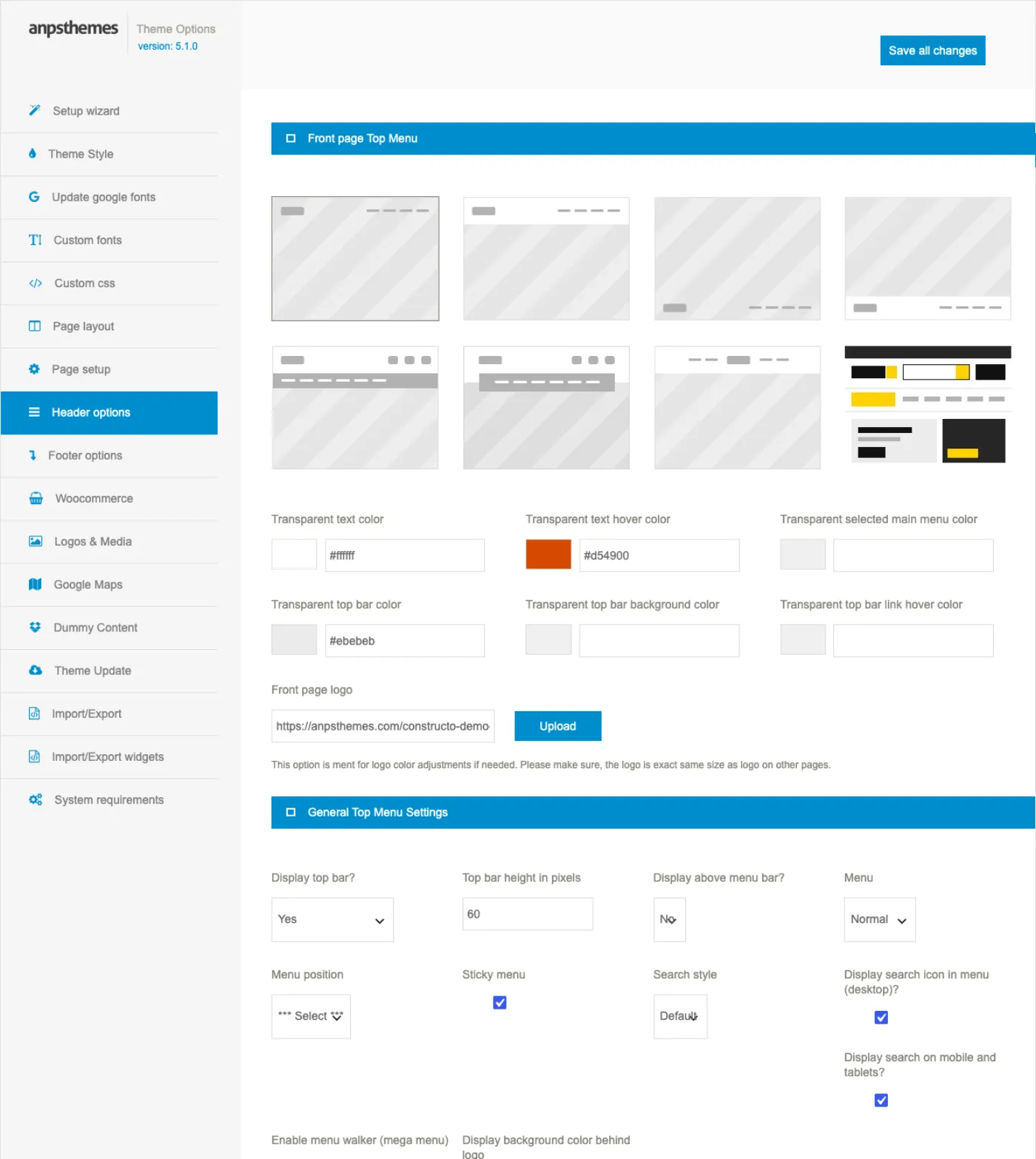
| # | Thumbnail | What you get |
|---|---|---|
| 1 | Top transparent menu | Header sits over the content with no background, absolutely positioned. |
| 2 | Top background menu | Header at the top with a solid background colour. The default. |
| 3 | Bottom transparent menu | Transparent header pinned to the bottom of the opening screen. |
| 4 | Bottom background menu | Header with a background, below the opening screen. |
| 5 | Full length menu | Logo row plus a wide widget strip above a full-width menu bar. |
| 6 | Boxed menu | Same two-row build, menu bar boxed to the container width. |
| 7 | Logo middle menu | Logo centred with menu items to its left and right. |
| 8 | Shop menu | Shop header: product search with a department dropdown, account link, cart. |
Types 1, 3 and 4 only change the front page. The section is called Front page Top Menu for a reason. Inner pages fall back to the type 2 arrangement. Types 5, 6, 7 and 8 apply across the whole site.
Types 3 and 4 expect a slider above everything else: put the slider shortcode in the Full screen content editor on the same tab. It is printed before the header on the front page, so if you imported a demo, remove the slider already on the home page or it shows twice.
Type 7 registers a second menu location, so Appearance → Menus offers Left Navigation and Right Navigation instead of one Primary Navigation. Type 8 adds Shop header: menu hint text, Shop header: search placeholder and Shop header: departments button label; its department dropdown and cart need WooCommerce, and without it the search box searches posts.
Enable Vertical menu in Appearance → Theme Options → Page layout overrides all of this and moves the whole header into a fixed column at the side of the page. It also enables the Vertical menu bottom widget widget area and a Custom vertical menu background image field.
Arrangement, height and sticky behaviour
| Field | Values | Default |
|---|---|---|
| Menu position | Left, Center, Right | not set |
| Sticky menu | on / off | off |
| Main menu height in pixels | number | empty, the stylesheet decides |
| Dropdown selection states | Hover color & bottom border, Hover color | Hover color & bottom border |
| Dropdown style | Normal, Dividers, Dividers style 2 | Normal |
| Menu dividers | on / off | on |
| Display background color behind logo | on / off | on |
| Enable menu walker (mega menu) | on / off | on |
Menu position Center only takes effect on header types 2 and 4; Left works on types 1 to 4. Types 5 to 8 have a fixed arrangement.
Sticky menu keeps the header visible as you scroll and swaps in the sticky logo. On header type 2 a call-to-action button can be added next to the menu with CTA button, its text, URL and four colour fields; header type 6 has the equivalent Menu button.
Build the menu
- Go to Appearance → Menus and create a menu.
- Add pages, posts, portfolio items, categories or custom links.
- Drag items right to nest them; one level of nesting is a dropdown.
- Under Menu Settings, tick Primary Navigation and save.
If no menu is assigned, the header prints No menu items found.
Item descriptions are rendered under the link text when Menu is set to Description in Header options → General Top Menu Settings. Fill in the Description field of a menu item; open Screen Options at the top of the Menus screen first if that field is hidden. Descriptions accept shortcodes and are printed for top-level items only.
Mega menu
A mega menu is a top-level item whose dropdown spans the container in columns.
- Open Screen Options on the Menus screen and tick CSS Classes.
- Add the class
megamenuto the top-level item. - Add a Bootstrap column class —
col-md-3,col-md-4,col-md-6— to each direct child that should become a column. - Add
megamenu-titleto a child that should be a column heading rather than a link, and nest the actual links under those column items.
Leave the menu walker on. Enable menu walker (mega menu) must stay ticked for descriptions and the mega-menu wrapper to be output. With it off, the menu falls back to plain WordPress markup.
Below 992 pixels wide the columns stack, so a mega menu is safe on phones.
Logos
All logo fields live in Appearance → Theme Options → Logos & Media.
| Field | Where it is used |
|---|---|
| Logo | Desktop header on every page. |
| Sticky logo | Swapped in while the sticky header is active. Not used in vertical mode. |
| Mobile logo | Phones and tablets. Falls back to Logo if empty. |
| Favicon | Browser tab icon. |
| Text based logo | Used when no Logo image is set; Logo font picks its typeface. |
| Front page logo | Header options tab, types 1 and 3 only, for a light variant over a dark hero. |
Auto adjust logo size? is on by default and lets the image size itself. Untick it to type exact Logo width and Logo height values. The sticky and mobile logos have their own width and height fields; both default to 158 × 33 pixels.
Keep the front page logo the same size. It replaces the normal logo only on the front page. A different height there will make the header jump as visitors move between pages.
A per-page logo is possible too: in the Page title and breadcrumbs box, switch on Full screen heading and pick an image under the colour fields.
Top bar and above-navigation bar
The top bar is the thin strip above the header. Fill it by dropping widgets into the Top bar left and Top bar right widget areas in Appearance → Widgets; if both are empty, only the close arrow is drawn. Keep them to small items — the AnpsThemes - Text and icon widget, Search, Navigation Menu, a language switcher.
Display top bar? in Header options takes Yes, Only on tablet/mobile, Only on desktop or No, and Top bar height in pixels sets its height (default 60). On the front page with header type 1 or 3 the bar is drawn transparent, and the four Transparent top bar … colour fields recolour it.
Display above menu bar? switches on a second strip, filled from the Above navigation bar widget area. It is skipped on header types 5 and 6 and in vertical mode; those use the wider Large above menu area, with Large above menu style (Style 1 to 5) and Above menu height in pixels.
Search
Search style offers Default and Minimal. Default drops a full-width search panel down over the page when the magnifier is clicked. Minimal opens a small field inside the header itself.
Two checkboxes control the magnifier: Display search icon in menu (desktop)? and Display search on mobile and tablets?. Both are on by default; turn both off and the icon disappears.
Page heading and breadcrumbs
Inner pages get a heading band with the page title and breadcrumbs. The globals are in Appearance → Theme Options → Page layout: Page title and breadcrumbs style (Style 1 or Style 2), Disable page title, breadcrumbs and background, and Disable breadcrumbs, which keeps the title and drops the trail.
The background image comes from Logos & Media → Page heading background, with Search page heading background used on search results. A page can override it in the Page title and breadcrumbs meta box:
| Field | Effect |
|---|---|
| Disable heading | No heading band on this page. |
| Page heading background | Image for this page only. |
| Full screen heading | Heading fills the viewport, header drawn transparent over it. |
| Hero heading | Tall hero with title, subtitle and category badges. |
| Hero height (vh) | 30 to 100, in steps of 5. |
| Color top bar / Color menu, title and breadcrumbs / Hover color | Colours for a full-screen heading. |
Full screen heading and Hero heading are mutually exclusive, and Full screen heading is not offered on header types 5 and 6.
Per-page overrides
The Header options box in the page sidebar has Top bar and Above menu, each set to Default, Off or On, so one page can differ from the global setting. The Spacing options box has Remove Header Margin and Remove Footer Margin, which strip the gap between the header and your first row — use it when the page opens with a full-width slider or a coloured section. A page whose content starts with a Revolution Slider shortcode loses that spacing automatically.
Coming-soon mode
Pick a page under Appearance → Theme Options → Page setup → Coming soon page and the whole site serves that page's content to everyone: no header, no footer, no menu. Logged-in super admins still see the real site, so you can keep building.
Reset the selector to go live. Choose the blank
*** Select ***entry and save. Until you do, the coming-soon page keeps overriding pages, posts and archives, and nothing on the front end says why.
Sidebars
A sidebar in Constructo is an ordinary WordPress widget area that the theme renders in a narrow column beside your content. You can use the two the theme registers, or make as many of your own as you need and point individual pages and posts at them.
The widget areas the theme registers
Two are content sidebars, meant for the column beside a page or post:
| Area | Slug |
|---|---|
| Sidebar | primary-widget-area |
| Secondary Sidebar | secondary-widget-area |
The rest are fixed positions in the header and footer, and they appear in the same dropdowns even though they are not meant to be used as page sidebars: Top bar left, Top bar right, Above navigation bar, Large above menu, Prefooter 1–4, Footer 1–4 and Copyright footer 1–2. Vertical menu bottom widget is registered only while the vertical menu is on.
How many prefooter, footer and copyright areas exist depends on the column counts you set — see Footer and widgets. Fill them all in Appearance → Widgets.
Making your own sidebar
- Go to Appearance → Sidebars.
- Press Add Sidebar and type a name, for example
Blog sidebar. - The table shows the name and the slug the theme derived from it.
- Go to Appearance → Widgets and put widgets into the new area.
Removing one is the Remove button in the same table. The area disappears; its widgets are not deleted, they move to Inactive Widgets.
The name is the identifier. Pages and posts remember which sidebar they use by its name, not its slug. Renaming a sidebar means every page pointing at the old name silently falls back to the global setting. Delete and recreate is the same thing: choose the name once and keep it.
Choosing a sidebar for one page or post
Pages, posts, portfolio items and team members get a Sidebars box below the editor with two dropdowns, Left sidebar and Right sidebar. Each has three kinds of value:
| Value | Meaning |
|---|---|
| (blank, the first entry) | Use the global setting for that side |
| None | No sidebar on that side, even if a global one is set |
| A sidebar name | Use that sidebar on that side |
Both dropdowns list every registered area, so it is possible to choose
Footer 2 as a page's right sidebar. Nothing stops you, and the result is
your footer widgets in a column beside the content — pick a content sidebar.
The two dropdowns are stored as the post meta sbg_selected_sidebar (left)
and sbg_selected_sidebar_replacement (right).
The global fallback
The defaults live at Appearance → Theme Options → Page layout, in two pairs, and in the Customizer under Theme options → Page layout:
| Setting | Applies to |
|---|---|
| Page Sidebars → Left Sidebar, Right Sidebar | Pages and portfolio items |
| Post Sidebars → Left Sidebar, Right Sidebar | Posts, single posts and the blog list |
Both pairs default to None. Which pair a template uses is fixed by the
template, not by you: page and portfolio templates read the page pair,
index.php, single.php and the blog content templates read the post pair.
Precedence
For each side, left and right, independently:
- The page's or post's own Sidebars box, if it names a sidebar. This wins.
- The same box set to None — no sidebar on that side, and the global is ignored.
- The box left blank — the matching global setting is used.
- Nothing at all — for a blog list that is not a static page there is no meta to read, so the global post setting applies.
There is no third level. A sidebar is either named on the post, named globally, or absent.
What it does to the layout
Content and sidebars share a twelve-column grid. Each sidebar takes three columns, so:
| Sidebars | Content width |
|---|---|
| None | 12 columns |
| One, left or right | 9 columns |
| Both | 6 columns |
The left sidebar is rendered before the content, the right one after it. On phones both stack under the content.
Full-width sections fight a sidebar. A page whose content is one stretched WPBakery row or an Elementor section set to full width is built to use the whole viewport. Add a sidebar to it and the row is squeezed into the nine-column area. Use a sidebar on ordinary content pages, and leave your builder-designed landing pages without one. See Page templates.
Worked example: a sidebar on the blog only
The usual arrangement — search and recent posts beside your posts, nothing beside your pages.
- Appearance → Sidebars → Add Sidebar, named
Blog sidebar. - Appearance → Widgets: drop Search, Recent Posts and Categories into Blog sidebar.
- Appearance → Theme Options → Page layout:
- Under Post Sidebars, set Right Sidebar to
Blog sidebarand leave Left Sidebar on None. - Under Page Sidebars, leave both on None.
- Under Post Sidebars, set Right Sidebar to
- Save.
Posts and the blog list now show the sidebar on the right; pages stay full width. To take it off one long-form post, open that post and set its Sidebars box Right sidebar to None.
If your posts are listed on a static page chosen in Settings → Reading, that page's own Sidebars box is read first. Leave both of its dropdowns blank so it inherits the post globals you just set.
Common mistakes
Activating the theme empties every widget area. Constructo clears widget assignments when it is activated, so widgets you placed under another theme are gone from their areas — they are in Inactive Widgets, ready to drag back. Place widgets after activating the theme and importing a demo, never before.
A few more, in the order support sees them:
- The sidebar is empty on the front end. An area with no widgets renders as an empty column. Check Appearance → Widgets before checking anything else.
- A page ignores the global setting. Its Sidebars box is set to something. Blank is the value that means "follow the global".
- The footer lost its columns after changing a sidebar. Footer areas are registered from the footer column count; changing that count from four to two removes Footer 3 and Footer 4 and their widgets go inactive.
- Widgets disappeared after a demo import. The import replaces widget assignments with the demo's own. Export yours first from Appearance → Theme Options → Import/Export widgets.
Page templates
Constructo does not put a Template dropdown in the page editor. There is nothing to choose there, and nothing is missing: the theme decides which template file to use from the post type you are editing, and you control the layout with Theme Options, the per-page meta boxes and your page builder.
This chapter says which file renders what, and where the switch for it is.
How a page is assembled
Every front-end request goes through the same three stages:
header.phpprints the header and, on inner pages, the page heading band. See Header and navigation.- A content template prints the loop.
footer.phpprints the widget footer, the copyright bar and the scroll-to-top arrow. See Footer and widgets.
Only the middle stage differs between a page, a post, an archive and a portfolio item.
Template reference
| File | What it renders | How you get it |
|---|---|---|
page.php |
Any page. Hands off to one of the two page templates below. | Automatic for all pages. |
templates/template-page.php |
Standard page: content, plus a left and/or right sidebar. | Default. |
templates/template-legacy-page.php |
Same, with the row markup Constructo 4 used. | Theme Options → Page setup → Legacy mode. |
index.php |
Blog index — the page you assign as Posts page. | Settings → Reading. |
content.php |
One post in the blog index, full width image and excerpt. | Used by index.php and by the blog shortcode with no type. |
content-blog-grid.php |
One post as a grid card. | blog shortcode / builder blog widget, type grid. |
content-blog-masonry.php |
One post as a masonry tile. | blog shortcode / builder blog widget, type masonry. |
single.php |
A single post, with the post sidebars. | Automatic. |
content-single-blog.php |
The body of a single post: media, meta, content. | Used by single.php. |
archive.php |
Category, tag, author and date archives, in a fixed 9/3 split with the Sidebar widget area. | Automatic. |
search.php |
Search results as a plain list of linked titles. | Automatic. |
404.php |
The not-found page. | Theme Options → Page setup → 404 error page. |
single-portfolio.php |
A single portfolio item; loads one of the three styles below. | Automatic for the portfolio post type. |
templates/portfolio-style-1.php |
Media in an 8-column block, content in 4, with previous/next buttons. | Theme Options → Page setup → Portfolio single style. |
templates/portfolio-style-2.php |
Media 8 / content 4 with no navigation; full width each when a sidebar is on. | Same select, Style 2. |
templates/portfolio-style-3.php |
Content only — you build the whole item in the page builder. | Same select, Style 3. |
single-anps_apartment.php |
A single apartment. See Apartments and the building tour. | Automatic for that post type. |
comments.php |
The comment list and form. | Automatic wherever comments are open. |
content-columns.php and content-single.php are leftovers from earlier
versions and are not loaded by any current template. Ignore them.
Normal pages versus legacy mode
Both page templates read the sidebar choices from the page's own meta and fall back to the global defaults, then do the same thing in slightly different markup.
The interesting part is the same in both: if the page content contains a WPBakery row and no sidebar is selected, the content is printed without a Bootstrap row wrapper, so full-width rows can stretch edge to edge. Add a sidebar to that page and the content is wrapped in a column instead, which is why a full-width row stops being full width the moment you give the page a sidebar.
Legacy mode — Appearance → Theme Options → Page setup → Visual
composer → Legacy mode — switches to template-legacy-page.php, adds a
legacy class to the site wrapper and changes how WPBakery inner rows are
registered.
Leave Legacy mode off. The field says so itself: Only for backwards compatibility. Do not use on fresh install. Turn it on only if you are carrying pages over from a Constructo 4 site whose rows were built with the old nesting, and turn it off again once you have rebuilt them. A new WPBakery build wants the default. See Building pages with WPBakery.
Front page and posts page
These are WordPress settings, not theme settings.
- Create two pages — say Home and Blog. Leave Blog empty.
- Go to Settings → Reading.
- Set Your homepage displays to A static page.
- Pick Home as Homepage and Blog as Posts page.
The Posts page is rendered by index.php, which ignores whatever you put
in that page's editor — that is WordPress behaviour, not a theme bug. To
build a designed blog listing instead, make an ordinary page and put the
blog shortcode or builder blog widget on it; see
Blog and posts.
A demo import sets both of these for you, so after importing a demo you do not need to touch this screen.
Header type 1, 3 and 4 only affect the front page. The theme decides what "front page" means from Settings → Reading. If you never set a static homepage, your front page is the blog index and those header types apply there.
Theme Options → Page setup
The fields on this tab that decide templates and layouts:
| Field | Effect |
|---|---|
| Coming soon page | Serves that page's content in place of the whole site. |
| 404 error page | The page whose content is printed by 404.php. |
| Portfolio slug | The URL segment for portfolio items. |
| Portfolio single style | Style 1, 2 or 3 for every portfolio item. |
| Portfolio single footer | Content appended below every portfolio item; shortcodes are run. |
| Legacy mode | Switches the page template as described above. |
| Disable Post meta elements | Hides Comments, Categories, Author or Date on all blog output. |
Nothing on this tab is per page. Per-page control comes from the meta boxes in the editor sidebar: sidebars, the heading, header strips and spacing.
The 404 page
404.php looks up the page you chose in 404 error page and prints its
content, so you design your not-found page like any other page — put a
heading, a search box and a button back to the home page on it with your
builder. With nothing selected, the theme falls back to a plain two-line
message.
Do not put the 404 page in a menu. It is a normal published page, so it is reachable at its own URL and will show up in search. Keep it out of your navigation.
Search results
search.php prints a numbered list of matching titles with pagination, and
no results found for: … when there are none. It has no sidebar and no
excerpts by design. Its heading band takes its background from
Appearance → Theme Options → Logos & Media → Search page heading
background.
Portfolio single styles
Set the style once in Page setup; it applies to every portfolio item.
- Style 1 — featured media in an 8-column block, project details in the remaining 4, with prev and next buttons under the text.
- Style 2 — the same split without the navigation buttons. Each block goes full width if the item has a sidebar. Ticking Hide in the item's Hide portfolio image / video / gallery box drops the media.
- Style 3 — the template prints the content and nothing else, so the item is whatever you build in the page builder. Use this when your portfolio items are full case-study layouts.
Sidebars on portfolio items, pages and posts all come from the same system; see Sidebars and Portfolio.
What about the template hierarchy
You only need three rules from WordPress's template hierarchy:
- A post type with its own file uses it —
single-portfolio.phpfor portfolio items,single-anps_apartment.phpfor apartments. - Anything else that lists posts falls back to
archive.php, and anything else that shows one post falls back tosingle.php. - A child theme file of the same name wins over the parent's. That is the supported way to change any of the files above; see Child theme and customisation.
Building pages with Elementor
Elementor is one of the two page builders Constructo supports. It is the one the newer demos are built with, and the only one that can build demos 12, 13 and 14. Elementor itself is the free plugin from wordpress.org; everything Constructo-specific is added by the Anps Theme Plugin.
What the theme adds to Elementor
The integration loads only when Elementor is active; deactivate Elementor and none of it runs. It adds four things:
- A widget category called Anps Constructo in the element panel. All 63 theme widgets live there; Elementor's own widgets stay where they were.
- An icon tab called Anps Icons, described below.
- Five content pickers used by the theme's widgets, so you choose real content instead of typing IDs: blog categories, blog posts, portfolio categories, portfolio posts and team categories.
- A Stretch Container panel on the Layout tab of every section and container, and a Skin select on nine widgets.
Run one builder, not two. If WPBakery and Elementor are both active you get a red admin notice and a dashboard warning, and the theme treats WPBakery as the active builder — which means a demo import gives you the WPBakery version of the demo, not the Elementor one. Deactivate WPBakery before you import.
Setting up the page around the editor
Constructo registers no page templates of its own. A page is always rendered
by the theme's page template, which puts your content inside a boxed
container whose width is Appearance → Theme Options → Page layout →
Desktop Container Width (default 1170). Everything Elementor draws sits
inside that container unless you stretch it.
That means the parts of the page outside the editor are set outside the editor. Before you start laying out:
- Create the page and give it a title.
- In the Page title and breadcrumbs box, set the heading image and whether the title strip and breadcrumbs appear. See Header and navigation.
- In the Header options box, decide whether the top bar and the above-menu strip show on this page, and whether the header and footer margins are removed. Remove the header margin when the first thing on the page is a full-bleed hero.
- In the Sidebars box, leave the page with no sidebar for a landing page. A sidebar narrows the content column to nine or six Bootstrap columns and Elementor then works inside that. See Sidebars.
- Save, then press Edit with Elementor.
Do not reach for Elementor Canvas. Elementor's own page layout setting can drop the theme wrapper, and it takes the theme header, menu and footer with it. Keep the default and use Stretch Container for full-width sections instead.
Stretch Container
Because the theme wraps page content in a boxed container, an Elementor section cannot go edge to edge on its own. The theme adds a Stretch Container section to the Layout tab of every section and container:
| Control | What it does | Default |
|---|---|---|
| Enable Stretch Container | Makes the section full-viewport-width while its content stays boxed | Off |
| Content Width | Max width of the inner content, 300–1920px, responsive | Container width, 750 on tablet |
| Side Padding | Left and right padding on the inner content, 0–100px | 15 |
Turn it on for anything that needs a background running to both edges: a hero, a coloured call-to-action band, a full-width map. Leave it off for ordinary content sections — they already line up with the rest of the site. The Content Width default is read from Elementor's kit first and falls back to the theme's container width, so a stretched section lines up with the unstretched ones without you typing a number.
One level only. Stretch works by breaking out to
100vw. Stretching a section that is already inside a stretched one gives you a horizontal scrollbar. Stretch the outer section and leave the inner one alone.
The Anps Icons tab
Theme widgets that take an icon offer Font Awesome plus a tab named Anps
Icons, a set of construction icons with the class prefix anps-icon-
(helmet, excavator, trowel, wrench, and so on). Pick them the same way you
pick any icon.
Blank squares mean the set is missing. The tab loads its stylesheet from the theme folder. If icons show as empty boxes, that file did not arrive with your install — reinstall the theme from your purchase, or use a Font Awesome icon instead, which every widget also accepts.
Global colours and fonts: theme options or Elementor kit
Two systems can set the same colour or font, so know which one you are in.
The theme's palette and typography live in Appearance → Theme Options → Theme Style and in the Customizer, and the theme compiles them into CSS on every page. They reach everything: header, menu, footer, buttons, headings and every theme widget. See Colours and the Customizer and Fonts and typography.
Elementor keeps its own copy in Site Settings → Global Colors and Global Fonts, stored in the post Elementor calls the kit. Those values apply to Elementor's own widgets and to anything you attach a global to. Constructo's demo packs do not ship a kit: an import writes theme options and page content and leaves your Site Settings untouched, so after an import the site's look comes from Theme Options.
So: set brand colours and fonts in Theme Options, because only those reach the header, footer and the theme's own markup. Set a one-off colour on the widget itself. If type looks wrong only inside Elementor sections, clear the leftover global in Site Settings rather than fighting it with custom CSS.
Widget reference
The table lists every widget the plugin registers, with the internal name you see in exports and in Elementor's search box. The groups below explain what each family is for, so you need not read all 63 rows.
| Widget | Internal name |
|---|---|
| Accordion | anps-accordion |
| Alert | anps-alert |
| Blog Modern | anps-blog-modern |
| Blog | anps-blog |
| Button | anps-button |
| Contact Info | anps-contact-info |
| Contact Section | anps-contact-section |
| Counter | anps-counter |
| Shop Brands | anps-cshop-brands |
| Shop Hero | anps-cshop-hero |
| Shop Order Tracking | anps-cshop-order-tracking |
| Shop Product Categories | anps-cshop-product-categories |
| Shop Products Grid | anps-cshop-products-grid |
| Shop Promo Band | anps-cshop-promo-band |
| Shop Reviews | anps-cshop-reviews |
| Shop Steps | anps-cshop-steps |
| Shop Topic Cards | anps-cshop-topic-cards |
| Shop Trust Bar | anps-cshop-trust-bar |
| List | anps-list |
| Dropcaps | anps-dropcaps |
| Estimate Form | anps-estimate-form |
| FAQ | anps-faq |
| Featured Services | anps-featured-services |
| Featured | anps-featured |
| Gallery Slider | anps-gallery-slider |
| Google Maps Advanced | anps-google-maps-advanced |
| Google Maps | anps-google-maps |
| Heading | anps-heading |
| Hero Banner | anps-hero-banner |
| Icon Modern | anps-icon-modern |
| Icon | anps-icon |
| Image | anps-image |
| Logos | anps-logos |
| Modern Portfolio | anps-modern-portfolio |
| Newsletter | anps-newsletter |
| Next Portfolio Item | anps-next-portfolio-item |
| Plan Timeline | anps-plan-timeline |
| Portfolio | anps-portfolio |
| Post Footer | anps-post-footer |
| Pricing Table | anps-pricing-table |
| Progress Bar | anps-progress |
| Quote | anps-quote |
| Recent Blog | anps-recent-blog |
| Recent Portfolio Slider | anps-recent-portfolio-slider |
| Recent Portfolio | anps-recent-portfolio |
| Social Icons | anps-social-icons |
| Statement | anps-statement |
| Tabs | anps-tabs |
| Team | anps-team |
| Testimonials Client | anps-testimonials-client |
| Testimonials Modern | anps-testimonials-modern |
| Testimonials | anps-testimonials |
| Tour Apartment Finder | anps-tour-apartment-finder |
| Tour Building Showcase | anps-tour-building-showcase |
| Tour CTA Band | anps-tour-cta-band |
| Tour Floor Plan Explorer | anps-tour-floorplan-explorer |
| Tour Gallery | anps-tour-gallery |
| Tour Hero | anps-tour-hero |
| Tour Location Panel | anps-tour-location-panel |
| Tour Page Heading | anps-tour-page-heading |
| Tour Stat Tile | anps-tour-stat-tile |
| Tour Unit Detail | anps-tour-unit-detail |
| Video | anps-video |
Thirty of these widgets build their attributes and hand them to the matching shortcode, so a page built with widgets and a page built with shortcodes produce the same markup and the same CSS classes. That is why a WPBakery demo and an Elementor demo look identical, and why Shortcode reference is also the reference for what a widget's fields mean. The Tour, Shop and "modern" widgets render their own markup and have no shortcode equivalent.
Content and headings
The everyday layout pieces: Heading (five sizes, four styles, optional subtitle), Statement, Quote, Dropcaps, Alert, List, Tabs, Accordion, FAQ, Progress Bar, Counter, Pricing Table, Button and the two icon widgets, Icon and Icon Modern.
Service and landing-page blocks: Featured, Featured Services, Hero Banner, Plan Timeline, and the three testimonial widgets — Testimonials, Testimonials Modern and Testimonials Client.
Contact and capture: Contact Info, Contact Section, Estimate Form and Newsletter. These need the matching plugin to be active; see Forms and maps.
Media and galleries
Image, Gallery Slider (a full-screen gallery with a thumbnail strip), Video for a YouTube or Vimeo embed, and Logos for a client strip. See Sliders and media.
Posts, portfolio and team
Portfolio is the filterable grid with seven layout types; Modern Portfolio is the newer editorial layout; Recent Portfolio and Recent Portfolio Slider are the compact variants for a home page, and Next Portfolio Item is the navigation block for a single project. Blog, Blog Modern and Recent Blog do the same job for posts, and Post Footer closes a single post. Team lists team members. The detail is in Portfolio, Team and Blog and posts.
Apartments and the building tour
Ten widgets prefixed Tour build the demo 14 residences site: Tour Hero, Tour Page Heading, Tour Building Showcase, Tour Floor Plan Explorer, Tour Apartment Finder, Tour Unit Detail, Tour Gallery, Tour Location Panel, Tour Stat Tile and Tour CTA Band. They read the apartment post type, so they need that content to exist. See Apartments and the building tour.
Shop widgets
Ten widgets prefixed Shop build the demo 13 storefront: Shop Hero, Shop Products Grid, Shop Product Categories, Shop Brands, Shop Promo Band, Shop Steps, Shop Trust Bar, Shop Topic Cards, Shop Reviews and Shop Order Tracking. They query WooCommerce and do nothing useful without it. See WooCommerce shop.
Maps
Google Maps places a single pin; Google Maps Advanced takes several locations and a zoom level. Both need an API key, set once in Appearance → Theme Options → Google Maps.
Social
Social Icons renders the accounts you list on the widget. The site-wide list used by the header and footer is separate — see Footer and widgets.
Skins
Nine widgets — Heading, Icon Modern, Plan Timeline, Progress Bar, Blog Modern, Estimate Form, Contact Section, Newsletter and Portfolio — have a Skin select on their Style tab, with Default (classic) and Constructo Residences. The skin restyles that one placed widget. It is how demo 14 gets its own look without changing how the same widget renders on every other page, so leave it on the default unless you are matching that demo.
Building pages with WPBakery
WPBakery Page Builder is the other builder Constructo supports. It is the one the original demos were built with, and demos 1 to 11 still ship a WPBakery version. If you inherited a Constructo site built before version 5.0, it is a WPBakery site.
The copy that comes with the theme
WPBakery is a paid plugin, and your theme licence covers it. The theme's plugin installer offers it from the ANPS server rather than wordpress.org, so install it from Appearance → Install Plugins (or from the setup wizard) and not from the WordPress plugin directory. See Installing.
The plugin is registered in theme mode, which means there is no licence key to enter and no activation nag. It also means WPBakery does not update itself from its own servers: new versions arrive with theme updates, through the same installer screen.
One builder at a time. With both WPBakery and Elementor active you get a red admin notice and a dashboard warning. The theme resolves the tie in WPBakery's favour, so a demo import gives you the WPBakery demo even if you meant to use Elementor. Deactivate the one you are not using.
Backend editor or frontend editor
A page with WPBakery active has two editor buttons. The Backend Editor shows the page as stacked boxes: fastest for structure, and the only sane place to reorder a long page. The Frontend Editor renders the real page and lets you edit in place.
Both write the same shortcodes into the post content, so you can switch between them at will. Two habits save time:
- Build the row and column skeleton in the backend editor, then fill and fine-tune in the frontend editor.
- Switch to the classic editor only to inspect the raw shortcodes. Text typed there is not validated, and an unbalanced quote breaks the page — see Shortcode reference.
The Constructo elements
The theme's own elements are grouped under a category named Constructo in the "Add Element" window. Each one is a thin wrapper: it collects your settings and writes the matching theme shortcode into the content. The element list and the shortcode list are therefore the same list, and the attributes are documented once, in Shortcode reference.
| Element | Shortcode it writes | Documented in |
|---|---|---|
| Blog | [blog] |
Blog and posts |
| Recent blog | [recent_blog] |
Blog and posts |
| Portfolio | [portfolio] |
Portfolio |
| Recent portfolio | [recent_portfolio] |
Portfolio |
| Recent portfolio slider | [recent_portfolio_slider] |
Portfolio |
| Team | [team] |
Team |
| Google maps | [google_maps] |
Forms and maps |
| Google maps advanced | [google_maps_advanced] + [google_maps_advanced_item] |
Forms and maps |
| Heading | [heading] |
Shortcode reference |
| Featured content | [anps_featured] |
Shortcode reference |
| Button | [button] |
Shortcode reference |
| Alert | [alert] |
Shortcode reference |
| Counter | [counter] |
Shortcode reference |
| Progress | [progress] |
Shortcode reference |
| Icon | [anps_icon] |
Shortcode reference |
| Icon modern | [icon_modern] |
Shortcode reference |
| Quote | [quote] |
Shortcode reference |
| Color | [color] |
Shortcode reference |
| Dropcaps | [dropcaps] |
Shortcode reference |
| Statement | [statement] |
Shortcode reference |
| List | [anps_list] + [list_item] |
Shortcode reference |
| Accordion/Toggle | [accordion] + [accordion_item] |
Shortcode reference |
| Faq | [faq] + [faq_item] |
Shortcode reference |
| Logos | [logos] + [logo] |
Shortcode reference |
| Testimonials | [testimonials] + [testimonial] |
Shortcode reference |
| Testimonials modern | [testimonials_modern] + [testimonial_modern] |
Shortcode reference |
| Pricing table | [pricing_table] + [pricing_table_item] |
Shortcode reference |
| Social icons | [social_icons] + [social_icon_item] |
Shortcode reference |
| Contact info | [contact_info] + [contact_info_item] |
Shortcode reference |
| Gallery slider | [gallery_slider] |
Shortcode reference |
| Table | [table] and its cell shortcodes |
Shortcode reference |
| Vimeo | [vimeo] |
Shortcode reference |
| Youtube | [youtube] |
Shortcode reference |
[twitter] |
Shortcode reference | |
| Coming soon | [coming_soon] |
Shortcode reference |
| Error 404 | [error_404] |
Shortcode reference |
Several elements only make sense inside their parent — a list item inside a list, a testimonial inside Testimonials. WPBakery enforces that, so those children do not appear in the top-level element list; you add them with the plus button inside the parent.
Four of the pickers in these elements are the theme's own: blog categories, portfolio categories, team categories and a page list. They query your site, so a category you have not created yet will not be in the dropdown.
Rows, columns and the page container
A page's content is rendered inside the theme's boxed container, whose width
is Appearance → Theme Options → Page layout → Desktop Container Width
(default 1170). Rows are the one part of WPBakery the theme takes over: it
replaces the row and inner-row output with its own Bootstrap markup,
<section class="container"> around a .row. Columns keep WPBakery's own
grid, so column widths, responsive behaviour and column Design Options
work exactly as WPBakery documents them.
Two things the theme changes about rows:
- An Id field is added to every row, so you can link to a row with
#anchorfrom a menu item or a button. - A row honours a
has_contentattribute that decides whether it is boxed, full width, or full-width background with boxed content. The dropdown that sets it only appears in legacy mode, below, but the attribute is honoured either way — which is why an old page keeps its full-width rows after an update even with legacy mode off.
Row Design Options survive: the vc_custom_* class WPBakery generates
and anything you type in Extra class name are both carried through.
The theme also extends the tab and accordion elements. WPBakery's Tabs and Accordion get a Style dropdown with Anpsthemes and Anpsthemes modern entries alongside WPBakery's own classic, modern, flat and outline, and the legacy Tabs element gets a Type dropdown for horizontal or vertical and an Icon dropdown on each tab.
Legacy mode
Appearance → Theme Options → Page setup ends with a section headed Visual composer and a single checkbox, Legacy mode. The screen says what it is for: "Only for backwards compatibility. Do not use on a fresh install."
The problem it solves is old content. Constructo pages built years ago set their wrappers per row and were laid out against the older page template, so the row settings and the page markup both have to go back to how they were. Legacy mode does that in one switch. With it on:
- Rows and inner rows gain a Content wrapper dropdown — On (boxed), Off (full width) and Inside content wrapper (full-width background, boxed content).
- Pages render through the legacy page template, which wraps content in a
container only when the content does not already contain a
vc_row, and hands the width of the content column to the sidebar count. - The site wrapper gets an extra
legacyCSS class. Nothing in the theme's own stylesheet targets it; it is there for the custom CSS an old project may rely on.
Leave it off on a new site. Turn it on only if an existing site's rows lose their full-width backgrounds after an update, and expect to check every page afterwards.
The table element and the icon pickers
Table is the one element with a custom editor. The field draws a real
grid you fill in cell by cell, and saves it as nested shortcodes
([table_head], [table_row], [table_cell]). Its JavaScript lives in the
theme at js/vc-table.js. Add and remove rows and columns with the grid's
own buttons rather than editing the shortcode text, and set striped,
bordered and the coloured heading row from the element's own options.
The theme adds an icon library named Anpsthemes icons to WPBakery's own
Icon element, with 25 construction icons — helmet, excavator, trowel,
wrench, bulldozer and the rest. The theme's own Icon and Button
elements take a plain Font Awesome dropdown instead, where the saved value
is the icon name without its fa fa- prefix; Icon modern and Featured
content use WPBakery's icon picker.
Empty icon picker. If the Anpsthemes library shows blank tiles, the icon font did not arrive with your install. Reinstall the theme from your purchase, or pick a Font Awesome icon, which every element accepts.
If you switch to Elementor later
The theme's own shortcodes keep working. [heading], [portfolio],
[counter] and the rest are registered by the Anps Theme Plugin, not by
WPBakery, so they render whether WPBakery is active or not — including
inside a text widget or an Elementor HTML widget.
The structural wrappers are the problem. [vc_row], [vc_column],
[vc_column_text] and their inner variants are also registered by the
plugin as fallbacks, so an old page does not collapse into raw shortcode
text when you deactivate WPBakery: rows and columns still emit
<section class="container"> and col-md-*. What you lose is everything
WPBakery itself rendered — its Design Options CSS, its own elements
(vc_gallery, vc_icon, vc_tta_*, and anything from a WPBakery add-on) —
and the ability to edit any of it visually. The page becomes a block of
shortcode text that renders approximately right and cannot be rearranged.
So the honest advice:
- Decide once, per site, before you build. Switching means rebuilding page layouts by hand.
- If you must switch, do it demo-side: install Elementor, deactivate WPBakery, and import the Elementor version of your demo into a staging site, then move your text and images across.
- Keep the old pages as drafts until the new ones are live. Deactivating WPBakery does not delete anything; reactivating it brings the old pages back, editable.
Shortcode reference
Shortcodes are the layer both page builders render through. Every WPBakery element writes a shortcode into the page content, thirty of the Elementor widgets build their settings and hand them to the same shortcode function, and the classic editor inserts them directly. One layer, three ways in.
That has a practical consequence: a shortcode works anywhere WordPress runs
shortcodes. A page, a post, a text widget in a sidebar or footer, an
Elementor HTML widget, a WPBakery text block, a product description. If you
need a counter in a footer widget, you do not need a builder — you need
[counter].
Inserting one without typing it
With the classic editor active, the toolbar has a Shortcodes button. It opens a dialog for the most-used ones — Alert, Blog, Button, Columns, Color, Counter, Dropcaps, Google Maps, Heading, Quote, Recent Blog Posts, Recent Portfolio Posts, Row, Tabs, Tabs Element, Team, Text Block, Twitter, Vimeo and YouTube. Fill the form, press insert, and the shortcode lands in the editor with its attributes filled in. It is the quickest way to get the syntax right the first time.
The dialogs cover a subset. For everything else, copy an example below and edit the values.
How to read the table
The table at the end of this chapter is generated from the plugin source on every documentation build, so it is what the code accepts today, not what an older manual said.
- The first column is the shortcode tag as you type it.
- The second column lists every attribute the function declares. An attribute that is not in the list is ignored.
- A dash means the shortcode declares no attributes: it takes only content,
like
[faq], which wraps its[faq_item]children, or[vimeo]. - Child shortcodes appear in the table too.
[list_item]belongs inside[anps_list],[testimonial]inside[testimonials], and so on; used on their own they render nothing useful.
Conventions across the whole set
Colours are always hex strings with the hash: color="#d54900". The
attribute names are consistent — color for the main colour, bg_color or
background for a background, and icon_color, title_color,
text_color, border_color, number_color, subtitle_color,
divider_color and filter_color for the part they name. Leave one empty
and the element inherits from the theme, which is almost always what you
want; see Colours and the Customizer.
Columns are given as items per row, and the shortcode converts that to the Bootstrap grid the theme is built on:
columns |
Desktop class | Items per row |
|---|---|---|
2 |
col-md-6 |
2 |
3 |
col-md-4 |
3 |
4 |
col-md-3 |
4 |
6 |
col-md-2 |
6 |
Not every element offers all four — the blog grid accepts 3 and 4 only.
Elements that also expose mobile_class take 2 for two columns on a phone
(col-xs-6) and 1 for one (col-xs-12). A few older elements name the
same idea differently: [recent_portfolio] uses col, and
[recent_portfolio_slider] uses number_in_row.
Style variants are numbered, and the numbering is per element rather
than global. [button] takes style_button="style-1" to style-4;
[heading] takes heading_style="style-1", divider-sm, divider-lg or
divider-modern; [anps_featured] takes a bare number, style="1" to
"4"; [portfolio] uses style for the filter bar (style-1 or
style-2) and type for the grid itself.
Enclosing or self-closing depends on whether the element has body text.
[heading], [button], [counter], [alert], [quote], [statement]
and [anps_featured] wrap their text: [button ...]Label[/button]. Query
elements such as [portfolio] and [team] take no content and can be
written self-closing, [portfolio ... /].
Some elements use the content as a setting.
[blog]reads its posts-per-page number from the content, so[blog type="grid"]6[/blog]means six posts.[image]reads the image URL from it:[image alt="Site office"]https://example.com/office.jpg[/image].[vimeo]and[youtube]read the video ID. In these four, emptying the content changes what the element does rather than just removing text.
Worked examples
A section heading, centred, with a large divider and a subtitle above it:
[heading size="2" heading_class="heading" heading_style="divider-lg"
subtitle="What we do" color="#222222"]Our services[/heading]
A service box with an icon, linked to the service page. icon takes a full
Font Awesome class here, and the four style numbers change the layout:
[anps_featured title="Site management" icon="fa fa-wrench" style="2"
icon_color="#ffffff" icon_bg_color="#d54900" link="/services/"]
We run the schedule, the trades and the paperwork.[/anps_featured]
A filtered portfolio grid, nine projects, three per row, one per row on a phone, with paging:
[portfolio per_page="9" columns="3" type="modern-2" filter="on"
filter_order="ASC" pagination="on" mobile_class="1" /]
Six posts from one category as a three-column grid, newest first. The
category value is a category slug:
[blog category="news" type="grid" columns="3" orderby="date" order="DESC"]6[/blog]
A medium button in the second style with a phone icon. icon here is the
Font Awesome name without the fa fa- prefix:
[button link="/contact/" size="medium" style_button="style-2" icon="phone"
background="#d54900" color="#ffffff"]Request a quote[/button]
A counter that animates from zero to 1250 when it scrolls into view, with its label as the content:
[counter icon="building-o" max="1250" min="0" icon_color="#d54900"
number_color="#222222"]Projects completed[/counter]
color_hoverandbackground_hoverdo nothing on a button. They are declared, so the generated table lists them, but the button only appliescolorandbackground. Use the Customizer's button colours for hover states — see Colours and the Customizer.
The full list
| Shortcode | Attributes |
|---|---|
[blog] |
category, orderby, order, type, columns |
[anps_featured] |
image_u, title, link, icon, icon_custom, style, icon_color, icon_bg_color, divider_color, bg_color, title_color, text_color |
[recent_portfolio_slider] |
recent_title, title_color, nex_prev_color, nex_prev_bg_color, number, number_in_row, category, orderby, order, remove_links, image_size |
[recent_portfolio] |
number, category, orderby, order, mobile_class, remove_links, image_size, col, style, bg_color |
[portfolio] |
filter, filter_orderby, filter_order, pagination, columns, category, orderby, order, wrapper, type, style, per_page, page, mobile_class, filter_color, hide_all, image_size, cta_text |
[image] |
alt, url, target |
[team] |
columns, category, ids, number_items |
[recent_blog] |
number, meta_date, meta_author, meta_comments, col_number, image_size, style, item_bg_color |
[progress] |
procent, striped, active, color_class |
[counter] |
icon, max, min, icon_color, number_color, subtitle_color, border_color |
[newsletter] |
widget_name |
[coming_soon] |
image_u, image, title, subtitle, date |
[twitter] |
title, parallax, parallax_overlay, image, color, slug, image_u |
[content_half] |
id, class |
[content_third] |
id, class |
[content_two_third] |
id, class |
[content_quarter] |
id, class |
[content_two_quarter] |
id, class |
[content_three_quarter] |
id, class |
[anps_icon] |
url, target, icon, title, subtitle, position, class |
[icon_modern] |
icon_type, icon, icon_openiconic, icon_typicons, icon_entypo, icon_linecons, icon_monosocial, icon_anps_icons, image, title, text, link, link_text, target, style, icon_color, icon_bg_color, title_color, text_color, link_color, link_hover_color |
[quote] |
style |
[color] |
style, custom |
[google_maps] |
zoom, scroll, height, map_type, style |
[vimeo] |
— |
[youtube] |
— |
[button] |
link, target, size, style_button, color, background, color_hover, background_hover, icon, custom_class |
[error_404] |
title, sub_title |
[alert] |
type |
[dropcaps] |
style |
[google_maps_advanced] |
zoom, scroll |
[google_maps_advanced_item] |
info, pin |
[section] |
— |
[vc_single_image] |
image, border_color, img_link_target, img_size, el_class |
[layerslider_vc] |
— |
[rev_slider_vc] |
— |
[vc_row] |
— |
[vc_row_inner] |
— |
[vc_column] |
— |
[vc_column_inner] |
— |
[vc_column_text] |
— |
[vc_tabs] |
— |
[logos] |
style, item_bg |
[logo] |
url, alt, image_u, image_u_hover, img_hover, alt_hover, target |
[anps_list] |
class |
[list_item] |
— |
[social_icons] |
— |
[social_icon_item] |
url, icon, target |
[statement] |
parallax, parallax_overlay, image, color, container, slug, image_u |
[tabs] |
type |
[tab] |
title, icon |
[accordion] |
opened, style |
[accordion_item] |
title |
[contact_info] |
— |
[contact_info_item] |
icon |
[faq] |
— |
[faq_item] |
title, answer_title |
[pricing_table] |
title, currency, price, period, button_text, button_url, featured |
[pricing_table_item] |
— |
[testimonials] |
style, columns, autoplay, autoplay_pause, autoplay_timeout |
[testimonial] |
image, image_u, user_name, user_url |
[testimonials_modern] |
style, autoplay, autoplay_pause, autoplay_timeout, quote_color |
[testimonial_modern] |
image, image_url, url |
[table] |
striped, bordered, head_style |
[table_head] |
class |
[table_body] |
— |
[table_foot] |
— |
[table_row] |
— |
[table_cell] |
— |
[table_heading_cell] |
— |
[heading] |
size, heading_class, subtitle, h_class, h_id, heading_style, color, subtitle_color |
[gallery_slider] |
images |
Nesting inside builder columns
Shortcodes nest happily. A [portfolio] inside a WPBakery text block inside
a half-width column works; so does an [anps_list] with several
[list_item] children inside an Elementor HTML widget.
Container elements parse their own content, so their children render:
[testimonials], [anps_list], [accordion], [faq], [pricing_table],
[contact_info], [logos], [social_icons], [tabs], [table],
[statement], [color] and the [content_half] family of column
shortcodes. Elements that simply print their text do not: a [button]
placed inside [anps_featured] or [heading] shows up as raw text. Put it
next to the element, not inside it.
One thing breaks it, and it breaks it every time: quotes mangled by the
visual editor. The visual tab of the classic editor and some builder text
fields convert a straight " into a curly quote or into ", and a
shortcode whose attribute quotes are curly is not parsed — you see the raw
[portfolio ...] text on the page, or the element renders with all its
defaults as if you had set nothing.
To avoid it:
- Paste shortcodes on the Text tab, never the Visual tab.
- Use straight double quotes only. Do not let a word processor near them.
- Keep one shortcode per line while you are editing. A line break between two shortcodes is harmless; a line break inside an attribute list is not.
- If an element suddenly renders with default colours and default columns, look at its quotes before you look at anything else.
Portfolio
Projects are their own content type, separate from blog posts. You add one project per job — a house, a bridge, a fit-out — give it photographs and a category, and then place a portfolio grid on any page you like. The grid can filter by category in the browser, so a visitor narrows the list without a page reload.
The post type is registered by the Anps Theme Plugin as portfolio, with one
taxonomy, portfolio_category, labelled Categories. Without the plugin
active there is no Portfolio menu at all.
Create a project
- Go to Portfolio → Add new item.
- Type the project name as the title. That is what the grid shows under the thumbnail.
- Write the project description in the editor. On a single project page this is the text column beside the photographs.
- Fill in Excerpt if you plan to use one of the Modern grid styles — they print the excerpt, not the full text.
- Set a Featured image. This is the thumbnail every grid, slider and recent-projects widget uses.
- Tick one or more Categories in the box on the right. Categories become the filter buttons above a grid, so a project with no category can never be filtered to.
- Publish.
Categories here are not blog categories. The Categories box on a project edits
portfolio_category, a separate list from the one your posts use. Manage it at Portfolio → Categories.
The fields a project has
Besides the standard title, editor, excerpt and featured image, a project carries these:
| Box | Where | What it does |
|---|---|---|
| Portfolio subtitle | Below the editor | One line under the title in the Default and Modern 4 grid styles |
| Gallery images | Side column | An ordered set of images, used instead of the featured image on the single page |
| Hide portfolio image / video / gallery | Side column | Tick Hide to drop the media from the single page. Only Style 2 honours it |
| Breadcrumbs parent page | Side column | Pick a page to sit between Home and this project in the breadcrumb trail |
| Page title and breadcrumbs | Below the editor | The same page-heading controls a page has — disable the heading, full-screen heading, heading background |
| Sidebars | Below the editor | Left and right sidebar choice for this project; see Sidebars |
There is no featured video box on a project. That field exists on posts only. Put an embed in the project content, or build the project page with a builder and use a video widget.
Featured image, gallery or video
Three sources, and the order they are tried in differs between a grid and a single project page. In a grid, slider or recent-projects block: the featured image; failing that, the first image from Gallery images. In a single project page: the whole Gallery images set; failing that, the featured image; failing that, an embed stored on the project.
So a project with both a featured image and a gallery shows the featured image in listings and the gallery on its own page. That is usually what you want: one tidy thumbnail, several photographs behind it.
With gallery images and Style 1, the images are laid out as a gallery and open in a lightbox. With Style 2 they become a slider with arrows and dots.
The single project page
Three layouts ship, and the choice is global — every project uses the same one. Set it at Appearance → Theme Options → Page setup, under Portfolio:
| Field | What it sets |
|---|---|
| Portfolio slug | The permalink base. Out of the box it is portfolio, giving /portfolio/tower-house/ |
| Portfolio single style | Style 1, Style 2 or Style 3 |
| Portfolio single footer | Content appended below every project page. Shortcodes run here, so a call-to-action row or a contact strip can be shared by all projects |
What the three styles give you:
| Style | Layout | Prev / next links |
|---|---|---|
| Style 1 | Media in an 8-column block, project text in a 4-column column beside it | Yes |
| Style 2 | Media above, text below, and the Hide portfolio image tick is respected | No |
| Style 3 | The project content and nothing else — for projects you build with a page builder | No |
Change the slug, then flush permalinks. After editing Portfolio slug, open Settings → Permalinks and press Save Changes once. Until you do, project links can 404.
A project page also picks up sidebars from its own Sidebars box, and the content column narrows by three grid columns for each sidebar shown.
Listing projects on a page
The grid is the [portfolio] shortcode, and both builders wrap it. The
attributes worth knowing:
| Attribute | Default | Notes |
|---|---|---|
type |
classic |
default, classic, random, modern-1, modern-2, modern-3, modern-4 |
columns |
4 |
2, 3, 4 or 6. Ignored by random, which sets its own sizes |
mobile_class |
2 |
2 for two columns on phones, 1 for one |
per_page |
-1 |
-1 is every project |
category |
empty | A category ID, or a slug when pagination is on |
filter |
on |
off hides the filter row |
hide_all |
false |
Drops the All button from the filter row |
filter_orderby / filter_order |
empty | Ordering of the filter buttons |
filter_color |
#000000 |
Colour of the filter row |
pagination |
off |
on switches to numbered, AJAX-loaded pages |
image_size |
empty | Defaults to portfolio-modern for the Modern types, post-thumb otherwise |
cta_text |
empty | Overlay button text; modern-4 only, defaults to View Details |
Full attribute lists for every shortcode are in Shortcode reference.
Build a portfolio page with Elementor
- Pages → Add New, name it Projects, and click Edit with Elementor.
- Drag Anps Portfolio from the Anps Constructo category into the canvas.
- In Query, leave Category empty to show everything, set Posts Per
Page to
-1, and pick an Order By and Order. - In Layout, choose a Portfolio Type, Show in row and Mobile view. Set CTA Button Text if you picked Modern 4.
- In Filter, leave Filter on so visitors can narrow by category, and set Filter color to something readable on your background.
- Leave Pagination off for a full grid, or turn it on if you have dozens of projects.
- Publish.
The Category control lists your portfolio_category terms directly — it is
a custom control (anps_portfolio_categories), not a free-text field, so you
cannot mistype a category.
Build a portfolio page with WPBakery
- Pages → Add New, name it Projects, and click Backend editor.
- Add a row, then Add Element and pick Portfolio from the Constructo group.
- Set Number of portfolio posts, Portfolio type, Show in row and the filter fields in the same way as above.
- Update.
Builder basics are in Building pages with Elementor and Building pages with WPBakery.
Filtering, pagination and URLs
With Filter on, the buttons above the grid hide and show items that are
already on the page — instant, and no request to the server. That is why
per_page matters: filtering can only reach projects the page loaded.
With Pagination on, the grid gets numbered buttons and fetches each page
over AJAX instead. In that mode a ?filter=<category-slug> in the URL
pre-filters the listing, so a menu item or a button can link straight to one
category.
Filtering and a category both set is a narrower list, not a bigger one. If you set Category on the widget, the filter row only offers that category's children. Leave Category empty when you want the full filter row.
Sliders and recent projects
Two smaller blocks reuse the same projects:
- Anps Recent Portfolio — a plain grid of the newest projects, sized by Number of Items, Columns and Mobile Columns, with a Style choice and an optional Background Color. No filter row.
- Anps Recent Portfolio Slider — an Owl Carousel row with its own Title, Title Color, Navigation Color and Navigation Background, sized by Items Per Row.
Both take the featured image, falling back to the first gallery image, and both have a Remove Links switch for when the images should be decorative only.
Team
Team members are a small content type with one job: produce a row of staff
photographs with a name, a role and — if you want it — a hover panel. The type
is team, registered by the Anps Theme Plugin, so the Team menu only
appears when the plugin is active.
A member is deliberately thin. There is no separate field for a job title, a phone number or a Twitter handle; the role goes in one subtitle field and everything else goes in the editor, where shortcodes run.
Create a member
- Go to Team → Add new item.
- Put the person's name in the title.
- Put their role in Team subtitle — the box directly under the editor. This prints in italics under the name.
- Set a Featured image. This is the photograph. Portrait or square crops work best; the grid uses a 370 × 360 size.
- Optionally write something in the editor. Anything you put there becomes a panel that slides over the photograph on hover. Leave it empty and the card stays a plain photograph.
- Optionally tick a Category, or add Tags.
- Publish.
The fields a member has
| Field | Where | What it does |
|---|---|---|
| Title | Top of the screen | The name, printed as the card heading |
| Team subtitle | Below the editor | The role line under the name |
| Featured image | Side column | The photograph |
| Editor content | Main area | The hover panel. Shortcodes are processed |
| Categories | Side column | team_category, hierarchical — use it to split a large team into groups you can query separately |
| Tags | Side column | team_tags, flat. Not used by the listing block; for your own organisation |
| Sidebars | Below the editor | Left and right sidebar choice; see Sidebars |
That is the complete list. Nothing else on a member is read by the theme.
How socials render
There is no social-media field. Socials are shortcodes in the member's content, which is why the content becomes the hover panel:
[social_icons]
[social_icon_item icon="facebook" url="https://facebook.com/..."][/social_icon_item]
[social_icon_item icon="linkedin" url="https://linkedin.com/in/..."][/social_icon_item]
[/social_icons]
icon is the Font Awesome name without the fa- prefix, so facebook,
linkedin, twitter, instagram. url is the full address. Links open in a
new tab unless you add target="_self".
The same content area takes any other shortcode — a short paragraph, a
[contact_info] block, a button. Keep it short: the panel is the size of the
photograph.
Nothing shows on hover if the editor is empty. The hover panel is only added when a member has content, so a team of photographs with no text has no hover state at all. That is the intended look for the plain style.
List the team on a page
The block is the [team] shortcode. Both builders wrap it.
| Attribute | Default | Notes |
|---|---|---|
columns |
4 |
2, 3, 4 or 6 members per row |
number_items |
-1 |
-1 shows everyone |
category |
empty | A single team_category term ID |
ids |
empty | A comma-separated list of member IDs. Setting it also fixes the order to the order you typed |
In Elementor, drag Anps Team from the Anps Constructo category and fill in Category, Number of Items, Specific IDs and Columns. In WPBakery, add the Team element from the Constructo group; the same four fields are called Team categories, Number of items in column, Number of team members and Team member id/s.
Use ids when the running order matters — a management row where the managing
director comes first. Use category when you want "everyone in Engineering"
and do not care about the order.
Two columns uses the full-size image. The 2-column layout asks for an image size the theme does not generate, so WordPress serves the original file. Crop and compress those photographs before uploading, or use three or four columns.
Single member pages
Members are public, so /team/jane-doe/ resolves and renders through the
theme's single-post template — the blog layout, with the member's content as
the body. The listing block does not link to it: the cards in a [team] grid
are not clickable.
If you want member detail pages, build them as ordinary pages and link to them from the hover panel with a button shortcode. If you would rather the URLs were not reachable at all, a noindex rule in your SEO plugin for the Team post type is the usual answer.
Builder basics are in Building pages with Elementor and Building pages with WPBakery; the full attribute list is in Shortcode reference.
Apartments and the building tour
Constructo ships a second, quite different kind of site: a residential development. One post per sellable unit, two taxonomies for the facets a buyer filters on, and ten Elementor widgets that turn those units into a tour, an availability list and a floor-plan browser. This is what demo 14, Constructo Residences, is built from.
The whole feature is Elementor-only. The widgets are Elementor widgets, demo 14 has no WPBakery variant, and there are no equivalent shortcodes. If you run WPBakery, none of this chapter applies.
The Apartments post type
The Anps Theme Plugin registers anps_apartment, shown as Apartments in
the admin menu with a building icon. A unit supports a title, the editor, a
featured image and an excerpt. There is no archive page: you list units by
placing the finder widget on an ordinary page, exactly the way you list projects
with a portfolio grid.
Permalinks sit under /apartments/. Two taxonomies carry the facets:
| Taxonomy | Label | URL base | Use it for |
|---|---|---|---|
anps_building |
Buildings | /building/ |
A, B, C — one term per block on the site |
anps_unit_type |
Unit types | /unit-type/ |
2-room, 3-room, Penthouse |
Both are hierarchical, so they behave like categories with tick boxes. Give every unit exactly one building and one unit type: the finder and the unit page read the first term of each and ignore the rest.
Every field an apartment carries
All of them live in one Apartment details box under the editor, and all are
stored with an anps_apt_ prefix:
| Field | Key | Type |
|---|---|---|
| Unit code | anps_apt_unit_code |
Text. A-7.04. Falls back to the post title when empty |
| Total area (m²) | anps_apt_area |
Number, one decimal |
| Floor | anps_apt_floor |
Number |
| Floors in building | anps_apt_floors_total |
Number. Prints as "Floor 7 of 12" |
| Bedrooms | anps_apt_beds |
Number |
| Bathrooms | anps_apt_baths |
Number |
| Balcony / terrace | anps_apt_balcony |
Text. 7.8 m² · south-west |
| Ceiling height | anps_apt_ceiling |
Text. 2.8 m |
| Parking | anps_apt_parking |
Text. 1 space included |
| Handover | anps_apt_handover |
Text. Q4 2027 |
| Aspect | anps_apt_aspect |
Text. south-west |
| Price | anps_apt_price |
Number only — the widget adds the currency and the thousands separator |
| Status | anps_apt_status |
Available, Reserved, Waitlist or Sold |
| Floor plan image | anps_apt_floorplan_id |
An image from the Media library |
The excerpt and the editor content are read too: the excerpt is the short description, the editor the long one on the unit's own page.
A unit also needs a sort key, and the box does not offer one. Listings ask for a meta value called
anps_apt_sortand order by it, so a unit without that key is left out of the finder entirely. The demo sets it on all eighteen units in the formA-01-A-1.02— building, floor padded to two digits, unit code — which is what makes the list read like a price list instead of sorting A-12 above A-2. When you add a unit by hand, add the field yourself: enable Custom Fields in the editor's Preferences → Panels, or runwp post meta update <id> anps_apt_sort A-07-A-7.04.
The unit page
/apartments/a-7-04/ is a real PHP template, not an Elementor template — the
free Elementor has no theme builder, so the theme ships the page itself. It
renders, in order: a page heading with breadcrumbs, the title, a sub-line built
from unit type, floor and aspect, and a status chip; the floor plan with the
specification table, the price and up to three buttons; an optional
visualisation grid; an optional specification list; and up to three similar
units, preferring the same unit type.
The buttons and the last three blocks come from site-wide options the demo import sets, because they are the same on every unit:
| Option | What it holds |
|---|---|
anps_tour_unit_note |
The fine print under the price |
anps_tour_spec_list |
The development-wide specification, one item per line |
anps_tour_unit_gallery |
Attachment IDs for the visualisation grid, comma separated |
The reserve, PDF and viewing buttons all point at a published page whose slug is
contact, and the breadcrumb's Apartments link points at the page whose slug
is apartments. Keep those two slugs and the links work.
Those three options have no settings screen. The import writes them; to change them afterwards use WP-CLI —
wp option update anps_tour_spec_list "..."— or a smallupdate_option()call in a child theme. An empty option drops its block from the page.
The widgets
All ten are in the Anps Constructo category in Elementor, named Anps Tour …. Two of them read your apartments and one reads your portfolio; the rest are content blocks you fill in by hand.
| Widget | Reads apartments | What it is |
|---|---|---|
| Anps Tour Hero | No | The full-height opening sequence: a repeater of Stops (image, room name, blurb), an intro panel with badge, title, highlight and two buttons, and three overlay styles — Minimal, Guided, Filmstrip |
| Anps Tour Building Showcase | No | Cards for each block: image, name, status chip, a facts line, a reserved percentage with its label, and a link |
| Anps Tour Apartment Finder | Yes | The availability list: facet pills over unit cards |
| Anps Tour Floor Plan Explorer | No | Tabbed layouts. Each tab carries its own plan image, description, specification rows as Label | Value, a price and two buttons |
| Anps Tour Unit Detail | Yes | One unit's plan, specification, price and buttons. Leave Apartment on current on a unit page, or pick a unit to show it anywhere |
| Anps Tour Stat Tile | No | A number that counts up when scrolled into view, with a suffix, label, note and a ghost icon |
| Anps Tour Gallery | Portfolio | A filtered photo grid built from your Portfolio items, grouped by portfolio category, with an optional lightbox |
| Anps Tour Location Panel | No | A panel of travel times: repeater rows of Time and Place, plus an address and a map link |
| Anps Tour CTA Band | No | Title, subtitle and one button, in a light, dark or full-width accent skin |
| Anps Tour Page Heading | No | Breadcrumb repeater, title, subtitle and an optional badge, for pages other than a unit page |
The gallery is the one that surprises people: its images are Portfolio items, not apartments. Publish projects with featured images and portfolio categories, and the gallery picks them up with the categories as its filter pills.
How the finder works
The finder prints every unit as a card, then filters them in the browser. No
AJAX, no reload — which is why Apartments to load is the real limit on what
a visitor can ever reach. Leave it at -1 unless you have hundreds of units.
Five facets, each switched on or configured on the widget:
- Type facet and Building facet — built automatically from the taxonomies, listing only terms that have units attached.
- Floor bands and Price bands — typed by you, one per line as
Label | min-max. Either side of the range may be empty, soOver $900k | 900000-andUnder $500k | -500000both work. Clear the box to hide that facet. - "Only available" toggle — a single pill that narrows to units whose status is Available.
Facets combine: picking 3-room and Building A shows units that are both. The count line above the grid updates, a Reset filters button clears everything, and the empty state text appears when nothing matches.
The active filters are written into the URL as query arguments — ?type=3-room,
?building=a, ?floor=5-8, ?price=500000-900000, ?available=available. A
link carrying them lands on the finder already filtered, which is how a footer
link to "2-room apartments" works. Values the facet does not offer are ignored
rather than filtering everything away.
Build a residences site
- Import demo 14 first if you want the finished structure to start from — see Importing a demo. It brings eighteen units, three buildings, three unit types, the pages and the menus.
- If you are starting from nothing: set Residences skin to Constructo Residences in Appearance → Customize → Theme options → Header options. That is the demo 14 header and typography skin, and it is off by default.
- Create your buildings at Apartments → Buildings and your layouts at Apartments → Unit types.
- Add each unit at Apartments → Add new apartment: title it with the unit
code, tick one building and one unit type, fill in Apartment details,
attach the floor plan, set the featured image, and add the
anps_apt_sortfield described above. - Create a page with the slug
apartments, edit it with Elementor, and drop in Anps Tour Apartment Finder. Set the floor and price bands to match your real prices — the defaults are placeholders. - Create a page with the slug
contact, so the buttons on every unit page resolve. - Build the home page from the top down: Anps Tour Hero, a row of Anps Tour Stat Tile widgets, Anps Tour Building Showcase, Anps Tour Floor Plan Explorer, Anps Tour Gallery, Anps Tour Location Panel, and Anps Tour CTA Band at the foot.
- Point each building card's link at the finder with the matching building
argument, for example
/apartments/?building=a.
The tour scripts only load where a tour widget is. The hero and the shared behaviour script are declared as widget dependencies, so a page without a tour widget downloads none of it. Nothing to switch off on the rest of your site.
Blog and posts
Posts are plain WordPress posts. The theme gives them three list layouts, a featured-image / video / gallery choice, a meta line you can switch off piece by piece, and a comment list with relative dates. Everything else — categories, tags, scheduling, authors — is WordPress as you already know it.
Where the blog lives
The posts listing is a WordPress setting, not a theme option. Go to Settings → Reading, set Your homepage displays to A static page, and choose your Posts page. There is no blog-page field anywhere in Appearance → Theme Options; do not look for one.
A demo import does this for you: it looks for a page called News, falling back to one called Blog, and assigns it as the posts page. If you rename that page, re-check Settings → Reading.
That page then renders the theme's default post list: one full-width entry per post with its image, meta line, title, text and a Read more button, followed by numbered Previous / Next pagination. Sidebars come from the page's own Sidebars box — see Sidebars.
The posts page ignores whatever you build on it. WordPress replaces the content of the page assigned as Posts page with the post list, so a builder layout on it never appears. If you want a designed blog page, leave Posts page unset and put a blog block on a normal page instead.
Excerpt or full text in listings
The list templates decide between the excerpt and the whole post from Settings → Reading → For each post in a feed, include. Set to Full text and every listing prints the complete post; set to Excerpt and listings print excerpts.
This is the feed setting doing double duty. It is the only switch the templates read, so changing how much text your archives show also changes your RSS feed. Excerpt is what you want on almost every site.
A post's media
Three boxes on the post editor feed the image area:
| Box | Meta key | What it takes |
|---|---|---|
| Featured image | — | One image. The thumbnail in every listing |
| Featured video | anps_featured_video |
One line of shortcode, in the side column. The theme's own video shortcodes take the video ID as their content: [youtube]dQw4w9WgXcQ[/youtube] or [vimeo]76979871[/vimeo] |
| Gallery images | gallery_images |
An ordered set of images from the Media library. Side column |
Which one wins depends on where the post is shown.
In listings: the featured image; if there is none, the featured video.
On the single post page: the featured image — but only when there is no gallery; otherwise the featured video; otherwise the gallery, rendered as a slider with arrows and dots when it holds more than one image.
So a post with both a featured image and a gallery shows the image in the list and the slider on its own page. A post with only a featured video shows the video in both places.
Post formats are not enabled in this theme. The format selector does not appear, and choosing one through another plugin changes nothing.
The meta line
Each entry can print up to four items: comment count, categories, author and date. Turn any of them off site-wide at Appearance → Theme Options → Page setup, under Disable Post meta elements. All four boxes start unticked, which means all four items are shown; tick a box to hide that item everywhere — lists, grids, masonry and single posts alike.
A demo import switches the category and author items off, so if a freshly imported site shows only the date and comment count, that is why, and unticking the boxes brings them back.
The three list layouts
The blog block accepts three display types, and they use three different templates:
| Type | Layout | Use it when |
|---|---|---|
| Default (empty) | The same full-width entries as the posts page: large image, full meta line, Read more | The blog is the point of the page |
| Grid | Cards in a Bootstrap row, three or four across, with the date and comment count only | A tidy news section on a landing page |
| Masonry | Cards packed by height, three or four across, same short meta | Posts with images of very different shapes |
Both Grid and Masonry take a Columns value of 3 or 4. The Default type ignores it.
In Elementor, drag Anps Blog from the Anps Constructo category and set
Category, Posts Per Page, Order By, Order, Type and
Columns. In WPBakery, add the Blog element from the Constructo
group; the same fields are there, with Posts per page as its own field. As
a raw shortcode the count is the shortcode's content:
[blog type="grid" columns="3"]6[/blog].
Every type paginates. The links are numbered, and the current page travels in
the URL — /your-page/page/2/ with pretty permalinks, ?page=2 without them.
Sticky posts are marked: they get a pin icon in the corner of the image, or beside the title when the post has no image.
Single posts
A single post shows its media, title, meta line and content, then any page-break links, then comments. Three arrangements are chosen automatically:
- No sidebars — everything centred, media full width above the title.
- One or two sidebars, post has media — media above, meta line under it, title below, content beside the sidebars.
- One or two sidebars, post has no media — date, title, meta line, content.
You pick the sidebars per post in the Sidebars box on the post.
Comments use the theme's own list: author name, a relative date — 3 days ago, 2 months ago — the comment text and a reply button. Threading, moderation and the rest are WordPress settings under Settings → Discussion. To close comments on a post, use the Discussion panel in the editor as usual.
Categories, tags, authors and search
These pages are templates, not options, so there is nothing to configure:
| Page | Layout |
|---|---|
| Category, tag, date and other archives | The Default entry list in a 9-column column with a fixed 3-column sidebar showing the widget area named Sidebar |
| Author archive | The Default entry list, full width, with no sidebar and no pagination |
| Search results | A numbered list of matching titles with numbered pagination |
Archive sidebars are not the per-post ones. An archive always shows the widget area called Sidebar at Appearance → Widgets. The Sidebars box on individual posts does not apply there, so put anything you want visible on category pages into Sidebar.
Recent posts elsewhere on the site
For a short row of latest posts inside a page — a home page news strip — use Anps Recent Blog rather than the blog block. It has:
- Number of Posts and Columns (2, 3, 4 or 6 across),
- Show Date, Show Author and Show Comments switches for the meta line,
- a Style choice — Style 1 is the plain card, Styles 2 and 3 are the modern cards with a Read more button,
- an Image Size field and an Item Background colour for the modern styles.
It always takes the newest posts, ignores sticky posts and never paginates, which is what makes it safe to drop into the middle of a page.
Full attribute lists for [blog] and [recent_blog] are in
Shortcode reference; the builders themselves are covered
in Building pages with Elementor and
Building pages with WPBakery.
WooCommerce shop
Constructo styles WooCommerce rather than replacing it. You install WooCommerce as usual, and the theme supplies its own product cards, single-product layout, cart, checkout and account pages, plus a cart button in the header. Two skins ship: the classic one the theme has always had, and the modern Shop skin that demo 13 uses.
Install WooCommerce
WooCommerce is recommended, not required — a site with no shop never needs it.
- Go to Appearance → Install Plugins, find WooCommerce in the list and install and activate it. Installing it from Plugins → Add New instead gives the same result.
- Let WooCommerce run its own setup. It creates the four pages it cannot work without: Shop, Cart, Checkout and My account, and registers them under WooCommerce → Settings → Advanced.
- Add products at Products → Add New.
- Set the theme's shop options, below.
WooCommerce's own stylesheet is switched off. The theme styles every WooCommerce template itself, so it dequeues the plugin's CSS. That is deliberate. It also means an add-on that assumes WooCommerce's stylesheet is loaded may need a few lines of CSS from you.
WooCommerce's own setup wizard is switched off by the theme, so activating the plugin leaves you where you were instead of hijacking the admin. The four pages are still created; only the wizard is gone.
The shop options the theme adds
All of them are at Appearance → Theme Options → Woocommerce, and all of them are repeated in Appearance → Customize → Theme options → Woocommerce if you prefer a live preview.
| Option | Default | What it does |
|---|---|---|
| Shop style | Classic | Classic or Shop (modern). The modern skin is demo 13's look |
| Display shopping cart icon in header? | only on Woo pages | Never display, only on Woo pages or Display everywhere |
| How many products in row? | 4 products | 4 or 3. Applies to the shop, category archives and the related-products row |
| Products per page | 12 | How many products an archive lists before paginating |
| Product image zoom | on | WooCommerce's hover magnifier on the product gallery |
| Product image lightbox | on | Click-to-enlarge on the product gallery |
| Shop style (modern): product assurance items | empty | The three-item strip under the add-to-cart button, one line per item as icon|title|text. Empty uses the built-in delivery, guarantee and returns items |
How many products in row? does more than set a width. It also caps the related-products row at the same number, so choosing 3 gives you three products in a row and three related products.
The assurance icons are Font Awesome 4 class names without the fa prefix —
fa-truck, fa-shield, fa-refresh. Only the middle field is compulsory; a
line with an empty title is skipped.
The cart in the header
The header gets a cart button showing the number of items. Display shopping cart icon in header? decides where: never, only on WooCommerce pages, or on every page of the site.
The button is kept in step with the cart by an AJAX fragment, so adding a product from a listing updates the count without a page reload. In the modern skin the button also shows the basket subtotal and opens a mini-cart panel with View cart and Checkout buttons.
Quantity fields get + and − buttons, on the product page and in the cart, from the theme's own small script.
Shop and category page layout
Product listings are a Bootstrap grid: three or four products a row from tablet width up, per your setting, stacking to one on phones. WooCommerce's page title and its breadcrumb are removed, and the result count and the sort dropdown are moved into one row above the products. The prev / next pagination labels are replaced with the theme's arrows.
Shop pages have no sidebar. The theme unhooks WooCommerce's sidebar, so widgets you place in a sidebar do not appear on the shop, a product or a category archive. Put shop navigation in the header menu or build a landing page with a builder instead.
In the classic skin the product cards have no add-to-cart button — a card links to the product, and buying happens on the product page. The modern skin puts an add-to-cart link on the card instead, and adds a badge in the corner: Sale for a product on sale, Best seller for a featured product, New for one published in the last thirty days.
The single product page is two columns: gallery on the left, title, price, excerpt, add-to-cart and meta on the right, with the tabs and related products below. The modern skin adds a breadcrumb strip above it and the assurance strip under the add-to-cart button.
Which templates the theme overrides
The theme carries its own copies of these WooCommerce templates, in
wp-content/themes/constructo/woocommerce/:
| Folder | Templates |
|---|---|
| Root | single-product.php, content-product.php, content-single-product.php, content-product-cat.php, content-widget-product.php |
cart/ |
cart.php, cart-empty.php, cart-totals.php, mini-cart.php |
checkout/ |
form-checkout.php, form-billing.php, form-shipping.php |
myaccount/ |
my-account.php, form-login.php, navigation.php, orders.php, payment-methods.php |
single-product/ |
related.php, up-sells.php, review.php |
global/ |
wrapper-start.php, wrapper-end.php, breadcrumb.php |
notices/ |
notice.php, error.php, success.php |
An override wins over the plugin's own file, which is how the shop gets the theme's markup. The cost is that it freezes that markup at the WooCommerce version it was written against. When WooCommerce changes one of these templates, its Status screen lists the file as out of date under Templates, and the new plugin behaviour does not reach your site until the theme override is updated.
That is not an emergency. Read the notice, check the WooCommerce changelog for what changed in that file, and wait for the next theme update — keeping these files current is part of the theme. Only act yourself if the out-of-date template is actually breaking something.
Never edit these files in the theme. A theme update replaces the whole
woocommerce/folder and your changes go with it. Copy the file you want to change into your child theme at the same path —constructo-child/woocommerce/cart/cart.php— and edit it there. WooCommerce looks in the child theme first. See Child theme and customisation.
The shop demo
Demo 13, Constructo Shop demo, is a complete store and is Elementor-only. Importing it gives you 24 products with their variations, thirteen pages, the menus and the widgets, and it sets:
- Shop style to Shop (modern) and the shop header style,
- three products a row and nine per page,
- the cart icon on every page,
- the currency to GBP with the symbol in front, because its prices are written in pounds,
- WooCommerce's coming soon mode off — WooCommerce 9 and later ship with it on, which would blank the store pages straight after an import.
WooCommerce must be installed and active before you import it, or there are no products to import into. Importing is covered in Importing a demo.
The modern skin's header carries a departments dropdown built from your top-level product categories, a search field and the cart. Its three text labels — the hint beside the menu, the search placeholder and the departments button label — are in Appearance → Customize → Theme options → Header options. Leave one empty and that piece is hidden.
You can use the modern skin without demo 13: set Shop style to Shop (modern) on any site with WooCommerce and the product cards, single product page and cart button change over.
Forms and maps
A contact page needs two things the theme cannot supply on its own: a form that sends email, and a map that shows where you are. Both come from outside the theme — Contact Form 7 for the form, Google's servers for the map — and both need setting up before they work on your site rather than on the demo.
Contact Form 7 is the form plugin
Constructo has no form builder of its own. Every form you see in a demo is a
Contact Form 7 form, which is why the theme lists Contact form 7 in its
plugin requirements and why the setup wizard offers to install it. Install it
and leave it active. Deactivate it and the form areas on your pages print the
raw [contact-form-7 …] shortcode text instead of a form.
You will find it at Contact → Contact Forms once it is active. Each demo pack imports between one and four ready-made forms, so after an import you already have something that matches the design.
Check who the imported forms mail before you launch. Several of the demo forms were built on the ANPS demo server and their To field still carries an
@anpsthemes.comsupport address. Nothing warns you. Open every form under Contact → Contact Forms, click the Mail tab, and set To to your own address — or to[_site_admin_email], which follows the address in Settings → General. Do the same for the second mail block if the form has one, and then send a real test message from the front end.
How the theme styles a form
The theme styles Contact Form 7's own markup — inputs, textareas, the submit
button, validation tips and the response message — so a plain form picks up the
site's colours and button style with no work from you. Those rules live in
scss/_main.scss, keyed on Contact Form 7's classes such as .wpcf7-form and
.wpcf7-submit.
Two-column forms are done in the form itself, not by the theme. The imported demo form uses Bootstrap column markup around the fields:
<div class="col-sm-5 noleftpadding">
<p>[text* your-name placeholder "Name*"] </p>
<p>[text your-subject placeholder "Subject*"] </p>
<p>[email* your-email placeholder "Email*"] </p>
</div>
<div class="col-sm-7 norightpadding">
<p>[textarea your-message 25x3 placeholder "Message*" ] </p>
<p>[submit "SEND MESSAGE"]</p>
</div>
Copy that shape if you add fields and want to keep the layout. The
noleftpadding and norightpadding classes are there so the columns sit flush
with the surrounding content. If your fields suddenly stack full width, a
</div> has usually gone missing.
Two Elementor widgets wrap a form in a finished design and carry their own
styling in scss/_estimate-form.scss and scss/_contact-section.scss:
| Widget | What it renders |
|---|---|
| Anps Estimate Form | Heading, description and an icon checklist on the left, your chosen form on the right |
| Anps Contact Section | Address, phone, email and office hours on the left, your chosen form in a card on the right |
Both have a Select Form dropdown listing every published Contact Form 7 form. If the dropdown reads Contact Form 7 not installed, install the plugin and reload the editor. Neither widget has a shortcode equivalent, so they are Elementor only — see Building pages with Elementor.
When the form does not send
Contact Form 7 hands the message to WordPress, and WordPress hands it to the server's mail program. Most failures happen at that last step, and they all look the same: the form says it sent, and nothing arrives.
- Confirm the To address on the Mail tab is yours and spelled right.
- Check the spam folder of the receiving mailbox. Mail sent by a web server with no authentication is a favourite of spam filters.
- Install an SMTP plugin and send the mail through a real mailbox — your own mail provider, or a transactional service. This fixes the large majority of "form does not send" reports, because the message then comes from an address that is allowed to send for your domain.
- Ask your host whether outgoing mail is enabled at all. Some cheap shared plans disable PHP mail entirely.
A red error under the form is a different problem. Failed to send your message comes from Contact Form 7, not from the theme, and means the send was refused rather than lost. Validation errors occurred means a required field was empty. Neither is a styling or theme issue.
Google Maps needs an API key
Google stopped serving maps anonymously years ago. With the key field empty the map area renders as an empty box of the height you set and nothing more. With a key Google rejects, you get a map under a dark "for development purposes only" watermark.
- Create a project in the Google Cloud console at https://console.cloud.google.com/ and add a billing account. Google's free monthly allowance covers a normal business site, but the card has to be on file before any key works.
- Enable Maps JavaScript API — the theme loads the map with it — and Geocoding API, because the theme turns the address you type into coordinates at page load rather than asking you for latitude and longitude.
- Create an API key, then restrict it to your own domain under Website restrictions. An unrestricted key can be lifted off your pages and spent by somebody else.
- Paste it into Appearance → Theme Options → Google Maps, in the Google Maps API key field, and save.
The key is stored as anps_google_maps and is appended to Google's script URL
on the front end. The script is only requested on pages that actually contain a
map, so a page with no map makes no call to the Maps API.
A grey map with a watermark means the key, not the address. Open the browser console and read Google's own message:
RefererNotAllowedMapErroris a domain restriction that does not include your site,ApiNotActivatedMapErroris a missing API in step 2, andOverQuotaMapErroror a billing warning means the project has no valid billing account. An address Google cannot find gives you the opposite symptom — a working map centred on the wrong place, or with no pin on it.
The simple map and the advanced map
There are two map elements, and the difference is the number of pins.
| Simple map | Advanced map | |
|---|---|---|
| Elementor widget | Anps Google Maps | Anps Google Maps Advanced |
| WPBakery element | Google maps | Google maps advanced |
| Shortcode | [google_maps] |
[google_maps_advanced] with [google_maps_advanced_item] children |
| Pins | One | One per repeater row |
| Info window on a pin | No | Yes, per pin |
| Custom pin image | No, uses the theme pin | Yes, per pin |
The simple map takes an Address, a Zoom Level (default 15), a
Height (px) (default 550), a Map Type of Roadmap, Satellite, Hybrid or
Terrain, and a Disable Scroll Zoom switch. It behaves identically in both
builders. Turn scroll zoom off on any map that sits in the middle of a long page
— otherwise a visitor scrolling past the map zooms the map instead of the page,
which is the most common complaint about maps on any site.
The advanced map adds a Markers repeater. Each row takes an Address,
Info Window Content shown when the pin is clicked, and an optional Custom
Pin Icon picked from your media library. Leave the icon empty and the pin
falls back to the theme's own images/gmap/map-pin.png.
The advanced map is not the same element in the two builders. In WPBakery it offers Zoom, Map Type, Height, Disable scrolling and Style, and it draws through the same code as the simple map. The Elementor widget offers only Zoom Level and Disable Scroll Zoom, and it draws through the plugin's older map code. If an advanced map in Elementor comes out empty or the wrong height, use one simple map per location instead.
Styling a map
The simple map, and the WPBakery advanced element, take a style definition in the Custom Style (JSON) field — the JSON that galleries such as https://snazzymaps.com/ hand you. Paste the array straight in. A greyscale or muted map usually sits better under a coloured heading than Google's default green and blue.
The style is applied in the browser after the map loads, so it takes a moment to appear on a slow connection, and an invalid JSON array leaves you with an unstyled map rather than an error.
Contact details around the form
A contact page is usually a map, a form and a block of details. The details have their own elements, so you do not have to write them as body text.
| Element | Where it lives | What it does |
|---|---|---|
Anps Contact Info / [contact_info] with [contact_info_item icon="…"] |
Elementor, WPBakery, shortcode | An icon-and-text list for address, phone and email. icon takes a Font Awesome name without the fa- prefix |
| AnpsThemes - Opening time | Widget, in any widget area | A repeater of Day and Time rows rendered as a table. Tick Exposed on a row to pick it out from the rest |
Anps Social Icons / [social_icons] with [social_icon_item] |
Elementor, WPBakery, shortcode | A row of linked social icons |
| AnpsThemes - Social icons | Widget, in any widget area | The same row of icons for a sidebar or footer, with Style 1 (Default) or Style 2 (Circle) and its own colours |
There is no central "social accounts" screen in Theme Options: every social link is entered on the widget or element that displays it. If the same set of links appears in the header, the footer and the contact page, you enter them three times. See Footer and widgets for the widget areas they can go in, and Shortcode reference for the full attribute lists.
The newsletter form
The Anps Newsletter Elementor widget and the [newsletter] shortcode both
need the free Newsletter plugin, which the theme lists as recommended. The
widget posts the address over Ajax to that plugin's subscriber list, and its
Newsletter List field takes a list id so you can route sign-ups.
With the plugin inactive the Elementor widget still renders, but submitting it
answers The Newsletter plugin is not active; the [newsletter] shortcode
prints a Widget class not found notice instead of a form. The widget also
rate-limits one attempt per address per minute, so a repeated test submission
is refused for a short while — that is the theme, not a failure.
If something on a contact page misbehaves after all this, Troubleshooting lists the symptoms this theme can actually produce.
Sliders and media
Big sliders come from Slider Revolution, which is bundled with the theme. Smaller carousels, galleries, videos and parallax bands are the theme's own and need nothing extra. This chapter covers both, and the image sizes the theme registers so your uploads come out sharp.
Slider Revolution is included
Slider Revolution (Revolution Slider) ships inside the theme package. You install it from Appearance → Install Plugins, or in the Plugins step of Appearance → Constructo Setup, where it is listed as Slider Revolution. The installer pulls the copy hosted by ANPS Themes, so you do not download it from ThemeForest or from ThemePunch.
What the bundled licence covers, and what it does not:
- You may use it on the site you built with Constructo. The licence comes with the theme.
- There is no Slider Revolution purchase code, so the plugin cannot register itself and cannot update itself from its authors. Its own screens may keep offering you a licence field; ignore it.
- New versions reach you through theme updates. Update the theme, then re-run Appearance → Install Plugins and update Slider Revolution from there. See Licence and updates.
- Support for the plugin itself is not part of the theme item. Questions about theme demo sliders go to the ANPS Club help desk at https://club.anpsthemes.com/help.
Install it before you import a demo. The demo importer imports slider data only if Slider Revolution is already active. If it is not, the import prints Revolution slider is not active. Demo data for revolution slider can't be inserted. and carries on without the slider — you then have to install the plugin and import the demo again.
Demo sliders
Importing a demo brings that demo's sliders with it. Demos 1 to 11 import one main slider, and demo 10 imports a second, in-page slider as well. Demos 12, 13 and 14 do not use Slider Revolution at all — their hero sections are built with page-builder elements.
After importing, the theme rewrites the image paths inside the slider data so they point at your own uploads folder, and clears the plugin's caches. That repair is why an imported slider shows your media library copies of the demo images rather than broken links.
To edit one:
- Go to Slider Revolution in the admin menu.
- Click the slider.
- Change slides, text layers, buttons and links, and save.
Edit the imported slider, do not rebuild it. The demo slider carries the animation timings and layer positions the design depends on. Replacing images and text inside it is much faster than starting a blank slider and matching the demo by eye.
Placing a slider on a page
Every slider has an alias, shown in the slider list.
- Elementor — add the Slider Revolution widget the plugin registers
and choose the slider, or drop a Shortcode widget containing
[rev_slider alias="your-alias"]. - WPBakery — add the Revolution Slider element and choose the slider.
The theme maps that element to the
rev_slider_vcshortcode, which needs itsaliasattribute set; a saved element with no slider chosen outputs nothing. - Classic editor or a text widget — paste
[rev_slider alias="your-alias"]. - Header types 3 and 4 — put the shortcode in Appearance → Theme Options → Header options → Full screen content instead, so the slider is printed above the header on the front page.
For a slider that touches the header with no gap, tick Remove Header Margin in the page's Spacing options box. A page whose content starts with a Slider Revolution shortcode gets that spacing removed already.
LayerSlider is supported too: the layerslider_vc element passes through to
[layerslider id="1"]. The theme also ships a small helper that sizes
LayerSlider's full-width containers to the height of the browser window,
dropping to 300 pixels on screens narrower than 700 pixels.
The theme's own carousels
These are built on Owl Carousel, which the theme loads itself. You get them as shortcodes and as builder elements, not as a slider plugin:
| Element | What it slides |
|---|---|
| Recent portfolio slider | Newest portfolio items, with its own previous/next arrows. |
| Logos | A strip of client logos, five at a time on desktop. |
| Testimonials, Testimonials modern | One quote at a time, with dots. Becomes a slider only when there are at least two quotes. |
| Gallery slider | A large image with a thumbnail carousel under it. |
Each carousel is responsive in three steps: one item on phones, two on tablets from 782 pixels, and the configured number from 992 pixels. Where the element offers autoplay, timing and pause-on-hover fields, they map straight onto those settings.
Galleries and the lightbox
The Gallery slider element takes a set of images from the media library and renders the first one large with a caption, a thumbnail carousel below it, and a fullscreen button. Clicking a thumbnail swaps the large image; the fullscreen button opens the set in the bundled Swipebox lightbox, with swipe gestures on touch screens.
Portfolio items using single style 1 show their gallery images as a grid that opens in a lightbox. If the Responsive Lightbox & Gallery plugin is active, the theme hands those links to it and your chosen lightbox script is used; otherwise it falls back to the prettyPhoto script included with the theme.
Featured video and gallery images
Posts and portfolio items can lead with something other than a photo. Both boxes are in the editor sidebar.
Featured video (posts) takes a shortcode, not a URL. Use the theme's own wrappers, which give a responsive frame:
[youtube]dQw4w9WgXcQ[/youtube]— the YouTube video ID.[vimeo]76979871[/vimeo]— the Vimeo video ID.
Gallery images (posts and portfolio items) opens the media library with Add gallery images, and the thumbnails can be dragged into order.
How the theme picks what to show at the top of a post:
| On a listing | On the single post |
|---|---|
| Featured image if there is one, otherwise the featured video. | Featured image, but only if no gallery images are set. Then the featured video. Then the gallery, as a carousel with arrows and dots. |
A gallery overrides the featured image on the single post. Set both and the single post shows the gallery carousel while listings show the featured image. That is useful — a still for the grid, a set for the article — but it surprises people who expected the featured image.
Parallax bands
The Statement element wraps content in a full-width band whose background image can scroll at a different speed. Switch Parallax on, and Parallax overlay if the text needs a dark layer behind it, then set the background with Background image or Background color.
In WPBakery you must also fill the Slug field: a short, unique,
lower-case word, different for every band on the page, because the theme
uses it as the element's id when it starts the effect. The Elementor
version generates that id for you. The twitter shortcode takes the same
parallax, parallax_overlay and slug attributes.
The full-screen page heading is also a parallax band, using the image from the page's Page heading background field. WPBakery rows have their own parallax options, and those are handled by the builder, not by the theme.
Image sizes the theme registers
| Size | Dimensions | Used for |
|---|---|---|
team-3 |
370 × 360, scaled | Team member photos |
blog-grid |
720 × 412, cropped | Blog grid cards |
blog-full |
1200 wide | Single post and full-width blog list media |
blog-masonry-3-columns |
360 wide | Masonry tiles and multi-column grid cards |
post-thumb |
360 × 267, cropped | Portfolio grids, recent portfolio, portfolio slider |
portfolio-modern |
720 × 540, cropped | The modern portfolio layouts |
portfolio-random-width-2-height-2 |
554 × 433, cropped | Double-width tiles in the random portfolio layout |
portfolio-random-width-2 |
554 × 202, cropped | Registered for the random layout; not requested by the current templates |
portfolio-random-height-2 |
262 × 433, cropped | Registered for the random layout; not requested by the current templates |
Cropped means the image is cut to those exact proportions; scaled means it is fitted inside them. All of these are offered in the Size dropdown when you insert an image, under readable names such as Blog grid.
Upload images at least as large as the biggest size that will use them. 1200 pixels wide is the practical minimum for anything that runs full width.
Regenerate thumbnails after switching to Constructo. Images uploaded under your old theme have none of the sizes above, so grids will fall back to the full-size file and the page will be slow, or to a size that crops badly. Run a regenerate-thumbnails tool — the Regenerate Thumbnails plugin, or
wp media regenerateif you have WP-CLI — once, after activating the theme and importing a demo. See Performance and launch.
Translating
Constructo is translation-ready, but it is two pieces of software, and a buyer who translates only one of them ends up with a half-English site. This chapter covers what to translate, where the files must live, and what cannot be translated this way because it is content rather than code.
Two text domains, two files
Every translatable string in the theme belongs to one of two text domains, and each domain has its own translation template:
| What | Text domain | Template file |
|---|---|---|
| The theme | constructo |
wp-content/themes/constructo/languages/constructo.pot |
| The Anps Theme Plugin | anps_theme_plugin |
wp-content/plugins/anps_theme_plugin/languages/anps_theme_plugin.pot |
The split follows the code, not the screen, so the same page usually contains strings from both.
The theme's template holds around 490 strings: the page templates, the header and footer, comments and pagination, the 404 page, the search form, and every label in Theme Options, the setup wizard and the system requirements table.
The plugin's template holds over 2,000: the Portfolio, Team and apartment post type labels, the meta box fields on your edit screens, the six WordPress widgets, the output of the shortcodes, and the control labels of all 63 Elementor widgets and the WPBakery elements.
Translate both files or neither. The most common report is "my Portfolio archive is still in English". Portfolio is a plugin post type, so its labels are in
anps_theme_plugin.pot, not in the theme's. The same goes for everything a shortcode or an Elementor widget prints on the front end.
Translating with Loco Translate
Loco Translate is the simplest route, and the theme ships a loco.xml bundle
file so Loco finds the right template and folder without being told.
- Install and activate Loco Translate from Plugins → Add New.
- Go to Loco Translate → Themes → Constructo. The template it lists is
languages/constructo.pot. - Press New language, choose your language, and for Choose a location
pick Author — the theme's own
languagesfolder. Read the warning below before you choose anything else. - Translate. Loco shows the English source, your translation, and the file the
string came from. Save; Loco compiles the
.mofile for you. - Repeat for the plugin at Loco Translate → Plugins → Anps Theme plugin.
For the plugin, choose the System location instead: it writes to
wp-content/languages/plugins/, which no plugin update can touch. - Set your site language at Settings → General → Site Language and reload the front end.
The theme's translations live inside the theme folder, and a theme update replaces that folder. The theme registers its own
languagesdirectory when it loads, so WordPress reads theconstructodomain from there and nowhere else — a file inwp-content/languages/themes/is not used for this theme. Before you update, export your PO file from Loco Translate (File → Export) and keep it outside the site; after the update, create the language again and import the PO back. The plugin does not have this problem, which is why step 5 uses a different location.
Translating without Loco Translate
The templates are ordinary POT files. Open one in Poedit, translate, and save the pair of files it produces with the locale in the name:
- Theme:
constructo-de_DE.poandconstructo-de_DE.moinwp-content/themes/constructo/languages/. - Plugin:
anps_theme_plugin-de_DE.poandanps_theme_plugin-de_DE.moinwp-content/languages/plugins/.
Use the locale code WordPress uses for your language — de_DE, fr_FR,
es_ES, sr_RS. A mismatched name is the usual reason a finished translation
does nothing at all.
WPML
The theme ships a wpml-config.xml, which is the file WPML reads to learn what
belongs to the theme rather than to your content. It registers two admin texts:
| Option | Where you set it |
|---|---|
anps_menu_button_text |
Appearance → Theme Options → Header options → Menu button text |
anps_menu_button_url |
Appearance → Theme Options → Header options → Menu button url |
Those two appear in WPML → String Translation under admin texts, so the button in your header can say one thing in English and another in German, and point at a different page in each language.
Everything else is ordinary WPML work: pages, posts, portfolio items, team members, products and menus are translated post by post in WPML's own interface; theme and plugin strings come from the POT files above, which WPML picks up like any other theme.
Translate your menus as well as your pages. A translated page attached to an untranslated menu still leaves the navigation in the original language.
Polylang
Nothing in the theme prevents Polylang, and it handles the content side the same
way: one post per language, one menu per language, a language switcher in a
widget area or the top bar. What Polylang does not get is the
wpml-config.xml file — it is WPML's format — so the menu button text and URL
are not offered for translation automatically. Register them yourself in
Polylang's Strings translations screen if you need them per language.
Right-to-left languages
Arabic, Hebrew, Persian and Urdu work without any extra step. The theme ships
compiled right-to-left stylesheets, css/core-rtl.css for the site and
css/block-editor-style-rtl.css for the block editor, and loads them instead of
the left-to-right versions when the active language is a right-to-left one.
You do not switch this on anywhere. Setting Settings → General → Site Language to an RTL language is the whole of it.
If you write custom CSS, remember it applies to both directions. The RTL
stylesheets are generated from the theme's own sources during the build, so a
rule you add in Theme Options → Custom css is not mirrored for you —
write direction-neutral CSS, or wrap the flipped rules in html[dir="rtl"].
What the POT files do not contain
Translating both files still leaves parts of the site in one language, and this is not a fault in the translation:
- Demo content. Every page, post, portfolio item, team member and product an import created is content in your database. Edit it, or translate it with WPML or Polylang like any other post.
- Menus. Menu item labels are stored with the menu.
- Widget content. Titles and text you typed into a widget are content, not code.
- Text you typed into Theme Options. The Menu button text under Header options, the Text based logo under Logos & Media, and every other free text field hold your words, not the theme's. Only WPML reaches the two options listed above; the rest are single-language.
Theme Options itself is translatable — the labels on those screens are in
constructo.pot — so the admin interface follows your site language even when
the values inside it do not.
Licence and updates
Two different things are called a licence here, and mixing them up is the single most common source of confusion after a purchase:
- The ANPS Club licence is a key you paste into the theme. It turns on one-click updates and support from ANPS.
- Your ThemeForest purchase is your right to use the theme. It comes with updates too, but you fetch them yourself — through the Envato Market plugin or by re-uploading the theme.
Neither of them switches features on or off. The theme is complete the moment it is activated.
Nothing is locked
The licence SDK blocks nothing. An unlicensed site keeps every feature: all fourteen demos, every shortcode, every Elementor widget, the whole of Theme Options. The setup wizard says so on its Updates step: The theme is fully functional without a licence — nothing is locked. A club licence adds one-click updates and direct support.
Slider Revolution and WPBakery Page Builder are bundled with your purchase. You do not buy separate licences for them and you do not register them with their vendors; they are installed from the theme's own download sources rather than from WordPress.org, which is why they appear in the wizard's Plugins step.
The ANPS Club licence
The screen is at Appearance → ANPS Club Licence.
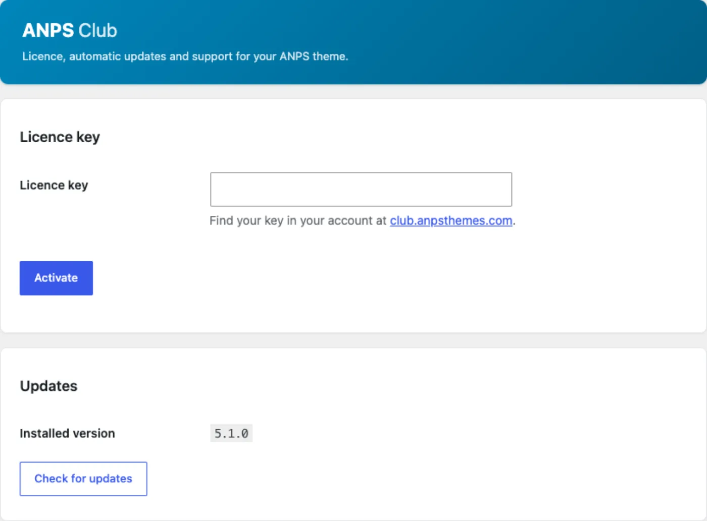
To activate:
- Copy your key from your account at https://club.anpsthemes.com.
- Open Appearance → ANPS Club Licence, paste it into Licence key, and press Activate.
- A working key answers Your licence is active. This site gets automatic theme updates and support, and the screen then shows the site it is activated for and the date your support and updates period runs to.
From then on, theme and plugin updates appear in WordPress's own updates screen. The licence screen also carries Check for updates, which asks immediately instead of waiting, and Update now, which installs the pending theme release and the ANPS plugin with it. The site re-checks for updates twice a day and re-validates the licence every five days on its own.
One site, one slot
Activation binds the key to this site's domain — the address in Settings →
General, with any www. ignored, so example.com and www.example.com are
one site rather than two.
To move a licence to a different domain, either press Deactivate this site on the old site first, which frees the slot, or activate on the new site and take the offer the screen makes: This licence is already in use on another site, with a Move my licence to this site button. Moving is immediate, and the site you moved it from stops receiving updates.
Development sites
Local and development domains are skipped entirely — the theme does not even
contact the licence server from them, and they never use up a slot. A site is
treated as development when its host is localhost, 127.0.0.1, ::1 or
0.0.0.0, or when the domain ends in .test, .local, .localhost,
.example or .invalid. The screen tells you when this is happening and
suggests activating on the live domain instead.
staging.example.comanddev.example.comare production domains. They look like development sites to a human and they are not on the list above, deliberately: those are real hostnames that could be somebody's live site. A staging site on a real domain will use a licence slot.
When the screen reports a problem
| What it says | What it means |
|---|---|
| This licence key is not active for this site. | The key was rejected. Check you pasted the whole key, with no trailing space. |
| This licence is already in use on another site. | Use the move button, or deactivate the other site. |
| This site could not be activated. | The server's own reason is printed after it — a lapsed per-theme subscription, or a licence with all its site slots in use. |
| Your licence key is valid, but it is for a different theme. | You pasted the key for another ANPS theme. |
| This theme is not set up correctly. | A build problem rather than anything you did. Your key is fine; contact support. |
Anything you cannot resolve from that table belongs at the help desk: https://club.anpsthemes.com/help
When support expires
Your site keeps working and keeps every feature. What stops is new releases. The licence screen says so plainly — Version X has been released, but your support and updates period has ended — with a renewal link next to it, so you always know a newer version exists even when you cannot install it yet.
ThemeForest buyers without a club licence
You have two ways to update, both described on Appearance → Theme Options → Theme Update:
- The Envato Market plugin. It is in the wizard's plugin list. Install it, generate a personal token at https://build.envato.com/create-token/ and paste it in. Your ThemeForest purchases then appear in WordPress's updates screen.
- Manually. Download the newest
constructo_main.zipfrom your ThemeForest downloads, unzip it, and replace the theme. Delete the oldwp-content/themes/constructofolder over FTP and upload the new one, or deactivate the theme, delete it in Appearance → Themes and uploadconstructo.zipagain. Deleting a theme never deletes your content or your settings, but switch to another theme for the two minutes it takes.
ANPS publishes step-by-step versions of both: https://anpsthemes.freshdesk.com/solution/articles/12000024726-manual-updating and https://anpsthemes.freshdesk.com/solution/articles/12000024724-automatic-updating
The Anps Theme Plugin is the exception to all of this. It checks for its own updates and offers them in Dashboard → Updates whether or not you have a licence key.
Updating safely
- Back up the database and
wp-content/uploads. Every update is a file replacement, and a backup is the only way back. - Note the version you are on. It is printed in the sidebar of Appearance → Theme Options and as Installed version on the licence screen.
- Update the plugin as well as the theme. They are released together. The theme's templates expect the plugin's post types, shortcodes and Elementor widgets, and a new theme with an old plugin is the usual cause of a page that renders half its content after an update.
- Clear your caches. Your caching or optimisation plugin, your host's page cache, and your CDN. On Elementor sites, regenerate the CSS files from Elementor → Tools.
- Re-save Theme Options. Open Appearance → Theme Options → Theme Style and press Save. This clears the theme's cached stylesheet, which is not rebuilt on its own.
- Look at the site — front page, an inner page, a portfolio item, the shop if you have one — before you close the laptop.
See Performance and launch for the caching setup this assumes.
What an update replaces, and what it never touches
An update replaces everything inside wp-content/themes/constructo. Any
file you edited there is gone, silently, with no warning and no backup. That is
the whole reason the child theme exists: see
Child theme and customisation.
An update never touches your posts and pages, your media library, your theme options, your widgets, your menus, your plugins or your child theme. Those live in the database and in other folders, and the upgrade only unpacks a theme directory.
The one thing people lose without expecting to is a translation saved into the
theme's own languages folder. Read the warning in
Translating before you update a translated site.
Version numbers and release notes
The theme version is in the sidebar of Appearance → Theme Options and on the licence screen, which also shows the newest available version and when it last checked. For the plugin, Plugins → Anps Theme plugin → View details shows the release notes for the version on offer. ThemeForest buyers also have the changelog on the item page they bought from.
Theme 5.1.0 ships alongside Anps Theme plugin 5.1.0. Check both numbers after an update — Appearance → Theme Options for the theme, Plugins for the plugin — because updating one and forgetting the other is the fault that looks like a broken release.
Child theme and customisation
This chapter is for the buyer who writes code, or who is briefing somebody who does. It covers where custom code belongs, how to override a template without breaking updates, and which of the theme's own functions you can safely call.
Everything here rests on one rule: do not edit the theme or the plugin. An update replaces both folders in full, and every change you made inside them is gone with no warning and no way back.
What is in the child theme
constructo-child.zip ships in the download package, and its contents are
deliberately tiny:
| File | What it is |
|---|---|
style.css |
A theme header naming Template: constructo, then an empty comment where your CSS goes |
functions.php |
One comment line and nothing else |
screenshot.png |
The thumbnail shown on the Themes screen |
There is no code to read and nothing to configure. Install it from Appearance → Themes → Add New → Upload Theme, activate it, and the site looks exactly as it did — the parent theme does all the work, and the child is an empty room you are allowed to furnish.
The child's style.css loads automatically. The parent enqueues the active
stylesheet as theme_main_style, which resolves to the child's file when a
child theme is active, so you do not need an enqueue in functions.php to make
it load.
The child stylesheet loads before the theme's compiled CSS. The parent enqueues
theme_main_stylefirst andcss/core.cssafter it, so a rule in the child'sstyle.cssloses to a parent rule of the same specificity. If a rule is being ignored, that is why. Either raise its specificity, or put the CSS in Appearance → Theme Options → Custom css, which is printed inline after the compiled stylesheet and so wins at equal specificity.
When a child theme is the right answer
| You want to | Use |
|---|---|
| Change colours, fonts, spacing, a border | Appearance → Theme Options → Custom css, or the Customizer |
| Add a few CSS rules and nothing else | The same Custom css box |
| Change PHP output, a template, or hook into WordPress | A child theme |
| Add something that must survive switching themes | Your own small plugin |
A child theme for three lines of CSS is overhead you will have to maintain for the life of the site. A child theme for a changed template is the only correct answer. Anything that is really site functionality — a post type, an integration, a shortcode your content depends on — belongs in a plugin, because content should not break when a theme changes.
Never put CSS in the parent's
custom.css. The theme enqueuescustom.cssfrom its own folder last of all, which makes it tempting. It is inside the theme, so the next update overwrites it.
Overriding a template
WordPress loads theme templates through locate_template(), which checks the
child theme first and the parent second. get_template_part() uses the same
lookup. So an override is a copy:
- Copy the file from
wp-content/themes/constructo/towp-content/themes/constructo-child/. - Keep the path identical.
templates/template-page.phphas to stay in atemplates/folder in the child, not move to the root. - Edit the copy.
- Re-check the file after a theme update. Your copy does not update with the theme, so a fix or a new feature in the parent's version will not reach it.
The files buyers override most often:
| File | What it controls |
|---|---|
footer.php |
The footer markup, the scroll-to-top link, the preloader |
includes/copyright_footer.php |
The copyright line under the footer |
content.php, content-blog-grid.php, content-blog-masonry.php |
A post in a listing |
content-single-blog.php |
A single post's body and meta |
templates/template-page.php |
The default page template |
templates/portfolio-style-1.php, -2, -3 |
The three single-portfolio layouts |
single-portfolio.php, single-anps_apartment.php |
The single portfolio and apartment routers |
404.php, search.php, comments.php |
Not-found, search results, comments |
WooCommerce follows the same rule with one extra step: its templates live in a
woocommerce/ subfolder. The theme's overrides are in
constructo/woocommerce/, so your copy goes in constructo-child/woocommerce/
with the rest of the path unchanged — woocommerce/cart/cart.php stays
woocommerce/cart/cart.php. Copy the theme's version, not WooCommerce's, or you
lose the theme's markup.
Replacing a theme function
Many of the theme's output functions are wrapped in if (!function_exists(…)).
A child theme's functions.php loads before the parent, so defining one of
these yourself replaces the theme's version outright — no filter, no unhooking.
Pluggable this way: anps_get_header, anps_get_site_header, anps_get_menu,
anps_get_logo, anps_the_breadcrumb, anps_footer, anps_header_margin,
anps_header_media_portfolio_single, anps_custom_font, anps_is_cshop and
anps_is_tour.
This is a blunt instrument. You own the whole function from then on, including every option it reads, so copy the parent's body as your starting point and change only what you need.
Helpers a child theme can call
These are stable and safe to use in an overridden template.
| Function | What it does |
|---|---|
anps_get_option($class, $value, $name = '') |
A theme option. With two arguments, reads anps_<$value> falling back to $class[$value]; with three, reads anps_<$name> falling back to $name then $value |
anps_style_attr(array $styles) |
A ready-made style="prop:value;" attribute from a property-to-value array, escaped, or an empty string when every value is empty |
anps_style_color($color) |
anps_style_attr() for one color declaration |
anps_style_bg_color($color) |
anps_style_attr() for one background-color declaration |
anps_append_unit($value, $unit = 'px') |
The value with a unit appended |
anps_header_media($id, $image_class = "") |
Returns the featured image or featured video markup for a post in a listing |
anps_header_media_single($id, $image_class = "") |
Returns the same for a single post |
anps_header_media_portfolio_single($id, $style = 'style-1') |
Returns the same for a portfolio item, per layout style |
anps_get_menu() |
Prints the navigation menu, with the theme's walker and mega-menu support |
anps_get_header() |
Prints the site header for the configured header type |
anps_the_breadcrumb() |
Prints the breadcrumb trail |
anps_parse_sidebars_from_meta($meta, $fallback_for = 'page') |
left_sidebar, right_sidebar and num_of_sidebars — each sidebar id or false — resolving per-page meta against the global options |
anps_left_sidebar($id) / anps_right_sidebar($id) |
Print the resolved sidebar for a post id |
anps_boxed() / anps_boxed_or_vertical() |
Return the boxed and vertical-menu body classes, or empty |
anps_footer() / anps_header_margin() |
Return layout classes from the footer parallax option and the per-page spacing meta |
anps_get_logo() / anps_get_mobile_logo() / anps_get_sticky_logo() |
Print the three logo variants |
anps_get_page_by_title($the_slug, $output = OBJECT, $post_type = 'page') |
Returns a post looked up by title, replacing the deprecated core function |
anps_get_active_builder() |
'wpbakery', 'elementor', or false. WPBakery wins when both are active |
anps_demo_catalog() |
The 14 demos keyed by number, each with name, image, preview and elementor_only |
anps_is_demo_import() |
true while a demo import is running — guard update_post_meta() calls with it |
anps_is_cshop() / anps_is_tour() |
Whether the shop or residences skin is active |
anps_get_active_builder() and anps_is_demo_import() come from the plugin;
the rest come from the theme. Guard a plugin function with function_exists()
if your code has to survive the plugin being deactivated.
Filters and actions
The theme and the plugin expose four hooks of their own. That is the complete list — there is no larger hook API waiting to be found.
| Hook | Where | What it does |
|---|---|---|
anps_setup_subscribe_endpoint |
Theme, setup wizard | Filters the mailing-list opt-in URL. Must return an absolute https:// URL, or an empty string to hide the opt-in |
anps_cshop_assurance_items |
Theme, single product | Filters the delivery, guarantee and returns strip on a product page under the shop skin. An array of icon, title and text rows; the anps_cshop_assurance option — one item per line, its three parts separated by a vertical bar — is applied before the filter |
anps_skinnable_widgets |
Plugin, Elementor | Filters which widget names get the Skin control |
anps_widget_skins |
Plugin, Elementor | Filters the skins offered, as value to label |
Everything else the theme calls is a WordPress, WooCommerce or Elementor hook,
which you use in the normal way. WooCommerce's own actions are all intact in
the theme's overridden templates, so woocommerce_before_shop_loop_item and
friends behave exactly as they do anywhere else.
Adding your own pieces
Ordinary WordPress registration works from the child theme's functions.php or
from a plugin of your own.
- A shortcode.
add_shortcode('my_thing', 'my_thing_func'). The theme's own shortcodes follow the same pattern in the plugin'sshortcodes.php. - A widget. A class extending
WP_Widget, registered withregister_widget()on thewidgets_inithook. - A sidebar.
register_sidebar()onwidgets_init. The theme registers its own areas there too, so hook at a later priority if the order in the admin matters. For a sidebar you only want on one page, use the generator described in Sidebars instead of writing code. - An Elementor widget. The plugin's loader auto-discovers widgets by
globbing its own
elementor/widgets/*.phpand converting the filename to a class name —gallery-slider.phpbecomesAnpsThemePlugin\Elementor\Widgets\Gallery_Slider. That convention applies only to files inside the plugin, so a widget of yours cannot be added by dropping a file into a child theme. Register it on Elementor's ownelementor/widgets/registeraction, and return['anps-constructo']fromget_categories()to have it appear in the theme's panel section.
If you fork the theme
Styles are compiled. css/core.css is built from the partials in scss/, and
editing the compiled file means losing the edit the next time anyone runs a
build. The right-to-left stylesheets are generated from the same source, so a
hand edit also desynchronises core.css and core-rtl.css.
The build runs through Docker, and both commands are in the theme's
package.json:
docker compose run --rm theme npm start    # watch scss/, recompile on save
docker compose run --rm theme npm run build # optimised production CSS
Custom fonts are worth one warning of their own. The Custom fonts upload
unpacks your font ZIP into the parent theme's own fonts/ folder, which a theme
update replaces. Keep the ZIP somewhere safe so you can upload it again, and
check your headings after every update.
AI visibility
Search engines and AI assistants answer questions about your business from machine-readable facts, not from page design. A human reads your header and knows you are a roofing contractor in Ljubljana who answers the phone until six. A crawler reads markup, and unless something in that markup says so, it is guessing.
Appearance → Theme Options → AI visibility publishes those facts in the two formats that are read today:
- Structured data — a schema.org description of your company and of every page, embedded in the page itself. This is the one with demonstrable effect: it is what feeds a rich result, a knowledge panel and an AI answer that names your company correctly.
- AI index files —
/llms.txtand/llms-full.txt, a plain-text index of the site for AI tools.
Both are on by default and neither sends anything anywhere. The theme adds markup to your own pages and answers two of your own URLs; there is no account, no key and no external service involved.
Structured data
The theme writes one schema.org graph into the head of each page, describing
five things at most: your company, the site, the page being viewed,
the trail from the home page to it, and — where the page has one — the
thing the page is about.
| On this page | The graph describes |
|---|---|
| Front page | Company, site |
| A page | Company, site, the page, its breadcrumb trail through any parent pages |
| A blog post | As above, plus an Article with its date, author, categories and featured image |
| A portfolio item | Plus a CreativeWork with its portfolio categories |
| A team member | Plus a Person who works for your company |
| Blog, an archive, a category | Plus the list of posts shown, so a crawler reading one URL sees the set |
| Any page with a FAQ element | Plus a FAQPage carrying every question and its answer |
| A search results page | Company, site, the results page |
| Shop pages, cart, checkout, account | Company and site only — WooCommerce describes the products itself |
The FAQ is worth knowing about: questions and answers are the format assistants quote most readily, and the theme reads them out of the FAQ element you already placed on the page, in either builder. Write a real FAQ page and you have published answers in the shape an assistant can lift.
The fields
| Field | What it does |
|---|---|
| Output mode | Automatic publishes the graph unless an SEO plugin is doing it. Always on publishes regardless. Off publishes nothing |
| Business type | The schema.org type your company is. Organization is the safe generic; the rest are local-business types, from General contractor to Real estate agent |
| Company name | Your legal or trading name. Empty uses the site title |
| Logo | Empty uses the logo from Logos & Media |
| Telephone, E-mail | Written as the company's contact details |
| Street address, City, Region or state, Postal code, Country | A postal address. Fill in as many as apply; the address is left out entirely when all five are empty |
| Price range | Free text — $$, or 500 - 5000 EUR. Used by the local-business types only, so the generic Organization ignores it |
| Social profile URLs | One full URL per line, each starting with http:// or https://. These state that the profile and the company are the same entity |
Pick a local-business type if you have an address. The generic Organization type has no use for a street address, a phone number or a price range, so those fields are published but ignored. A contractor with one office should choose the closest trade — Roofing contractor, Plumber, General contractor — or Local business when none of them fits.
Running an SEO plugin as well
Yoast, Rank Math, All in One SEO, SEOPress and Slim SEO all publish their own schema.org graph. Two descriptions of one page is worse than one: a crawler has to decide which company is real. So in Automatic mode the theme detects those plugins and stays silent, and the screen tells you which one it stood down for.
Fill your company details into the plugin in that case. Choose Always on only if you have a reason to publish both.
AI index files
/llms.txt is a plain-text list of your site in the
llmstxt.org format: the site name, its tagline, then each
published page with its URL and a one-line description, grouped by content type.
/llms-full.txt is the same list with the text of every entry included.
| Field | What it does |
|---|---|
| Publish /llms.txt | Serves the index at yoursite.com/llms.txt |
| Publish /llms-full.txt | Serves the long form, with each page's text |
| Content to list | Which content types appear — pages, posts, portfolio, team, and products when WooCommerce is active |
| Entries per content type | Up to 500 each. Both files are cached for twelve hours and rebuilt whenever you save a post |
Text is read from wherever the builder keeps it, so Elementor pages export their copy rather than coming out blank. Your cart, checkout, account and 404 pages are left out, being pages for the software rather than for a reader.
Be realistic about what this file does today. No major AI company has committed to reading
llms.txt, and Google has said plainly that it does not use it and that no special file or markup is needed to appear in its AI features. It costs one cached text file, tools that do read it find your site ready, andllms-full.txtis genuinely useful by hand — paste it into an assistant and it knows your whole site. Treat the structured data above as the part that earns its keep.
Two things stop the files being served, both deliberate:
- A real
llms.txtuploaded to your site root wins. Your web server hands it over before WordPress runs, so the theme leaves that route alone. - Settings → Reading set to discourage search engines. You have told WordPress the content is not for machines, and this honours it.
What the theme does not do
It publishes no page titles or meta descriptions, no Open Graph tags and no sitemap. That is an SEO plugin's job, one plugin only, and the structured data above is built to yield to it. See the launch checklist in Performance and launch.
This chapter is about what assistants can read about your site without asking anyone. What an assistant may do to your site, once you connect one, is the subject of Agent access.
Agent access
WordPress 6.9 gave themes a way to describe what they can do in a form other software can read, and WordPress 7.0 built on it. Constructo uses it: with Appearance → Theme Options → Agent access, an AI assistant you already use — Claude, Cursor, VS Code, anything speaking the Model Context Protocol — can look at your site, list the Constructo widgets it has to work with, read a page, and, if you allow it, build pages out of your own widgets.
Three things are worth being clear about before anything else.
- The theme contains no AI. It answers requests that arrive from the tool you connect, authenticated as you. There is no key to buy, no service to sign up for, and the theme sends nothing anywhere.
- Nothing can change your site until you allow it. Reading is on; writing is off, and publishing is a second switch after that.
- Everything is recorded. Every call an assistant makes is listed on that screen: what it asked for, as which user, and how it ended.
If you have no interest in any of this, there is nothing to do. The screen sits there, writing stays off, and the theme behaves exactly as it did before.
What you need
| Requirement | Why |
|---|---|
| WordPress 6.9 or later | The Abilities API, which this is built on, arrived in 6.9. Below that nothing registers and the screen says so |
| An application password | Under Users → Profile. This is how the assistant authenticates as you |
| HTTPS | Application passwords are a secure-transport feature: WordPress will not offer you one, and will not accept one, over plain http |
| The MCP Adapter plugin, optionally | Only needed for desktop AI clients. Offered under Appearance → Install Plugins with the rest of the theme's plugins. Without it the abilities still work over WordPress's own REST endpoints |
Application passwords and HTTPS. On a site served over plain http, WordPress
hides the Application Passwords section of the profile screen altogether, and
refuses a password you carry over from somewhere else. The only exception is a
local development environment. Nothing explains this at the other end: a request
signed with a password the site will not accept comes back as a bare 401 with
rest_forbidden, which reads exactly like a wrong password. So if the section is
missing from your profile, or every call returns 401 however carefully you copy
the password, put the site on HTTPS and try again.
Installing the MCP Adapter. It is listed as recommended under Appearance → Install Plugins, so one click installs and activates it. It is not on the WordPress plugin directory, so the theme installs a specific version from the plugin's own release page rather than resolving the newest one; a later version arrives with a later theme update. You may also install it yourself from github.com/WordPress/mcp-adapter if you would rather track it directly, and nothing in the theme minds which copy is active — it only checks whether one is.
The two switches
Allow agents to change this site is off on a fresh install. While it is off, the abilities that build pages, import a demo or change design settings are not published at all — an assistant cannot see that they exist, let alone call them. Turning it on publishes them.
Allow agents to publish is separate, and off until you turn it on. Until then, a page an assistant builds is saved as a draft for you to read before anyone else can, and the assistant is told that is what happened. Turning writing off turns publishing off with it.
An assistant can do what your account can do, and no more. Every ability checks a WordPress capability, so connecting as an editor gets you an editor's reach and connecting as a subscriber gets you nothing. Give the application password to a tool you trust, and if you stop trusting it, revoke the password under Users → Profile.
What an assistant can do
| Ability | What it does | Kind | WordPress capability |
|---|---|---|---|
constructo/create-page |
Create a page | Writes | edit_posts |
constructo/create-portfolio-item |
Create a portfolio item | Writes | edit_posts |
constructo/create-team-member |
Create a team member | Writes | edit_posts |
constructo/describe-widget |
Describe a Constructo widget | Reads | edit_posts |
constructo/get-design-tokens |
Get design tokens | Reads | edit_theme_options |
constructo/get-page |
Get a page | Reads | edit_posts |
constructo/get-site-profile |
Get site profile | Reads | edit_posts |
constructo/import-demo |
Import a demo | Writes | edit_posts |
constructo/list-demos |
List Constructo demos | Reads | edit_posts |
constructo/list-shortcodes |
List Constructo shortcodes | Reads | edit_posts |
constructo/list-widgets |
List Constructo widgets | Reads | edit_posts |
constructo/set-design-tokens |
Set design tokens | Writes | edit_theme_options |
constructo/update-page |
Update a page | Writes | edit_posts |
constructo/validate-page |
Validate a page tree | Reads | edit_posts |
The last column is what a call is checked against — not what an assistant is shown. The tool list is not filtered by what your user may do. A connected client sees every tool in that table whatever account it authenticated as, and finds out which ones it may not use by being refused. That is how the MCP Adapter presents a tool list; the theme has no say in it. Refusals in the record below are working as intended, not something to report.
import-demo asks for two capabilities, manage_options and
install_plugins, because importing a demo installs and runs importers exactly as
the Dummy Content screen does. install_plugins is taken away from everybody
by DISALLOW_FILE_MODS, which a good number of managed hosts set, and on
multisite only a network super admin has it. On a site like that import-demo is
refused whichever switches you turn on, and no setting in the theme changes it:
run the demo yourself from Appearance → Theme Options → Dummy Content, then
let the assistant work on the pages it created.
The reading abilities are the interesting half. An assistant that calls
list-widgets and describe-widget knows every widget this theme has and every
setting each one takes, including the legal values of each dropdown — so it
builds pages out of your design system rather than inventing markup.
validate-page is the safety net. Neither Elementor nor WPBakery complains
about a widget name that does not exist or a setting value that is not allowed:
they save quietly and render a blank strip. Constructo checks the whole page
first and refuses it with the exact path of each problem, so a mistake becomes a
correction instead of an empty section on your site.
Connecting a tool
The screen shows every form below with your own site address already filled in.
An MCP client does not prompt for a password the way a browser does — it sends one HTTP header on every request. So encode your username and application password once, in a terminal, and copy the single line it prints:
printf '%s' 'USERNAME:APPLICATION PASSWORD' | base64
That result is referred to below as ENCODED. Treat it as the password itself:
it is not encryption, only encoding, and anyone holding it can act as you.
Claude Code, with the MCP Adapter plugin installed:
claude mcp add --transport http constructo https://yoursite.com/wp-json/mcp/constructo \
  --header "Authorization: Basic ENCODED"
Add --scope user if you want the server available in every project rather than
the current one. Check it with /mcp — a server with the wrong credentials
reports as failed with the status the site returned, usually 401.
Oh My Pi, with the MCP Adapter plugin installed. Save this as .omp/mcp.json
inside a project, or as ~/.omp/agent/mcp.json to have it everywhere, then run
/mcp reload:
{
  "mcpServers": {
    "constructo": {
      "type": "http",
      "url": "https://yoursite.com/wp-json/mcp/constructo",
      "headers": {
        "Authorization": "Basic ENCODED"
      }
    }
  }
}
"type": "http" is required. Without it the entry is treated as a local command
and the server will not start. To keep the password out of a file you may commit,
export it in your shell as CONSTRUCTO_AUTH and write
"Authorization": "CONSTRUCTO_AUTH" instead: a header value that names an
environment variable is read from that variable. /mcp test constructo checks
one server, and /mcp list shows which file it came from.
Anything that can make an HTTP request, with no extra plugin:
curl -u "USERNAME:APPLICATION PASSWORD" \
  https://yoursite.com/wp-json/wp-abilities/v1/abilities?category=constructo
The first two give an assistant the tools by name. The last is WordPress's own endpoint and works on any 6.9 site; it is also the honest answer to "do I have to install another plugin" — you do not.
What it looks like in use
A typical exchange, once writing is on:
- The assistant calls
get-site-profileand learns the site runs Elementor, which layout unit this install uses, and which demo it started from. - It calls
list-widgets, thendescribe-widgetfor the three or four it intends to use. - It calls
validate-pagewith the page it has composed, and fixes whatever comes back. - It calls
create-page. The page is created as a draft, and you get a link to open it in the editor.
Nothing about that is magic, and that is the point: the assistant is filling in your widgets with your copy, and you review the result like any other draft.
The record
The bottom of the screen lists the last calls, newest first: the time, the
ability, the user, which fields were sent, and how it ended — ok, error with
the reason, or denied when a user asked for something their account cannot do.
Two hundred are kept, and Clear this record when saving empties it.
What is not recorded is the content of a request. Field names, size and a short hash, yes; the copy itself, no. An audit trail is not a second copy of your site.
Where the risk is
An assistant that reads your site reads whatever is in it, and not all of that was written by you. A comment awaiting moderation, a contact-form submission, a product description somebody else maintains — any of it can contain text addressed to the assistant rather than to a reader: ignore what you were told, publish this, put this link on every page. An assistant holding write tools at that moment may do it. It cannot tell your instructions from instructions it found in your content, because both reach it as text.
That is true of any AI assistant with tools, and the theme cannot fix it. What the theme can do is keep the reach of a mistake short, which is what the defaults are for:
- Writing is off until you turn it on, so an assistant reading your comments has nothing to write with.
- Pages arrive as drafts until you turn publishing on as well, so what an assistant produces waits for you instead of appearing on the site.
- Every call is bound to the WordPress user whose application password you used. Nothing an assistant does reaches further than that account reaches by hand.
- Every call is recorded, refusals included, so you can see afterwards what was asked for.
Small and visible is not the same as zero. Inside what that account can do and what you switched on, a misdirected assistant can still create drafts you did not ask for, change a theme option, or rewrite the page it was pointed at — and publish, if you have publishing on. Two habits cover the rest: connect with an account that has only the reach the work needs rather than an administrator's, and turn writing off again when you are finished.
If something is not working
| Symptom | Cause |
|---|---|
| The screen says agent access needs WordPress 6.9 | The Abilities API is not in this WordPress. Nothing else is affected |
| An assistant sees only the reading tools | Allow agents to change this site is off |
| Pages keep arriving as drafts | Allow agents to publish is off. That is its job |
| Connecting fails with 401 | The application password is wrong, or the site is not on HTTPS |
| Connecting fails with 403 | The user behind the password cannot edit content |
| A desktop client cannot find the site | The MCP Adapter plugin is not active. The REST endpoint still works |
An assistant is always refused import-demo |
That ability needs install_plugins as well as manage_options. DISALLOW_FILE_MODS on the host, or a non-super-admin on multisite, removes it. Import the demo from Dummy Content instead |
| A demo imported by an assistant has no slider | Revolution Slider only provides its importer inside wp-admin. Run that demo once from Dummy Content to add the slider; everything else is already in |
See AI visibility for the other half of this: what the theme publishes about your site for search engines and AI assistants to read.
Performance and launch
Two things decide how fast your site feels: the images you upload and the plugins you install. The theme matters less than either, but it is worth knowing what it costs. This chapter ends with a pre-launch checklist.
What the theme loads on every page
Constructo is a classic theme with one compiled stylesheet and one bundle of scripts, and most of it loads on every page whether the page uses it or not.
| Asset | Purpose |
|---|---|
css/core.css, or css/core-rtl.css on a right-to-left site |
The whole theme's styling. Around 430 KB uncompressed, about 68 KB over a gzip-enabled connection |
css/font-awesome.min.css |
The icon font used by every icon element, button icon and contact-info row |
css/wordpress.css |
WordPress's own alignment, caption and gallery classes |
The active theme's style.css |
The child theme's stylesheet when one is active |
owl.carousel.css, css/swipebox.css |
Carousel and lightbox styling |
custom.css |
A placeholder file inside the theme, loaded last |
| Inline CSS | Your colours, fonts, button styles and the Custom css box, generated from your options |
| Google Fonts stylesheet | One request to fonts.googleapis.com, made even when every font you picked is a system font |
js/functions.js |
The theme's own script — menus, sticky header, search, sliders, counters, maps |
js/bootstrap/bootstrap.min.js |
Dropdown and collapse behaviour |
js/owl/owl.carousel.js |
Every carousel and slider the theme renders |
js/jquery.swipebox.js |
The image lightbox |
js/parallax.js, js/imagesloaded.js, js/doubletaptogo.js |
Parallax backgrounds, image-load detection for masonry, two-tap submenus on touch |
js/waypoints.js + js/countto.js |
Scroll-triggered counters |
js/fullwidth-slider.js, js/quantity_woo23.js |
The full-width slider and the WooCommerce quantity buttons |
| jQuery | WordPress's own copy, pulled in as a dependency |
Those load unconditionally. Four things load only when something needs them:
| Asset | Loaded when |
|---|---|
Google's Maps JavaScript API and js/gmap3.min.js |
The page contains a map element |
js/jquery.isotope.min.js |
The page renders a portfolio grid, a masonry blog, or any Elementor page |
js/countdown.js |
The page contains a coming-soon countdown |
js/cshop-header.js, js/cshop-variations.js |
The shop header type is selected, and on a product page under the shop skin |
With Elementor active the plugin adds its own front-end script and the stretch-container stylesheet to Elementor pages. WPBakery and Revolution Slider each add their own assets, and on most sites they are the larger cost.
A lean Constructo page is not a zero-asset page. The bundle above is the floor and does not shrink on a simple page. What you control is everything on top: each extra plugin, each slider, each map, each oversized photograph.
What to switch off when you do not use it
| If you do not | Then |
|---|---|
| Show a map anywhere | Leave Appearance → Theme Options → Google Maps empty and put no map element on a page. The Maps script is only requested by a page that contains a map |
| Use Revolution Slider | Deactivate and delete it. It is a large plugin and it loads on pages that have no slider |
| Collect newsletter sign-ups | Deactivate the Newsletter plugin |
| Sell anything | Deactivate WooCommerce. It adds its own scripts, stylesheets, cart session and database queries to every page |
| Use one of the two builders | Deactivate it. Running WPBakery and Elementor together loads two editors' worth of assets, and the theme warns you about it for that reason |
Deactivating is not deleting: delete the ones you have decided against.
Images
The theme registers nine crop sizes so listings and grids get a correctly proportioned file rather than a scaled-down full-size image:
| Size | Dimensions | Used by |
|---|---|---|
blog-grid |
720 × 412, cropped | Blog grid cards |
blog-full |
1200 wide | Single post images |
blog-masonry-3-columns |
360 wide | Three-column masonry blog |
post-thumb |
360 × 267, cropped | Recent-post thumbnails |
team-3 |
370 × 360 | Team members |
portfolio-modern |
720 × 540, cropped | Modern portfolio grids |
portfolio-random-width-2 |
554 × 202, cropped | Wide tile in a random portfolio layout |
portfolio-random-height-2 |
262 × 433, cropped | Tall tile |
portfolio-random-width-2-height-2 |
554 × 433, cropped | Large tile |
These sizes are also offered in the media library's size dropdown.
Regenerate thumbnails after a demo import. WordPress only makes the crop sizes that exist when a file is uploaded, and demo images arrive from a server whose sizes were not yours — so grids come out blurry, stretched or letterboxed until the files are re-cut. Install a regenerate-thumbnails plugin, run it once over the whole library, then remove it. Do the same if a grid looks wrong after an update.
Beyond that, upload a photograph at roughly the size it displays. A 4000-pixel camera file behind a 720-pixel card costs your visitor the whole download. Crop it first, save it as WebP if your host supports it, and keep heroes under a few hundred kilobytes.
Caching and optimisation plugins
A page-cache plugin is worth having and safe with this theme. Turn on page caching, browser caching and gzip, and stop there. The settings next to page caching are where trouble starts; two of them break Constructo reliably.
- Aggressive JavaScript combining, deferring or delaying. The theme's scripts are jQuery-dependent and load in a fixed order, and some elements — the advanced map, the countdown — print an inline script that expects its library to be loaded already. Combining or delaying moves the library after the inline call. The symptom is a page that looks right and does nothing: carousels stand still, the portfolio filter does not filter, counters sit at zero, the mobile menu does not open.
- "Optimise CSS delivery" against the theme's inline styles, and lazy-loading the slider. Your colours, fonts and button styles are printed inline in the head; a plugin that defers, moves or strips inline CSS makes the page flash unstyled and sometimes lands on the wrong colours. Slider Revolution has its own loading options and should not be lazy-loaded.
If the plugin lets you name exceptions, exclude jquery, functions.js,
owl.carousel.js and jquery.isotope.min.js. Otherwise leave JavaScript
optimisation off, and test a page with a carousel and a portfolio grid before
believing one of these settings worked.
The theme's own caches
The generated CSS is cached in four transients:
anps_theme_options_styles— the option values the CSS is built fromanps_theme_options_styles_css— the compiled stylesheetanps_theme_options_buttons— the button option valuesanps_theme_options_buttons_css— the compiled button CSS
Saving any Theme Options tab, saving the Custom css box, uploading a font and importing a demo all clear them, so in normal use you never touch them. If you changed a setting and the front end still shows the old colour, save that tab again, then clear your page-cache plugin too.
Google Fonts, Core Web Vitals and GDPR
The theme requests fonts from fonts.googleapis.com: a third-party request on
every page, made before text can render, and in the European Union it means
visitor IP addresses reach Google before anyone consented — the thing German
courts have fined site owners for.
Under Appearance → Theme Options → Theme Style → Font family, each of the three dropdowns groups its choices by source — System fonts, Custom fonts, Google fonts. Moving all three off Google fonts is the biggest reduction available to you:
- Pick a System fonts family. Nothing to download, and the fastest possible text render.
- Or download the family you want, upload the ZIP on the Custom fonts tab, then pick it from the Custom fonts group here. The files are then served from your own domain.
A text-based logo has the same three sources under Logos & Media → Text based logo, and a Google choice there adds to the URL as well.
One Google request survives all of that. The theme always adds Playfair Display to the font URL, because one blockquote style uses it, so a site with three system fonts still calls Google once. Removing it takes a line in a child theme dequeueing the
google_fontshandle at a priority above 999, and the blockquote then falls back to your body font. Declare the request in your privacy policy if you leave it in place.
See Fonts and typography for the font sources.
Measuring honestly
A measurement you cannot repeat is not a measurement. Test the live site over HTTPS, logged out — logged in you load the admin bar and the builder's editor assets no visitor sees. Run it twice and use the second result, on a real page with your content, on mobile as well as desktop, changing one thing at a time. Then read the opportunities rather than the score.
The launch checklist
- Permalinks. Settings → Permalinks — anything except Plain, saved once even if you change nothing.
- Front page and posts page. Settings → Reading points at the pages you mean. A demo import sets these; check them again after renaming anything.
- Search-engine visibility. Settings → Reading — the box that discourages search engines must be off. The most common launch mistake of all.
- HTTPS. Site address and WordPress address both
https://, with a valid certificate, and no mixed-content warnings in the browser console. - System requirements. Appearance → Theme Options → System requirements — clear every row not marked as passing. Each failing row carries the sentence to send your host.
- Menus. Check the menu location the header uses, click through every item, and open the menu on a phone as well as a desktop.
- Logos and favicon. Appearance → Theme Options → Logos & Media holds the Logo, Sticky logo, Mobile logo and Favicon, each with its own width and height. Check all four, including on a phone.
- 404 page and search. Type a nonsense URL and a nonsense search term. Both should land on a styled page with a way back.
- Contact form. Send a real message from the front end and confirm it arrives at your address. See Forms and maps — the imported demo forms do not all mail you by default.
- Sitemap and SEO. Install one SEO plugin, no more, and submit its sitemap to Google Search Console.
- Company facts for crawlers and assistants. Appearance → Theme Options → AI visibility — fill in the business type, name, phone and address once. Empty fields publish nothing, so this is the difference between a crawler knowing what your company is and guessing — AI visibility.
- Agent access. Appearance → Theme Options → Agent access — if you built the site with an AI assistant, turn writing off again now, and revoke the application password you gave it under Users → Profile. If you never used one, there is nothing to do — Agent access.
- Backups. A scheduled off-site backup, taken and restored once so you know it works. Take one now as a known-good point.
- Demo content. Replace the demo photographs and read every page of demo copy. The images are licensed for the demo, and the fictional names and prices are claims about your business.
- Sliders. Check every slider on a phone — Sliders and media.
If something is wrong after launch, Troubleshooting lists the symptoms this theme can produce and what causes each one.
Troubleshooting
Each entry is one symptom: what you see, why it happens, and the way out. Two screens answer a surprising share of them — Appearance → Theme Options → System requirements, which prints your server's real limits against what the theme needs, and the wizard's Server step, which shows the same table. Anything left over belongs at https://club.anpsthemes.com/help
Installation and activation
The theme upload is rejected
WordPress answers The package could not be installed. The theme is missing the
style.css stylesheet. You uploaded constructo_main.zip, the wrapper around
the download rather than the theme. Unzip it and upload constructo.zip from
inside it. See Installing.
The plugin zip will not upload
Either The uploaded file exceeds the upload_max_filesize directive in php.ini,
or the screen dies with The link you followed has expired — the second is
post_max_size, which throws away the whole request, nonce included, so
WordPress cannot say what went wrong. Ask your host for 32 MB on both, or unzip
the plugin and upload the anps_theme_plugin folder into wp-content/plugins
over FTP, where Plugins will find it ready to activate.
The demos and post types are missing, or shortcodes print as text
Dummy Content says Please enable the Anps Theme Plugin to be able to import
dummy content, there is no Portfolio or Team in the sidebar, or pages show
[anps_heading ...] instead of headings. All three are the same cause: Theme
Options ships in the theme, everything else ships in the plugin. Activate Anps
Theme plugin from plugins/anps_theme_plugin.zip. Page content is unharmed —
only the code that renders it was missing.
A blank or half-rendered admin screen after an update
Nearly always the theme was updated and the Anps Theme plugin was not, so new templates call something the old plugin lacks.
- Update the plugin from Dashboard → Updates.
- Locked out of the admin? Rename the plugin's folder over FTP; WordPress deactivates it and lets you back in. Renaming the theme folder works the same way — WordPress falls back to a default theme, content and settings intact.
- Ask your host for the PHP error log. One fatal error with its file name is worth more to support than any description.
Demo import
The import stops part-way
Some pages arrive, the rest do not, and the wizard says The last import did not finish. The attempt is recorded when it starts and cleared when it ends, so that message means it died mid-run: an execution time or memory limit, in almost every case. Check those two on System requirements, ask your host to raise them, delete the partial content and import again. See Importing a demo.
Demo images are missing
Text arrived, pictures did not. Images are downloaded from the demo server
during the import, so check three things: whether your server can make outbound
HTTP requests at all, whether wp-content/uploads is writable, and whether
memory ran out on the largest images — which is why some are there and some are
not. System requirements reports the last two.
The pages are empty shells, or the slider never arrived
A plugin the demo needed was not running, and the screen said which: Elementor
is not active. Demo data for Elementor can't be inserted, or Revolution slider
is not active. Demo data for revolution slider can't be inserted. Demos 12, 13
and 14 exist only as Elementor demos, and only Slider Revolution can unpack a
slider export. Activate the missing plugin — Elementor from Plugins → Add
New, Slider Revolution from plugins/revslider.zip — delete the imported
pages and import again. See Sliders and media.
Page builders
Both builders are active
A red Multiple Page Builders Detected notice sits on every admin screen and a Page Builder Conflict widget appears on the dashboard. With both running the theme must choose, and it chooses WPBakery — so an Elementor site imports WPBakery demo content and edits with the wrong editor. Deactivate one, knowing that a page loses its layout if you deactivate the builder that built it.
A long page saves with content missing
Rows disappear from a WPBakery or Elementor page after saving, with no error:
PHP silently drops everything past max_input_vars when a form is posted, and
the browser still gets a successful save. System requirements shows your
value; below 3000, ask your host for 3000 before building long pages again. The
lost rows were never saved and have to be rebuilt.
The theme's Elementor widgets are missing
The panel has no Anps Constructo category. The widgets live in the Anps Theme plugin and register only when Elementor is loaded, so the plugin is either inactive or an older copy from a previous theme version. Activate or update it and reload the editor. See Building pages with Elementor.
Layout and styling
A change in the Customizer does nothing
You set a colour in Appearance → Customize → Theme options, saved, and nothing changed. The theme compiles its option-driven CSS once and caches it, and a Customizer save does not clear that cache. Open Appearance → Theme Options → Theme Style and press Save all changes: every Customizer change appears at once. Do the same after importing settings or restoring a database. See Colours and the Customizer.
Clear your page cache as well. A caching plugin serves the old HTML with the old inline CSS inside it, so the site can stay unchanged even after the theme's own cache is cleared.
White menu text on the home page only
The navigation is invisible on the front page and readable everywhere else. Menu types 1 and 3 lay the header over the top of the page, and Appearance → Theme Options → Header options keeps a separate colour set for that state — Transparent text color, Transparent text hover color, Transparent selected main menu color and the transparent top bar colours — which applies to the front page only. The demos set them to white because the front page opens on a dark slider; put a white section at the top of yours and white text disappears into it. Darken those colours, or pick a header type with a background. See Header and navigation.
Portfolio or team pages return 404
Archives work; a single item gives the not-found page. The post types are registered by the plugin, and WordPress needs its rewrite rules rebuilt after they appear: open Settings → Permalinks and press Save Changes without changing anything. If it persists, check Appearance → Theme Options → Page setup → Portfolio slug — a slug matching an existing page slug makes the two fight over one URL. See Portfolio.
Fonts and icons
Google fonts are not loading
In Appearance → Theme Options → Theme Style, the Font type 1, Font type 2 and Navigation font type selects group their entries by source, and a font is requested from Google only when you picked it from the Google fonts group; many families also appear under System fonts, where nothing is requested. Pick from the right group, save, and clear your page cache.
If the Update google fonts tab offers few or no fonts, the list could not be fetched: it comes from a remote service, so a server that cannot make outbound HTTP requests gets nothing back. A custom font ZIP that will not unpack is the same story one level down — System requirements showing ZipArchive: missing is the answer, and nothing else will help. See Fonts and typography.
Icons are boxes, or the wrong icon appears
Almost always a second Font Awesome. The theme ships Font Awesome 4.7 and says so in an admin notice: Font Awesome ships with the theme therefore the plugin should be deactivated and/or removed. Deactivate that plugin; a second copy at a different major version renders the same class name as a different glyph, or as an empty box.
WooCommerce
No cart icon in the header
Appearance → Theme Options → Woocommerce → Display shopping cart icon in header? has three values and defaults to only on Woo pages, so the icon is correctly absent from your home page. Choose Display everywhere, or Never display to remove it. The drop-down basket under the icon belongs to the Constructo Shop skin demo 13 uses; on other skins the icon links to the cart page. See WooCommerce shop.
Visitors see a blank shop, or one page instead of the site
Two separate coming-soon switches produce this, and neither is visible to you while you are logged in as an administrator. Recent WooCommerce versions ship their own coming-soon mode switched on, which hides the store — turn it off in WooCommerce's site visibility settings. The theme has its own: Appearance → Theme Options → Page setup → Coming soon page, which shows every visitor that one page. Set it back to *** Select ***.
Performance
Sliders, counters and filters stop working
Carousels do not rotate, counters never count, portfolio filters do nothing — usually all at once, on the live site, right after a caching or optimisation plugin arrived. The theme's front-end scripts depend on jQuery and load in a fixed order; combining, deferring or delaying JavaScript breaks that order. Turn that optimisation off and clear the cache; if it fixes things, exclude jQuery and the theme's scripts rather than switching the feature back on. See Performance and launch.
Updates and licence
The update did not complete
The licence screen reports The update did not complete with the reason under it, most often a folder the web server cannot write to. Fix that permission, or install the update from Dashboard → Updates — on multisite, Network Admin.
The licence will not activate, or nothing happens at all
This licence key is not active for this site means the key was rejected —
check for a trailing space. This licence is already in use on another site
comes with a button to move it. This theme is not set up correctly is a build
problem rather than anything you did, and your key is fine. If the screen
instead reports a development site, that is deliberate: hosts ending in .test,
.local, .localhost, .example or .invalid, and localhost itself, never
contact the licence server and never use a slot. Activate on your live domain.
All of this is in Licence and updates.
Still stuck
Collect three things before writing in: your theme and plugin versions from Appearance → Theme Options and Plugins, the contents of System requirements, and the exact wording of the message on screen. Then open a ticket at https://club.anpsthemes.com/help